Dreavo Studios, study 1 of 6

Eclipse

A thin eclipse crescent hangs over the name like the last light before a film begins, with the A drawn as an inverted V mirrored against the V.

02

Small sizes

Mark at 16 px
16 px
Mark at 24 px
24 px
Mark at 32 px
32 px
Mark at 64 px
64 px
Primary at 120 px wide
120 px wide
Primary at 240 px wide
240 px wide
03

Palette

background

Eclipse Black

#0B0A0A

Contrast
Reference ground
Usage
The default ground: title cards, screens, decks, the avatar. 60 to 70% of any layout. A warm near-black, never pure #000000.

text

Bone

#EFE8DC

Contrast
16.24:1 on Eclipse Black, AAA text
Usage
The wordmark, STUDIOS, and all text on Eclipse Black and Umbra (16.2:1). Never pure white.
primary

Ember

#D9652B

Contrast
5.51:1 on Eclipse Black, AA text
Usage
The crescent and the body of the corona gradient. Light only: the crescent, rules, one highlight per layout, under 5% of any surface. 5.5:1 on Eclipse Black.
secondary

Corona

#F2C79A

Contrast
12.63:1 on Eclipse Black, AAA text
Usage
The hot end of the crescent gradient and the core of the glow in key visuals. Dark grounds only; never as text on a light ground (1.3:1 on Bone).
accent

Rust

#A8431A

Contrast
3.28:1 on Eclipse Black, Large text only
Usage
The flat crescent on light grounds (primary-alt, letterhead, Vellum), and the cool end of the crescent gradient. 5.4:1 on Vellum; never as text on Eclipse Black (3.3:1).
surface

Umbra

#1A1817

Contrast
1.12:1 on Eclipse Black, Not for text
Usage
Panels, cards, deck slides and merchandise stock one step off Eclipse Black. Bone text passes at 14.5:1.
background

Vellum

#F5F1EA

Contrast
17.56:1 on Eclipse Black, AAA text
Usage
The light ground for print and documents: letterhead, contracts, press notes. Carries primary-alt (Eclipse Black lettering, Rust crescent).
04

Typography

display

Montserrat

Weights
300, 600
Source
fontsource. Loaded from the brand's fonts folder.
Usage
Titles in 300, caps only, tracking +100 to +140 (film titles, deck covers, title cards). Labels and credits in 600, caps, tracking +250 to +350, 11 to 16 px, the same voice as STUDIOS. The wordmark is outlined from Montserrat 500/600 interpolated to 550, with a custom Λ and V; never retype the wordmark.
300

Dreavo Studios

600

Dreavo Studios

ABCDEFGHIJKLMNOPQRSTUVWXYZ
abcdefghijklmnopqrstuvwxyz
0123456789 & ! ? , . ( )

A thin eclipse crescent hangs over the name like the last light before a film begins, with the A drawn as an inverted V mirrored against the V.


body

Geist

Weights
300, 400, 600
Source
fontsource. Loaded from the brand's fonts folder.
Usage
Running text 16/26 and captions 13/20 in 400, sentence case, tracking 0. 600 for names, subheads and in-text emphasis, tracking -1 % above 24 px. 300 at 24 px and up for lead lines and release lines in Corona, e.g. 'In cinemas 12 March.' No italics: emphasis is weight or color.
300

Dreavo Studios

400

Dreavo Studios

600

Dreavo Studios

ABCDEFGHIJKLMNOPQRSTUVWXYZ
abcdefghijklmnopqrstuvwxyz
0123456789 & ! ? , . ( )

A thin eclipse crescent hangs over the name like the last light before a film begins, with the A drawn as an inverted V mirrored against the V.

05

Applications

Key visual: one-sheet
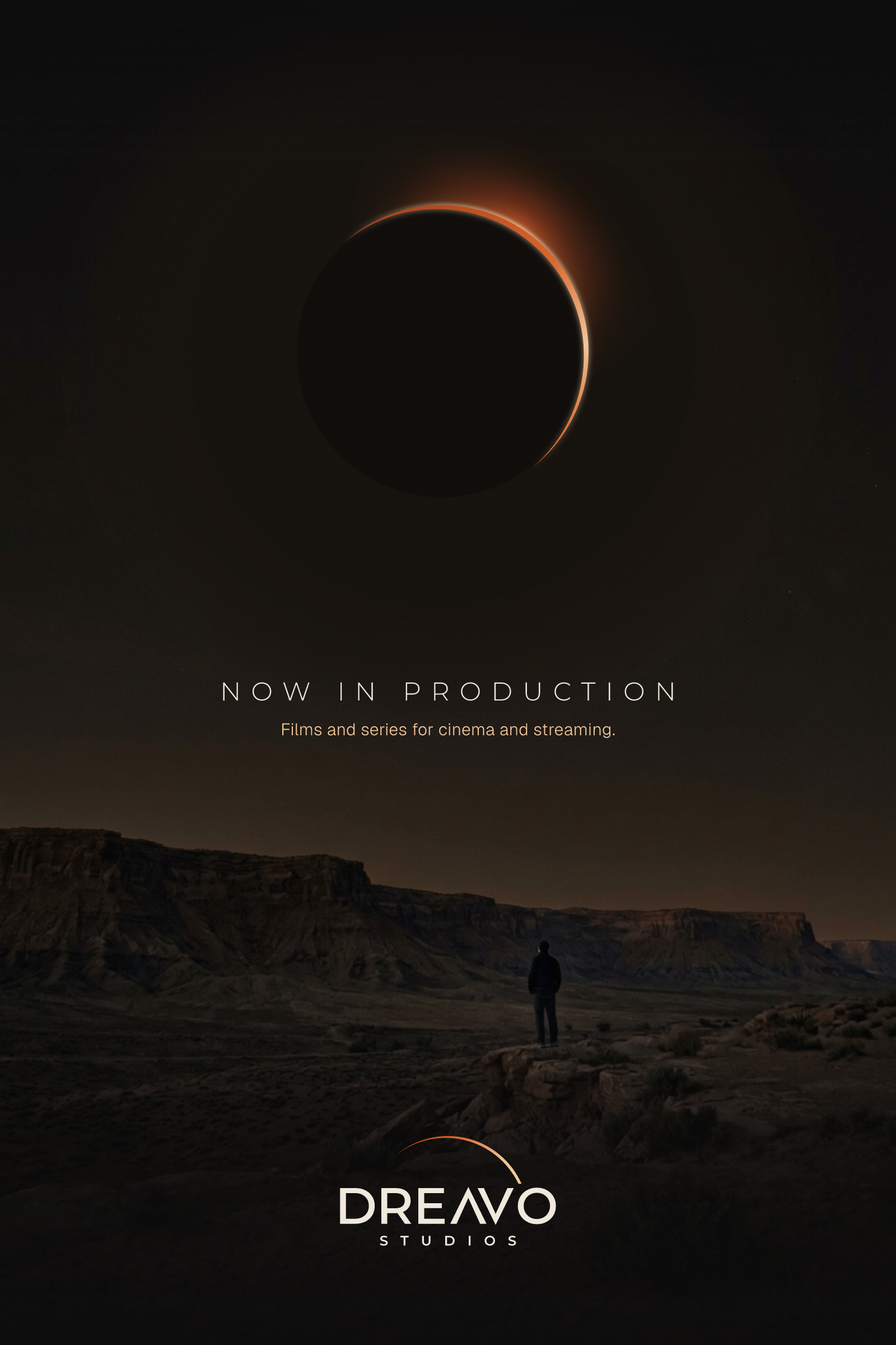
Key visual: one-sheetThe glow lives here, not in the logo: the eclipse is redrawn from the logo's own two-circle crescent over a desert plate, with the crisp lockup in the billing position.
Production ident, 2.39:1
Production ident, 2.39:1End pose of the opening ident on black: primary lockup at 30% of frame width, corona bloom behind the crescent only.
Ident in the cinema
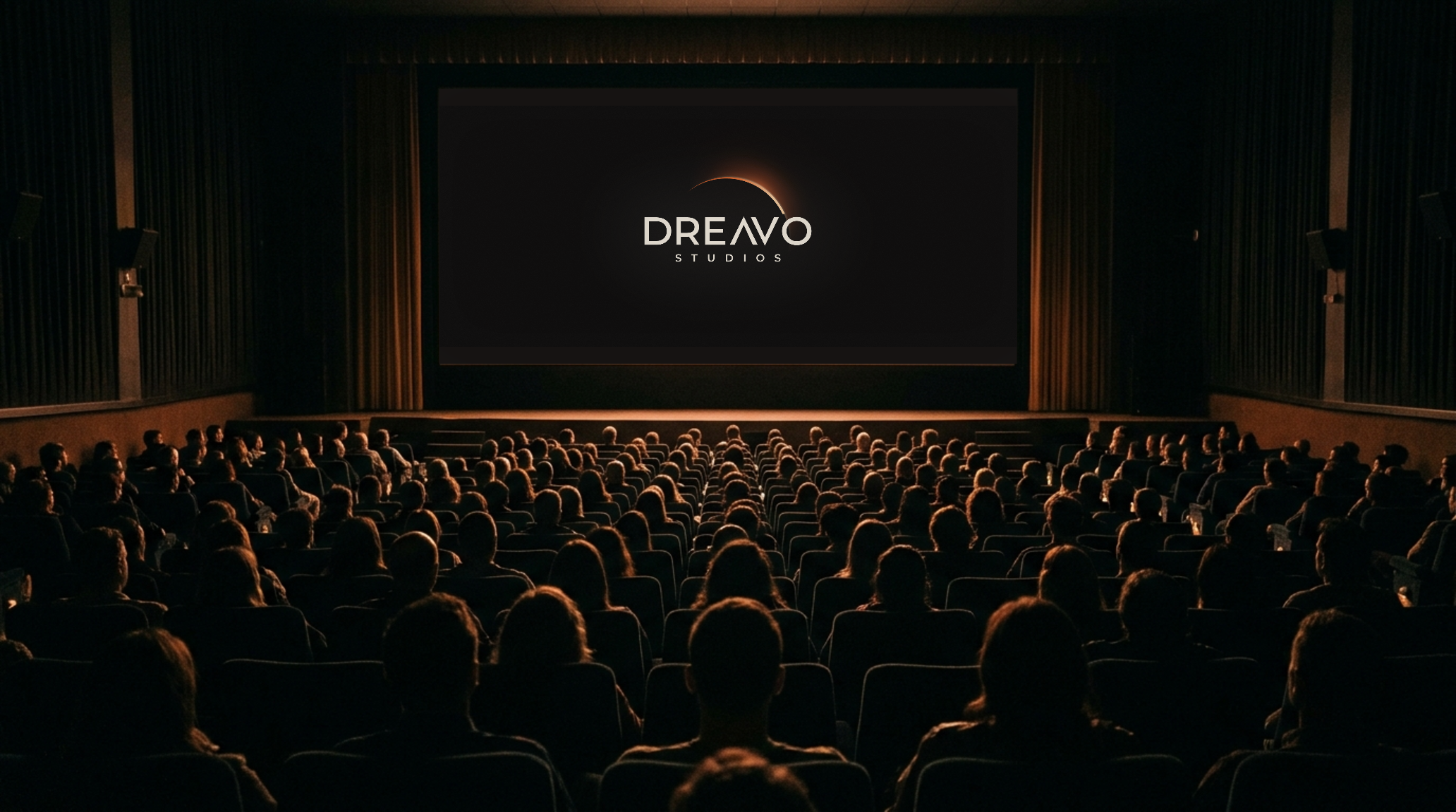
Ident in the cinemaThe title card on a scope screen in a full auditorium: the logo's first home, the second before the film starts.
Social avatar
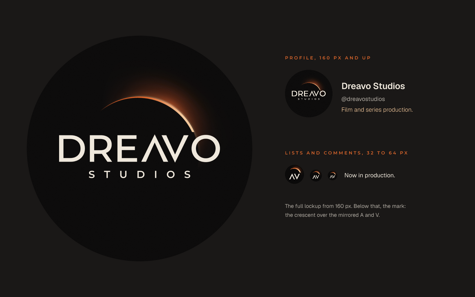
Social avatarThe reference composition rebuilt with the real lockup in a round crop; below 160 px the crescent-over-ΛV mark takes over.
Poster billing block
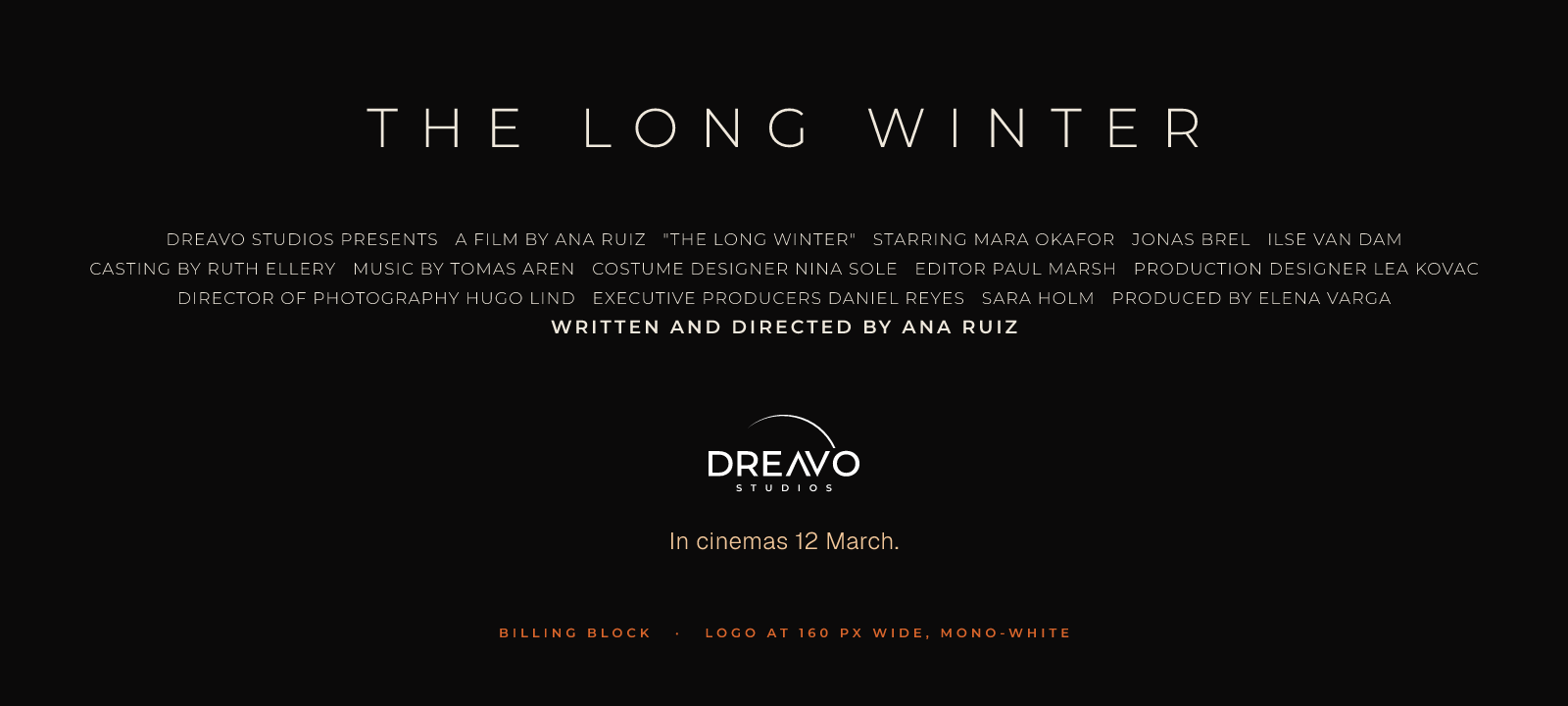
Poster billing blockMono-white lockup at 160 px wide under the credits: the crescent and STUDIOS still hold.
Business card
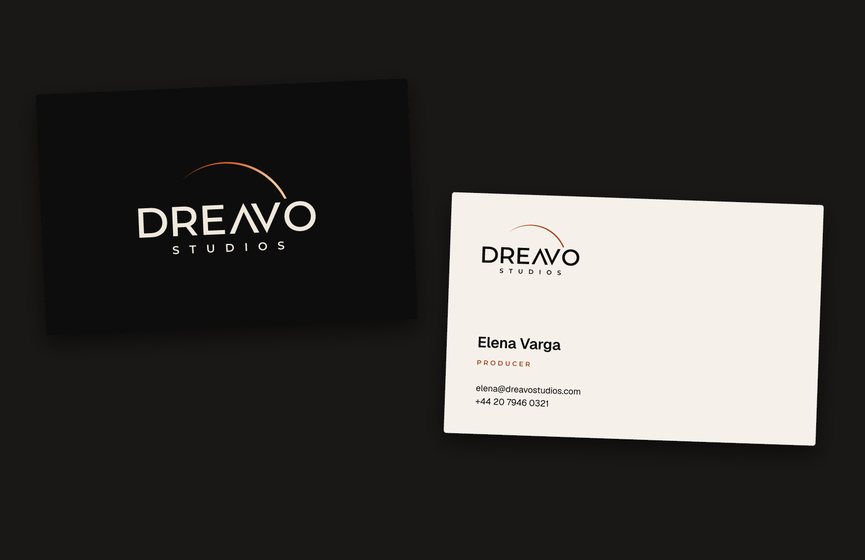
Business cardFront on Eclipse Black with the primary lockup; back on Vellum with primary-alt (Eclipse Black letters, Rust crescent) and the Geist and Montserrat hierarchy.
06

Concept

Written

Study 01-eclipse for Dreavo Studios. Created 2026-11-14.

Idea

The last sliver of light before totality: a thin eclipse crescent rides over the upper right of a large dark disc, and the name sits beneath it like a title card in the second before the film starts. The wordmark carries the reference's signature detail: the A has no crossbar, so it stands as an inverted V against the real V, and the pair reads as mirrored chevrons (Λ V). For Dreavo, the eclipse is the hush in the auditorium, a rare event people stop to watch.

Summary: A thin eclipse crescent hangs over the name like the last light before a film begins, with the A drawn as an inverted V mirrored against the V.


Why it fits

  • Positioning: "the weight of a studio picture" is delivered through stillness and scale: one large implied circle, a lot of black, a small amount of light. It is the quietest way to say "epic".
  • Personality: "Epic, not bombastic" (one thin crescent, no rays or flares); "Quiet, not anonymous" (the Λ V pair is a feature no stock font has).
  • Principles leaned on hardest: 4 (one drawn feature: the mirrored Λ V) and 1 (the crescent must work as a flat one-color shape, with the glow only as enrichment in primary.svg). Principle 2 is the weak spot (see Risks).
  • Landscape: this study deliberately follows convention 2 (light as the hero). It earns that by keeping the light flat and geometric in the logo files and putting the glow only in the ident and key visuals.

Logo type and track

  • Type: combination, symbol above wordmark: the crescent over DREAVO, with STUDIOS beneath.
  • Track: svg. Every part is geometric (two circles and a type-based wordmark with one custom glyph) and needs exact construction. An image model would add glow and garble the letters.
  • Ground: dark. The reference is on near-black, and the idea is light against darkness; the primary home is the title card on black.
  • Reference: references/eclipse-reference.jpg. Preserve, in this order: (1) the thin eclipse crescent on the upper right of a large circle, thickest around one to two o'clock and tapering to a point toward ten o'clock; (2) DREAVO in wide geometric sans caps, regular weight, warm off-white; (3) the crossbar-less A mirrored against the V; (4) STUDIOS small, very widely tracked, centered beneath; (5) the overall composition: the arc's circle is centered right of the wordmark's center, and the wordmark sits across the circle's lower half. Refine the execution; do not change the idea.

Form notes

Measured from the reference (480 px crop), with H = DREAVO cap height:

  • Wordmark: width W ≈ 6.1 H. Stem ≈ 0.17 H (regular to medium weight). O is a near-perfect circle (width ≈ H); D ≈ 0.9 H wide with a round bowl; R has a straight diagonal leg from the bowl junction; E has three arms, the middle one slightly shorter. Flat terminals, sharp joins.
  • Base face: set DREAVO with bun lf outline from Montserrat Regular or Medium caps (the closest Fontsource match to the reference's wide geometric caps). Compare Red Hat Display and Lexend Exa before committing. Expect to adjust the R leg and the E arm lengths toward the reference.
  • Custom A: draw the A as the V rotated 180°: same stroke weight, same diagonal angle, no crossbar, pointed apex overshooting the cap height by about 1.5 % of H (the V's point overshoots the baseline by the same amount). The A's right leg and the V's left leg are parallel; set the gap between them to match the visual gap between the other letters, so Λ V reads as a pair without touching.
  • STUDIOS: in the reference its cap height is ≈ 0.25 H, its width ≈ 0.63 W, and its baseline-to-cap gap below DREAVO ≈ 0.27 H. Its strokes (≈ 0.035 H) are too thin for a 160 px billing block, so raise STUDIOS to regular or medium weight and to about 0.28 H cap height, and keep the very wide tracking (about 0.6 em of its own size) so the width stays near 0.63 W.
  • Crescent: build it as one circle minus a second circle of the same radius, offset toward seven-thirty, so the crescent is thickest at one-thirty and its tips fall at ten-thirty and four-thirty. Diameter ≈ 0.55 W (≈ 3.4 H); center ≈ 0.075 W right of the wordmark's center, at about the DREAVO cap line. Maximum thickness ≈ 0.08 H, never thinner than 6/96 of the mark at its thickest. Clip the crescent with a horizontal line at least 0.2 H above the cap line so it never touches the letters (the reference's arc grazes the V; the mono version cannot). The visible arc runs from the ten-thirty tip over the top to the clip on the right.
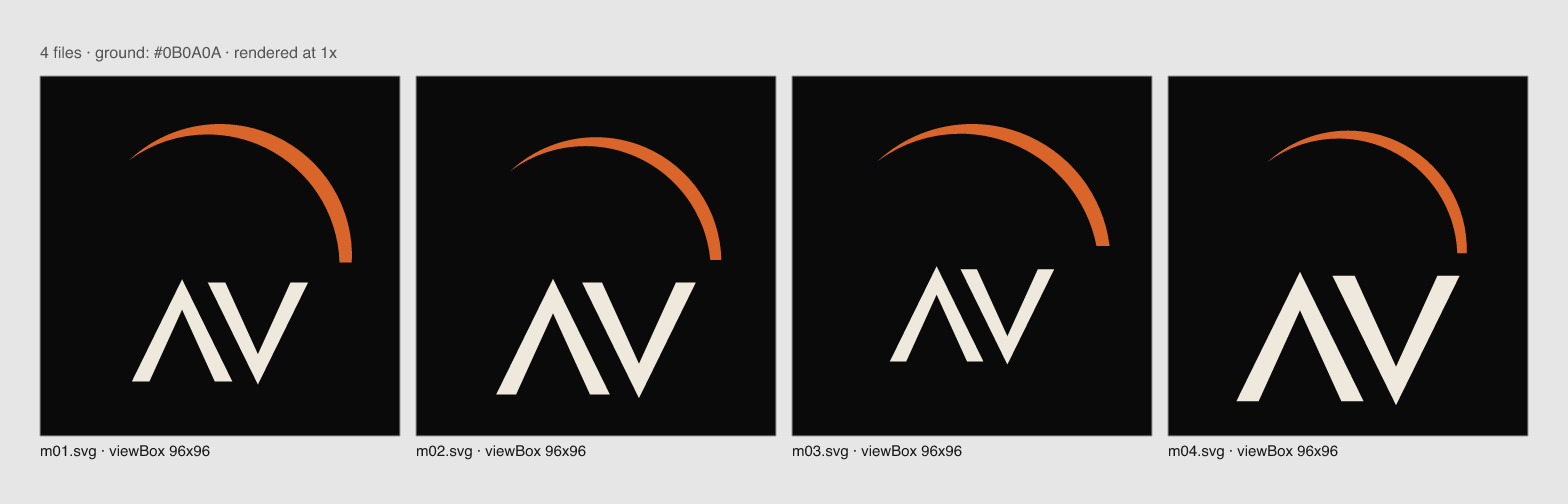
  • Mark (mark.svg): candidate A is the crescent over the Λ V pair, which keeps both distinctive features and also reads as "AV". Candidate B is the crescent over a D. Choose at stage 4 by testing both at 32 px in a circle crop.
  • Color direction: ground near-black (around #0B0A0A); wordmark warm off-white (around #EFE8DC); crescent in ember orange (around #D9652B) blending to warm white. In primary.svg the crescent may carry a linear gradient from warm white at one-thirty to ember orange toward the ten-thirty tip. No blur filters in any logo file; the soft halo is for key visuals and the motion ident. Mono files: crescent and letters in one flat color.
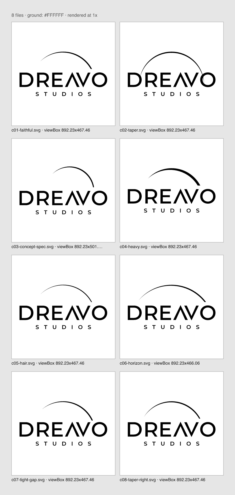
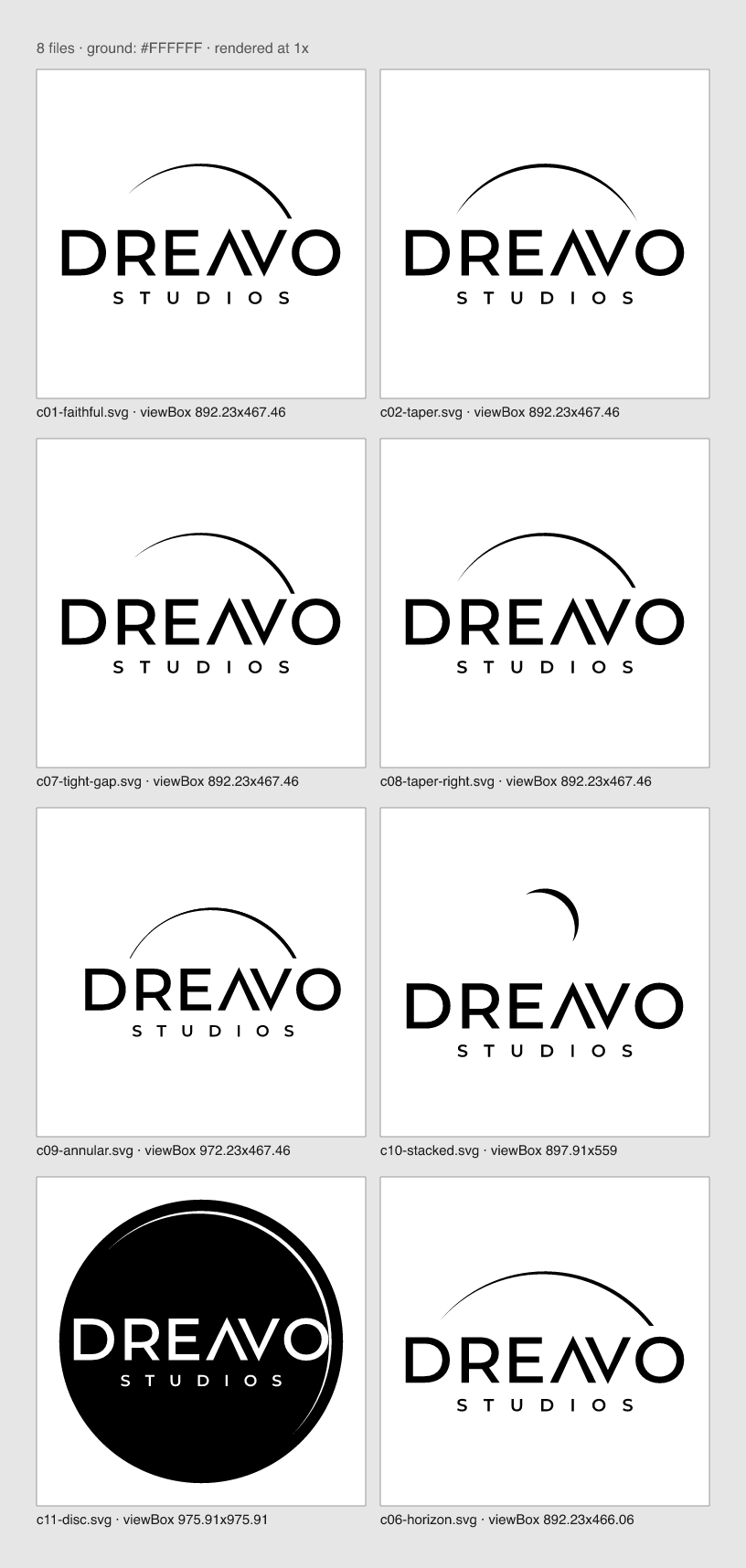
  • Stage 4 decisions (2026-11-15). Concepts are in logo/concepts/ (compare-01.png, compare-02.png, compare-marks-01.png to -03.png). Chosen: c07, the faithful rebuild with a tighter clip, refined into the final files. Runner-up: c06, a larger, flatter circle centered below the baseline, which reads more like a horizon but drifts from the reference's dome. Rejected: a symmetric bow with two natural tips (c02, the arc-over-wordmark cliché), a small free-standing crescent (c10, reads as a night-mode moon icon), a full thin ring (c09, adds a second stroke weight), and a black disc emblem (c11, a badge that disappears on the dark ground).
  • Measured corrections to the notes above. Fitting a circle to the reference's arc (pixels sampled along the bright edge) puts its center on the wordmark's horizontal center, 0.8 H below the cap line, with radius 2.26 H (diameter ≈ 0.73 W), not 0.55 W and 0.075 W right. The final files use the measured values. The clip sits 0.12 H above the cap line: 0.2 H left the arc floating, 0.12 H lets it set just above the V and O as in the reference and still keeps 3 px of air at 160 px wide.
  • Final construction. DREAVO is outlined from Montserrat 500 and 600 and interpolated halfway (the two static instances share point structure), so the stem is 0.164 H, between the two weights and close to the reference's 0.17 H. D, R, E, and O keep Montserrat's outlines; Λ and V are drawn new as pointed chevrons (Montserrat's have flat apexes): equal width (1.01 H), apex overshoot 3.2 % of H, inner join thinned 15 % against clogging, and Λ is V rotated 180°, so the channel between them is parallel. Crescent: two circles of radius 2.26 H, the second offset by half a stem (0.084 H) toward about seven-forty, so the crescent is widest at about one-forty and its widest point is exactly half the letter stem (a fixed 1:2 ratio). STUDIOS is Montserrat 600, cap height 0.27 H, ink width 0.63 W, 0.34 H below the baseline.
  • Mark. Candidate A (crescent over Λ V) won over candidate B (crescent over D): the D reads more cleanly at 16 px, but D plus an arc could belong to any company, while Λ V is the drawn feature. The mark is an optical cut for small sizes: the letters use the 600 instance, the Λ V channel is opened by 30 %, and the crescent's widest point equals one stem instead of half, because half a stem disappears below 32 px.
  • Gradient. primary.svg runs Rust at the ten-thirty tip to Ember to Corona at the clip, so the light is brightest where the arc meets the name, as in the reference. mark.svg starts at Ember instead of Rust because Rust is too dark to read at 16 px on black.
  • Typography (stage 6). Montserrat is on the craft docs' list of overused faces. It stays here on purpose: the reference's lettering is Montserrat-like, the wordmark is cut from it, and the job of the display face in this system is to make title cards and credits look like the logo, not to add a second voice. Distinctiveness is carried by the drawn Λ V and the crescent. Lexend Exa 300 was the runner-up for titles (more cinematic, but a second wide geometric sans beside the wordmark looked like a near-miss).
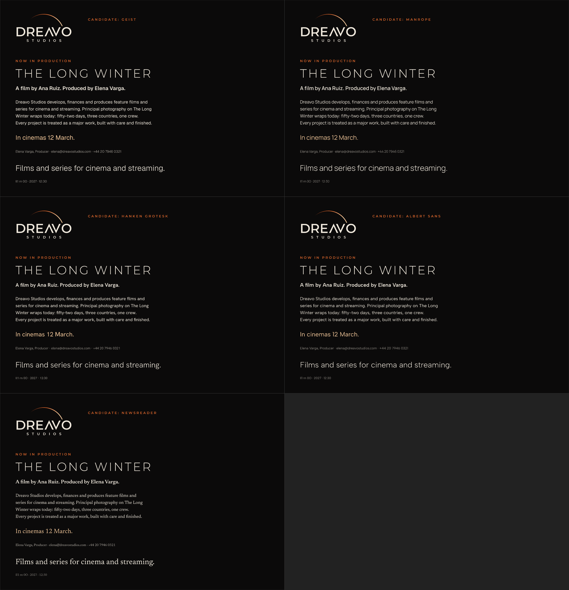
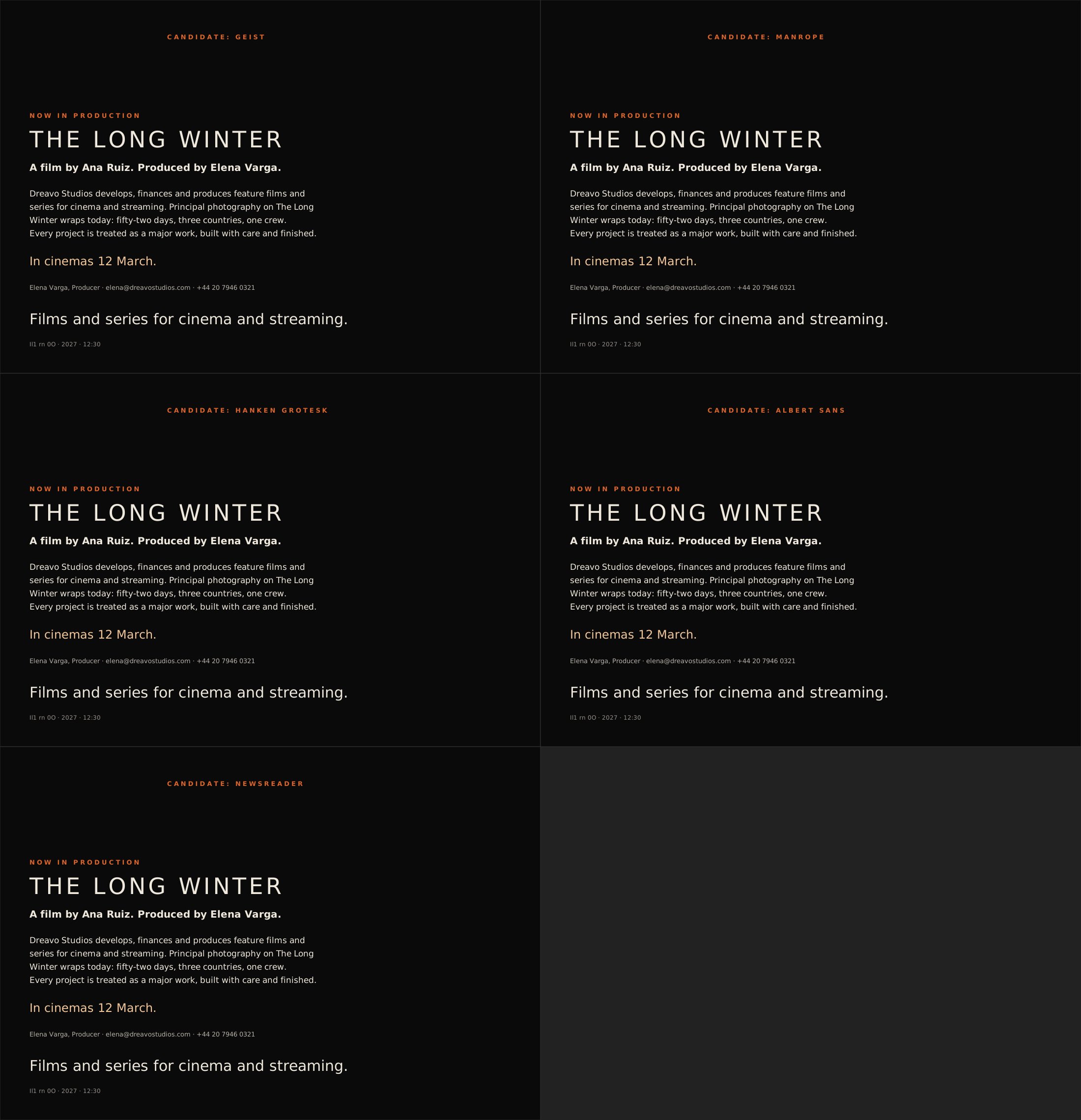
  • Body face revised (2026-11-15, user feedback). The user rejected Newsreader ("not sexy"); bookish text serifs read as unsexy to them. Replaced by Geist 300/400/600 after a side-by-side specimen of Geist, Manrope, Hanken Grotesk, and Albert Sans next to the logo with copy from the applications (logo/concepts/body-candidates.png). Geist won: a narrow, precise grotesque that contrasts with Montserrat's wide round geometry and reads like a studio credit sheet, sleek at 300 for lead lines. Manrope was the runner-up (equally sleek, but its squarish rounds read as product UI and it has no italic). Albert Sans and Hanken Grotesk are geometric like Montserrat and blurred into it. The system drops italics; emphasis is weight or color.

Risks

  • Stock eclipse and arc-over-type cliché. Design blogs call an arc over a wordmark overused, and stock sites carry thousands of sunrise and eclipse logo templates. Skydance used a sun and an arch of light. Guard: the crescent is constructed (two circles, defined offset), the Λ V carries recognition, and the arc never becomes a swoosh. If the mono version looks like a template at review, that is the verdict.
  • Too close to Legendary's lettering. Legendary uses wide, widely tracked geometric caps. Guard: the custom Λ, the round D and O, and the crescent; compare side by side at stage 4.
  • The A may not read as an A. "DREΛVO" can stumble at small sizes. Guard: test the wordmark at 160 px and 32 px height for readability with the name hidden; keep the Λ's apex sharp and its weight equal to the V.
  • Small sizes. A thin crescent and widely tracked STUDIOS are the first things to vanish (principle 2). Guard: the minimum crescent thickness and the heavier STUDIOS above; the mark at 32 px must keep the crescent visible.
  • Glow as the idea. The reference's beauty is largely its glow. Judge mono-white.svg first; if the idea dies without the glow, thicken the crescent rather than leaning on the gradient.
  • Distinct from the other studies: the only study built on light and the only one with a thin geometric curve; the others use carved type (02), an organic solid mass (03), and a heavy cut slab (04).

Sign-off

Approved by the user on 2026-11-15. No changes requested.

07

Reference

Reference: references/eclipse-reference.jpg
references/eclipse-reference.jpg
08

Concept sketches

applications-check.png
body-candidates.png
body-candidates.png
body-candidates.svg
body-candidates.svg
c01-faithful.svg
c01-faithful.svg
c01-r.png
c01-r.png
c02-taper.svg
c02-taper.svg
c03-concept-spec.svg
c04-heavy.svg
c04-heavy.svg
c05-hair.svg
c05-hair.svg
c06-horizon.svg
c06-horizon.svg
c07-tight-gap.svg
c07-tight-gap.svg
c08-taper-right.svg
c08-taper-right.svg
c09-annular.svg
c09-annular.svg
c10-stacked.svg
c10-stacked.svg
c11-disc.svg
c11-disc.svg
compare-01.png
compare-01.png
compare-02.png
compare-02.png
compare-fonts.png
compare-fonts.png
compare-marks-01.png
compare-marks-02.png
compare-marks-03.png
compare-type.png
compare-type.png
final-mono-black-r01.png
m01.svg
m01.svg
m02.svg
m02.svg
m03.svg
m03.svg
m04.svg
m04.svg
m05-d.svg
m05-d.svg
m06.svg
m06.svg
mark-avatar-r01.png
mark-avatar-r01.png
mark-avatar-r02.png
mark-avatar-r02.png
mark-r3.svg
mark-r3.svg
mark-r4.svg
mark-r4.svg
mark-r5.svg
mark-r5.svg
mark-t1.0.svg
mark-t1.0.svg
mark-t1.2.svg
mark-t1.2.svg
mark-v2.svg
mark-v2.svg
mark-v3.svg
mark-v3.svg
mark-v4.svg
mark-v4.svg
r01.png
r01.png
r01.svg
r01.svg
r02.png
r02.png
r02.svg
r02.svg
type-a.png
type-a.png
type-a.svg
type-a.svg
type-b.png
type-b.png
type-b.svg
type-b.svg
type-c.png
type-c.png
type-c.svg
type-c.svg
type-d.png
type-d.png
type-d.svg
type-d.svg
wm-jost-400.svg
wm-jost-400.svg
wm-lexend-exa-300.svg
wm-lexend-exa-400.svg
wm-mont-500-t0.svg
wm-mont-500-t0.svg
wm-mont-600-t0.svg
wm-mont-600-t0.svg
wm-montserrat-400.svg
wm-montserrat-500.svg
wm-outfit-300.svg
wm-outfit-300.svg
wm-outfit-400.svg
wm-outfit-400.svg
wm-red-hat-display-400.svg
wm-test.png
wm-test.png
wm-test.svg
wm-test.svg
09

Moodboard

Not yet madeNothing in moodboard/ yet
10

Guidelines

Written

Study 01-eclipse. Version 1, 2026-11-15.

Overview

The last sliver of light before totality: a thin eclipse crescent hangs over the name like the last light before a film begins, and the name sits beneath it like a title card in the second before the film starts. The A is drawn without a crossbar, as a V turned upside down, so A and V stand as mirrored chevrons (Λ V). The system is built faithfully from the user's reference image, references/eclipse-reference.jpg.

Personality: serious, not grim; epic, not bombastic; classic, not nostalgic; quiet, not anonymous.

The system answers the strategy's design principles like this:

  1. Survives in one flat color. The crescent is a solid shape built from two circles; mono-black.svg and mono-white.svg carry the whole idea. The glow lives only in key visuals and the ident.
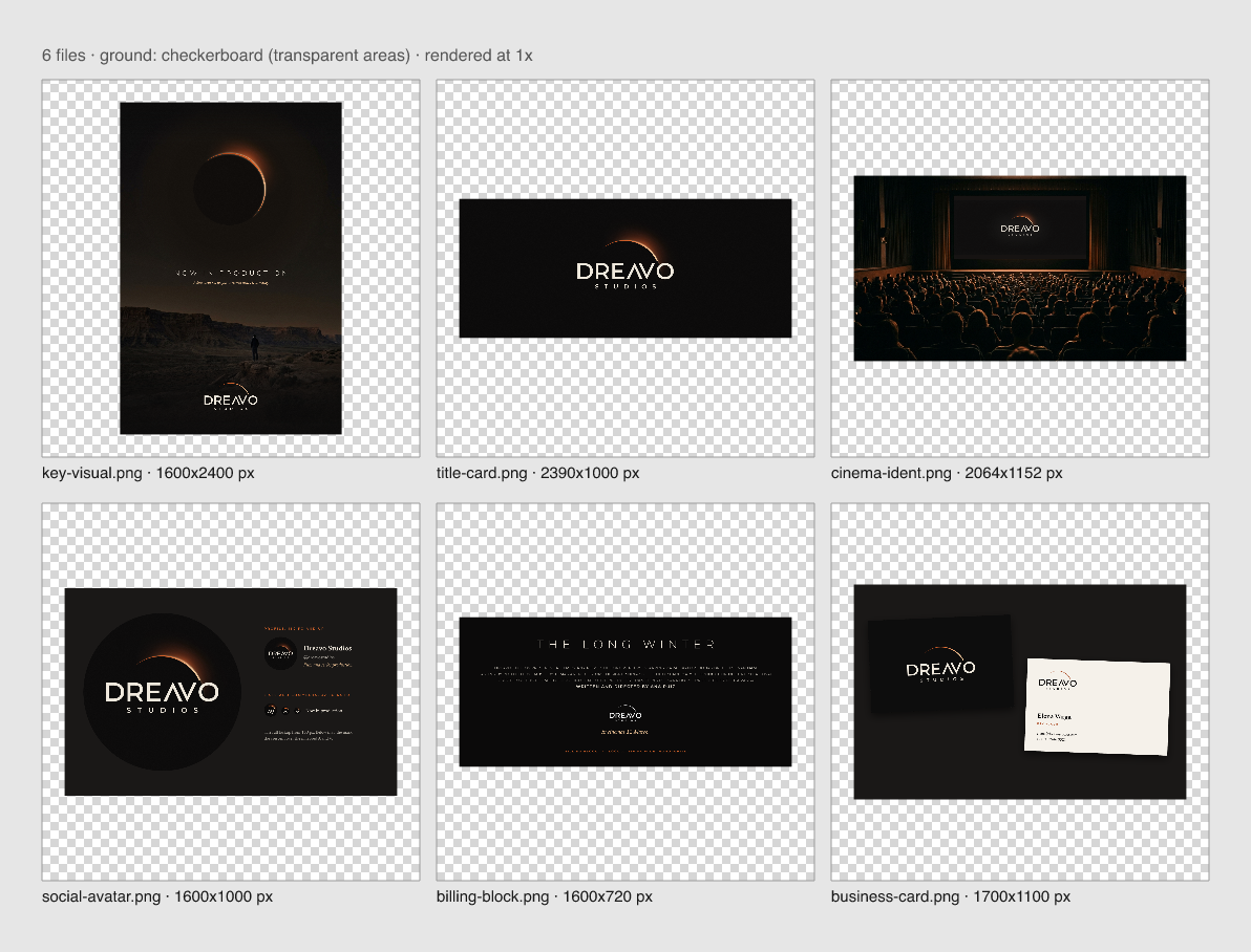
  2. Holds in a billing block and a round avatar. The lockup is tested at 160 px wide in mono-white (applications/billing-block.png), and the mark in a round crop at 32 px (applications/social-avatar.png).
  3. No stock cinema and no levity. No reels, lenses, stars, or chrome. One light source, flat.
  4. One drawn feature you can name. "The mirrored A and V": a crossbar-less Λ against a V of the same weight and angle.
  5. Two elements, one weight logic. Crescent plus name. The crescent at its widest is exactly half the letter stem.

This document is for anyone who places the logo: title designers and editors cutting the ident, poster and key-art studios setting billing blocks, deck and web designers, printers.

Logo

Versions

Primary

File What it is Use when Do not use when
logo/primary.svg Full lockup: Bone letters, crescent in the Rust to Ember to Corona gradient The default. Title cards, screens, decks, social, anything on Eclipse Black, Umbra, or dark imagery On light grounds; below 180 px or 24 mm wide
logo/primary-alt.svg Same lockup: Eclipse Black letters, flat Rust crescent Light grounds: Vellum, Bone, white paper, letterhead, contracts On dark grounds
logo/mark.svg Crescent over the Λ V pair, small-size cut Avatars below 160 px, favicons, app icons, embroidery, and anywhere the lockup would fall below its minimum As a replacement for the name where the audience does not yet know the company (first page of a pitch deck, the ident)
logo/mono-black.svg Full lockup, solid black One-color print on light stock, poster billing blocks on light posters, engraving, stamps On dark grounds
logo/mono-white.svg Full lockup, solid white Billing blocks and end-credit pages on dark posters, over photography, one-color print on dark stock, foil On light grounds
logo/wordmark.svg DREAVO and STUDIOS without the crescent, in Bone Very wide, very short spaces (a credit crawl line, a lanyard) where the crescent would push the lockup below minimum size Anywhere the full lockup fits

Primary-alt

Mark

Mono black

Mono white

Wordmark

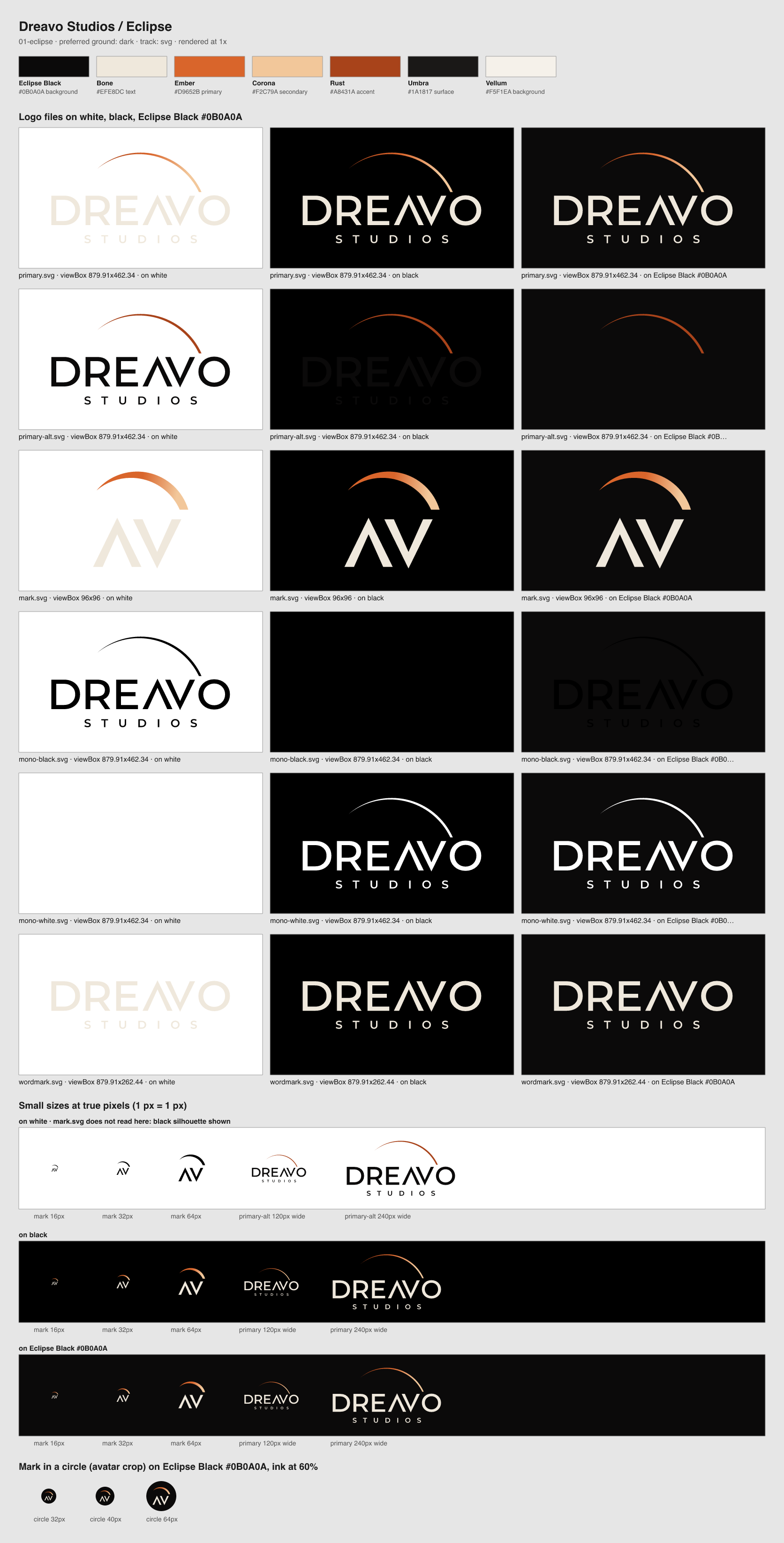
Contact sheet with every file on white, black, and Eclipse Black, and the small sizes:

Logo sheet

Construction

Let X be the cap height of DREAVO. Every measurement below is a multiple of X.

  • Wordmark. DREAVO is outlined from Montserrat 500 and 600, interpolated halfway (an in-between weight, about 550), so the stem is 0.164 X. D, R, E, and O are Montserrat's outlines. Λ and V are drawn: pointed chevrons of equal width (1.01 X), the points overshooting the cap line and the baseline by 0.032 X, the inner join thinned by 15 %. Λ is V rotated 180°, so Λ's right leg and V's left leg are parallel. Letter gaps at the ink: D–R 0.19 X, R–E 0.20 X, E–Λ 0.16 X, V–O 0.11 X; the Λ V channel is 0.24 X wide, measured horizontally at mid-height. The word is 6.06 X wide.
  • STUDIOS. Montserrat 600, cap height 0.27 X, tracked so its ink width is 0.63 of DREAVO's, centered on DREAVO's ink. Its cap line sits 0.34 X below DREAVO's baseline.
  • Crescent. One circle of radius 2.26 X, centered horizontally on DREAVO's ink and 0.8 X below its cap line, minus a second circle of the same radius offset by 0.084 X toward about seven-forty. The result is widest (0.084 X, half the letter stem) at about one-forty and tapers to a point at about ten-forty. A horizontal line 0.12 X above the cap line cuts the crescent where it meets the name, so the light sets just above the V and the O. Measured from the reference by fitting a circle to its arc.
  • Mark. The crescent and the Λ V pair, redrawn as a small-size cut on a 96-unit square: letters from the Montserrat 600 instance (stem 7.95/96), the Λ V channel opened by 30 %, and the crescent widest at one full stem, because half a stem vanishes below 32 px.
  • Color in the files. primary.svg carries a linear gradient along the crescent from Rust at the tip to Ember to Corona at the cut. Mono files are flat.

Clear space

Keep at least 1 X clear on every side of the lockup, measured from the top of the crescent, the left edge of the D, the right edge of the O, and the baseline of STUDIOS. On a 1920 px title card with the lockup at 30 % of the width, X is 92 px.

Keep at least 0.25 of the mark's width clear around mark.svg. In a round avatar, the mark sits inside the circle at 86 % of its diameter.

Intrusions: other logos, text, crop and image edges, folds, and the frame edge of a title card. The glow in key visuals may enter the clear space; type and other marks may not.

Minimum size

The finest detail in the lockup is the stem of STUDIOS: 7 units against a lockup 848 units wide.

Version Screen Print
Primary, primary-alt, mono lockups 180 px wide 24 mm wide
Poster billing block, mono only 160 px wide, absolute floor 20 mm wide, absolute floor
Mark 18 px (favicons may use 16 px) 6 mm

Below 180 px, or 160 px in a billing block, use mark.svg. At 16 px the crescent survives as a warm line and the chevrons as a pair; it is a favicon, not a signature. Place the favicon on an Eclipse Black tile, because the Bone letters disappear in a light browser tab.

Misuse

  • Do not add a crossbar to the Λ, and do not replace it with a typed A.
  • Do not let the crescent touch the letters, and do not extend it down past its cut toward the V and the O.
  • Do not add glow, blur, outer glow, lens flare, or shadow to the logo files. The glow is built in key visuals behind the logo, never applied to it.
  • Do not thicken the crescent in the lockup, and do not swap the half-stem crescent for the mark's full-stem crescent.
  • Do not move the crescent left of center, flip it, or rotate it. The light is always at the upper right.
  • Do not place primary.svg on Vellum, Bone, or white; use primary-alt.svg.
  • Do not recolor the crescent outside the palette. Never use the Corona end of the gradient on a light ground.
  • Do not set STUDIOS in another face, weight, or tracking, and do not move it closer to DREAVO.
  • Do not stretch, condense, skew, or retype DREAVO in Montserrat or any other face.
  • Do not place the full-color logo over bright or busy parts of an image; darken the area to Eclipse Black first or use mono-white.svg.

Color

Name Hex RGB Role Usage
Eclipse Black #0B0A0A 11, 10, 10 background The default ground: title cards, screens, decks, the avatar. 60 to 70 % of any layout. A warm near-black, never pure #000000.
Bone #EFE8DC 239, 232, 220 text The wordmark, STUDIOS, and all text on Eclipse Black and Umbra. Never pure white.
Ember #D9652B 217, 101, 43 primary The crescent and the body of the corona gradient. Light only: the crescent, rules, one highlight per layout.
Corona #F2C79A 242, 199, 154 secondary The hot end of the crescent gradient and the core of the glow in key visuals; release lines in Geist 300. Dark grounds only.
Rust #A8431A 168, 67, 26 accent The flat crescent on light grounds, small caps labels on Vellum, and the cool end of the crescent gradient.
Umbra #1A1817 26, 24, 23 surface Panels, cards, deck slides, and merchandise stock one step off Eclipse Black.
Vellum #F5F1EA 245, 241, 234 background The light ground for print and documents: letterhead, contracts, press notes, the back of the business card.

Proportion. Eclipse Black and Umbra 70 %, Bone 25 %, Ember, Corona, and Rust together under 5 %. On light documents: Vellum 75 %, Eclipse Black 22 %, Rust under 3 %. The light is always the smallest thing on the page.

Approved pairs.

Foreground on ground Contrast Use
Bone on Eclipse Black 16.2:1 Body text, the wordmark
Bone on Umbra 14.5:1 Text on panels
Corona on Eclipse Black 12.6:1 Release lines, highlights
Ember on Eclipse Black 5.5:1 Crescent, labels, small caps
Ember on Umbra 4.9:1 Labels on panels
Eclipse Black on Vellum 17.6:1 Body text and lettering on light grounds
Rust on Vellum 5.4:1 Crescent and labels on light grounds
Rust on Bone 5.0:1 Crescent on Bone stock

Pairs not allowed.

  • Ember on Bone (3.0:1) or Vellum (3.2:1): too weak for the crescent on light grounds and fails as text. Use Rust.
  • Corona on Vellum (1.4:1) or Bone: invisible.
  • Rust as text on Eclipse Black (3.3:1): fails for body text. Allowed only as the dim end of the crescent gradient.
  • Eclipse Black on Umbra (1.1:1): no contrast; never set the light-ground logo on Umbra.

Typography

Role Family Weights Source Fallback
Display Montserrat 300, 600 Fontsource, OFL-1.1 (fonts/montserrat-300.ttf, fonts/montserrat-600.ttf) "Avenir Next", "Century Gothic", system-ui, sans-serif
Body Geist 300, 400, 600 Fontsource, OFL-1.1 (fonts/geist-300.ttf, fonts/geist-400.ttf, fonts/geist-600.ttf) "Helvetica Neue", Arial, system-ui, sans-serif

Montserrat is the face the wordmark is cut from. Titles in 300 look like the opening titles of a film; labels in 600 speak with the same voice as STUDIOS. Geist carries everything people read in sentences: a narrow, precise grotesque with tight apertures that contrasts with Montserrat's wide round geometry while sharing its cool, unornamented finish, so text reads like a studio's credit sheet rather than a book. There are no italics in the system; emphasis is weight (600) or color (Corona on dark, Rust on light). Never retype the wordmark in Montserrat: the Λ and V exist only in the logo files.

Level Face and weight Size / line height (px) Case, tracking
Display (title cards, key art) Montserrat 300 64 / 72 Caps, +120
H1 (deck covers, page titles) Montserrat 300 40 / 48 Caps, +100
H2 Geist 600 26 / 34 Sentence, −1 %
Body Geist 400 17 / 27 Sentence, 0
Lead line, release line Geist 300 24 / 32 or larger Sentence, +0.5 %
Label, credit, kicker Montserrat 600 13 / 18 Caps, +300
Caption Geist 400 13 / 20 Sentence, 0

Rules:

  • Body text is left-aligned, never justified, 55 to 75 characters per line.
  • Titles of films and series are set in Montserrat 300 caps; in running text they are set in Geist 600, never in quotes.
  • Dates are written out the way the credits read them: "12 March 2027", no ordinals, no slashes. Times are 24-hour.
  • One label line in Ember per layout at most; everything else in Bone.

Imagery and key visuals

Key visual

  • Light. One source of light per image, low and warm, coming from the upper right where possible: dusk, firelight, practical lamps, the edge of an eclipse. Everything else falls to black.
  • Grade. Blacks crushed toward Eclipse Black, highlights warmed toward Corona, a single Ember accent. No teal and orange split, no blue night.
  • Subject. Wide shots with a lot of empty frame and a small human figure for scale; production stills that hold their breath. The scale comes from the frame, not from effects.
  • Glow belongs here. The corona bloom, the soft halo behind the crescent, film grain, and haze are allowed in key visuals, idents, and social images, and only there. Build them behind the logo (blurred copies of the crescent's own circle, a radial mask centered at about one-thirty), then place the flat logo on top.
  • Eclipse geometry. When an eclipse appears in imagery, it is drawn from the logo's construction: two equal circles, the light widest at about one-forty, tapering toward ten-forty and four-forty. If a photograph or generated plate contains another eclipse, replace it with this one, as in applications/key-visual.svg.
  • The logo on images sits on the darkest region, at 10 to 25 % of the frame width, in primary.svg or mono-white.svg.
  • Don't: light rays or flares, stock "cinema" props (reels, clapperboards, film strips, popcorn, projector beams), bright daylight skies, starfields, glossy 3D renders.

Voice

Dreavo writes like a title sequence: names, verbs, facts. Short declarative sentences in the present tense. No exclamation marks, no superlatives, no marketing filler, no emoji. It says "film", "series", "production", "slate", names, and dates. It never says "content", "creatives", "passionate", or "epic"; the work should be epic, the copy never says so.

Principle Do Don't
Say less, mean it "Now in production." "We're so excited to finally share our amazing new project!!"
Credits, not copy "Dreavo Studios presents a film by Ana Ruiz." "Your one-stop partner for premium creative content."
Confident, never loud "In cinemas 12 March." "The most unforgettable film of the year!"

Example lines in this direction:

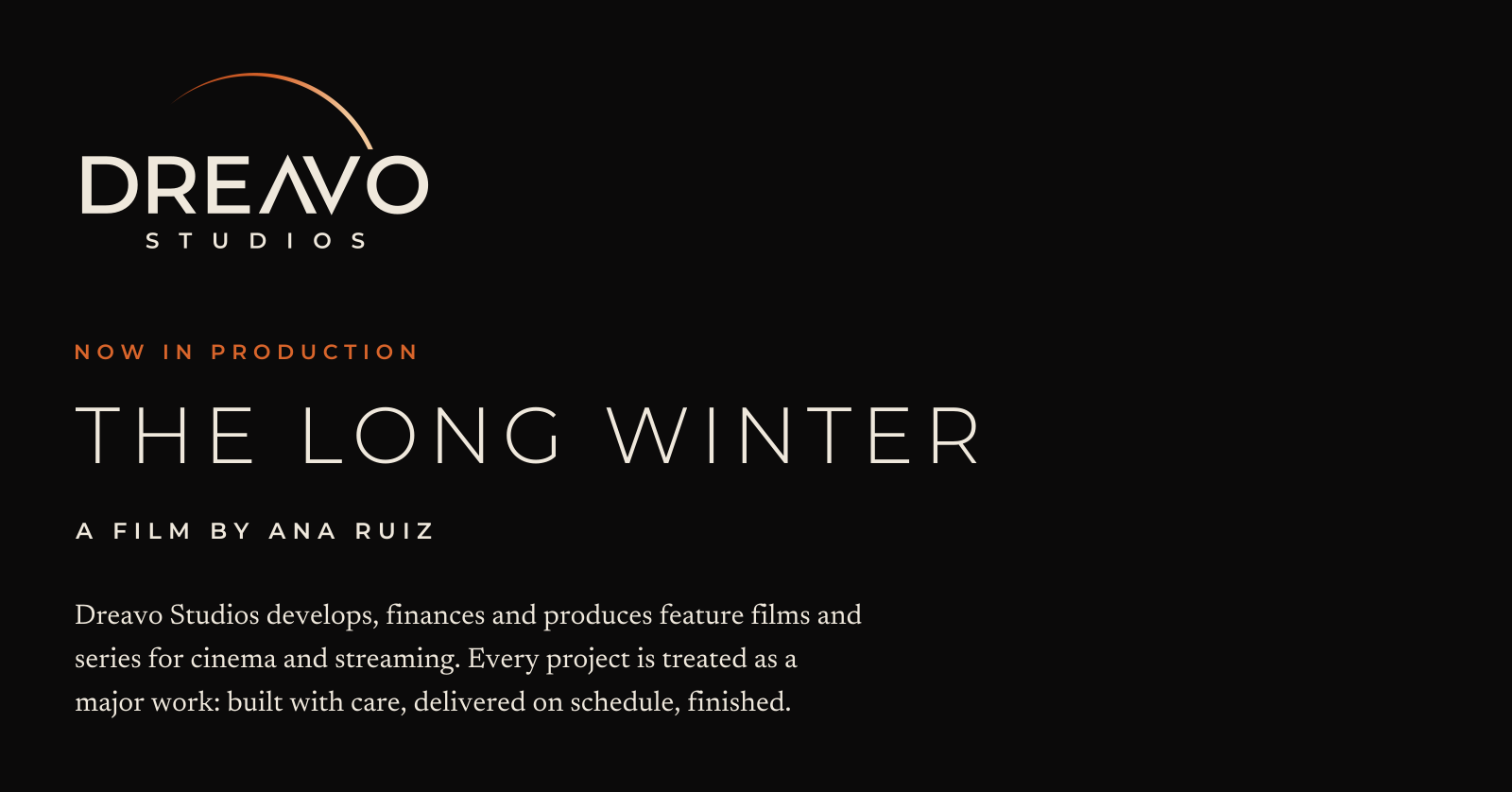
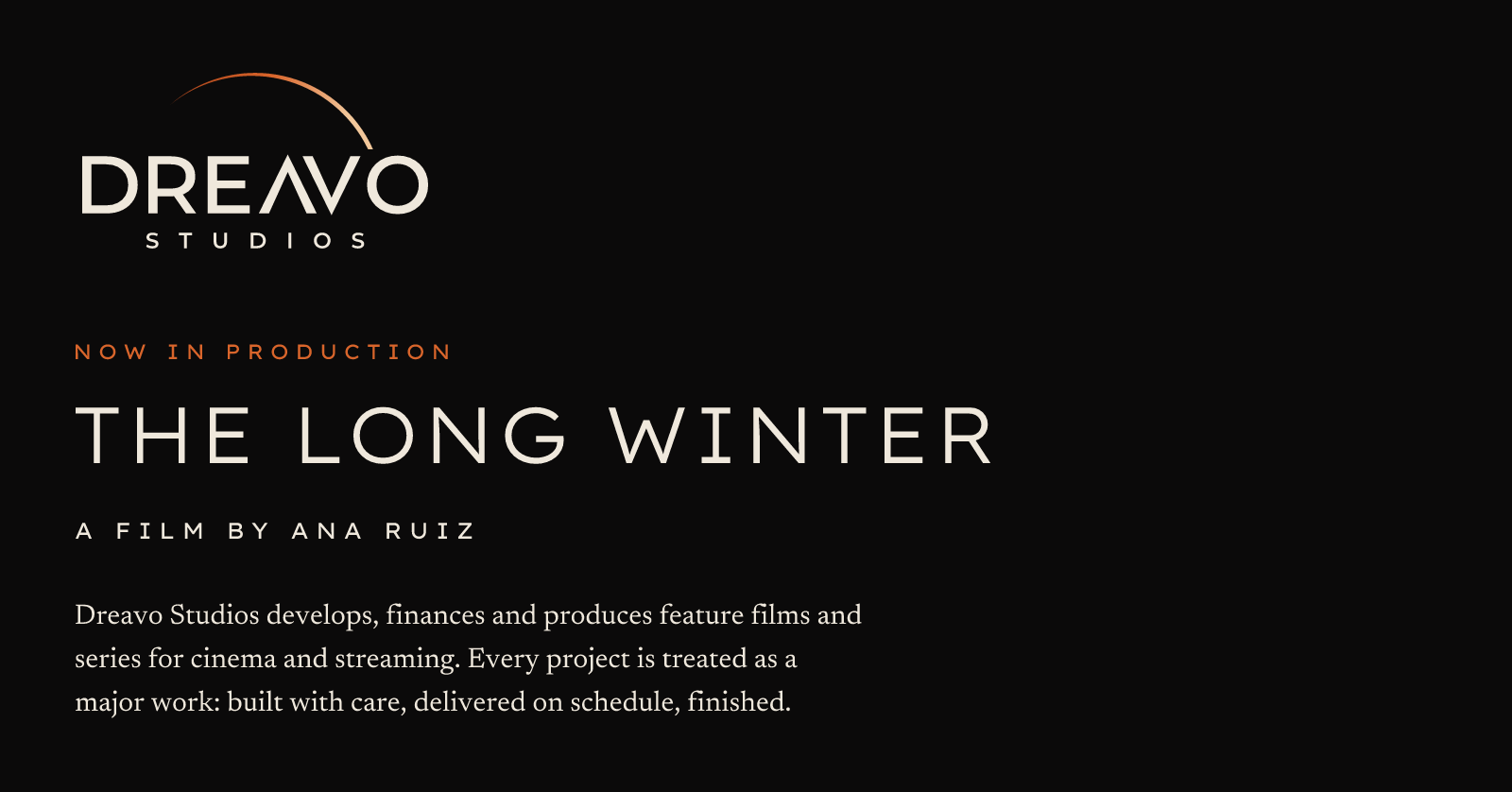
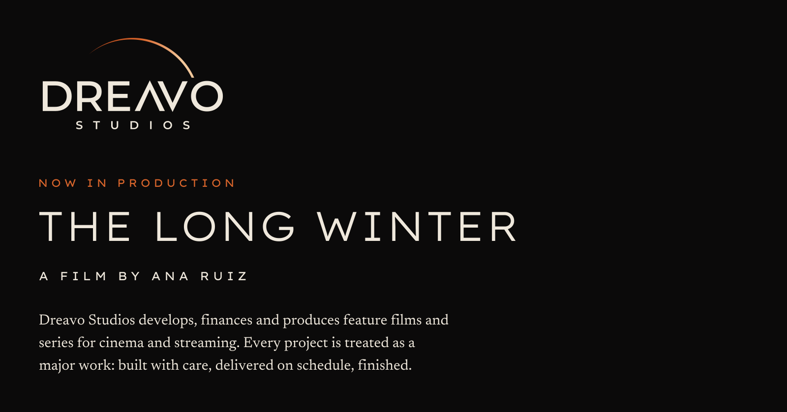
  • Headline (deck cover, key art): "NOW IN PRODUCTION" in Montserrat 300 caps, with "Films and series for cinema and streaming." in Geist 300, Corona, beneath.
  • Button label: "View the slate"
  • Social post: "Principal photography on The Long Winter wraps today. Fifty-two days, three countries. In cinemas 12 March."

Tone by context: social is the same voice with one fact per post; festival and market materials list names, running times, and screening slots and nothing else; contracts and legal stay plain and complete.

Applications

Key visual

Key visual, one-sheet: the glow lives here, not in the logo. The eclipse is redrawn from the logo's two-circle construction over a desert plate, and the flat lockup sits in the billing position at 25 % of the width.

Production ident

Production ident, 2.39:1: the end pose of the opening ident. Primary lockup at 30 % of frame width, corona bloom behind the crescent only, with DREAVO's cap-height midline 2 % below the middle of the frame so the crescent and the name together sit optically centered.

Ident in the cinema

Ident in the cinema: the title card on a scope screen in a full auditorium, the logo's first home.

Social avatar

Social avatar: the reference composition rebuilt with the real lockup in a round crop for profiles of 160 px and up; below that, the mark in the same crop.

Poster billing block

Poster billing block: mono-white.svg at 160 px wide under the credits, the absolute floor for the lockup. The crescent and STUDIOS still hold.

Business card

Business card: the front on Eclipse Black with primary.svg; the back on Vellum with primary-alt.svg (Eclipse Black letters, Rust crescent), name in Geist 600, role in Montserrat 600 caps in Rust, contact lines in Geist 400.