background
Cutting Room
#111214
- Contrast
- Reference ground
- Usage
- Default ground for the logo, title cards, screens, and the dark face of print. 60 to 70% of any layout. A graphite black, not pure black, so it holds detail on screen and in print.

Dreavo Studios, study 2 of 6
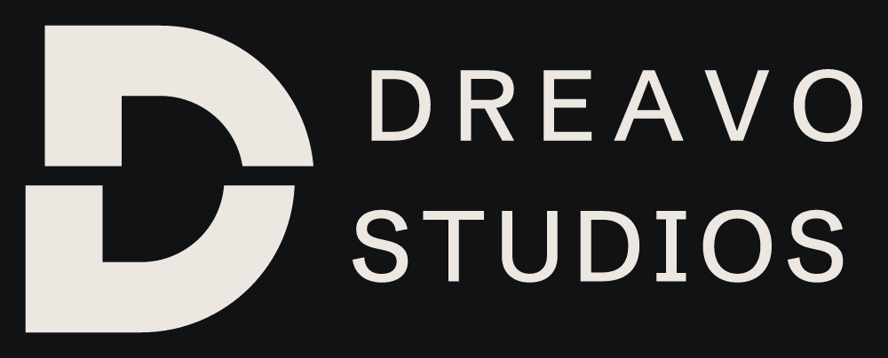
A heavy, monumental D cut once by a horizontal line with its upper half shifted by the width of the cut, the edit that turns footage into a film.




#111214
#ECE8E1
#D6D1C8
#1C1D20
#8E8981
#F3F0EA
#B3341F
display
Dreavo Studios
ABCDEFGHIJKLMNOPQRSTUVWXYZ
abcdefghijklmnopqrstuvwxyz
0123456789 & ! ? , . ( )
A heavy, monumental D cut once by a horizontal line with its upper half shifted by the width of the cut, the edit that turns footage into a film.
body
Dreavo Studios
Dreavo Studios
Dreavo Studios
ABCDEFGHIJKLMNOPQRSTUVWXYZ
abcdefghijklmnopqrstuvwxyz
0123456789 & ! ? , . ( )
A heavy, monumental D cut once by a horizontal line with its upper half shifted by the width of the cut, the edit that turns footage into a film.
A heavy, monumental D cut once by a horizontal line with its upper half shifted by the width of the cut, the edit that turns footage into a film.
Study 04-splice for Dreavo Studios. Created 2026-11-14.
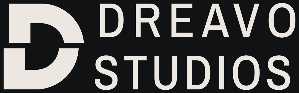
The cut is the one act that turns footage into a film. A monumental, heavy D is cut once by a straight horizontal line, and its upper part is shifted right by exactly the width of the cut: one edit, two shots, one film. The same cut runs through the whole lockup, so DREAVO above the line shifts with the top of the D and STUDIOS below the line stays with the bottom. For Dreavo it says: the work is decided in the cut, with precision.
Summary: A heavy, monumental D cut once by a horizontal line with its upper half shifted by the width of the cut, the edit that turns footage into a film.
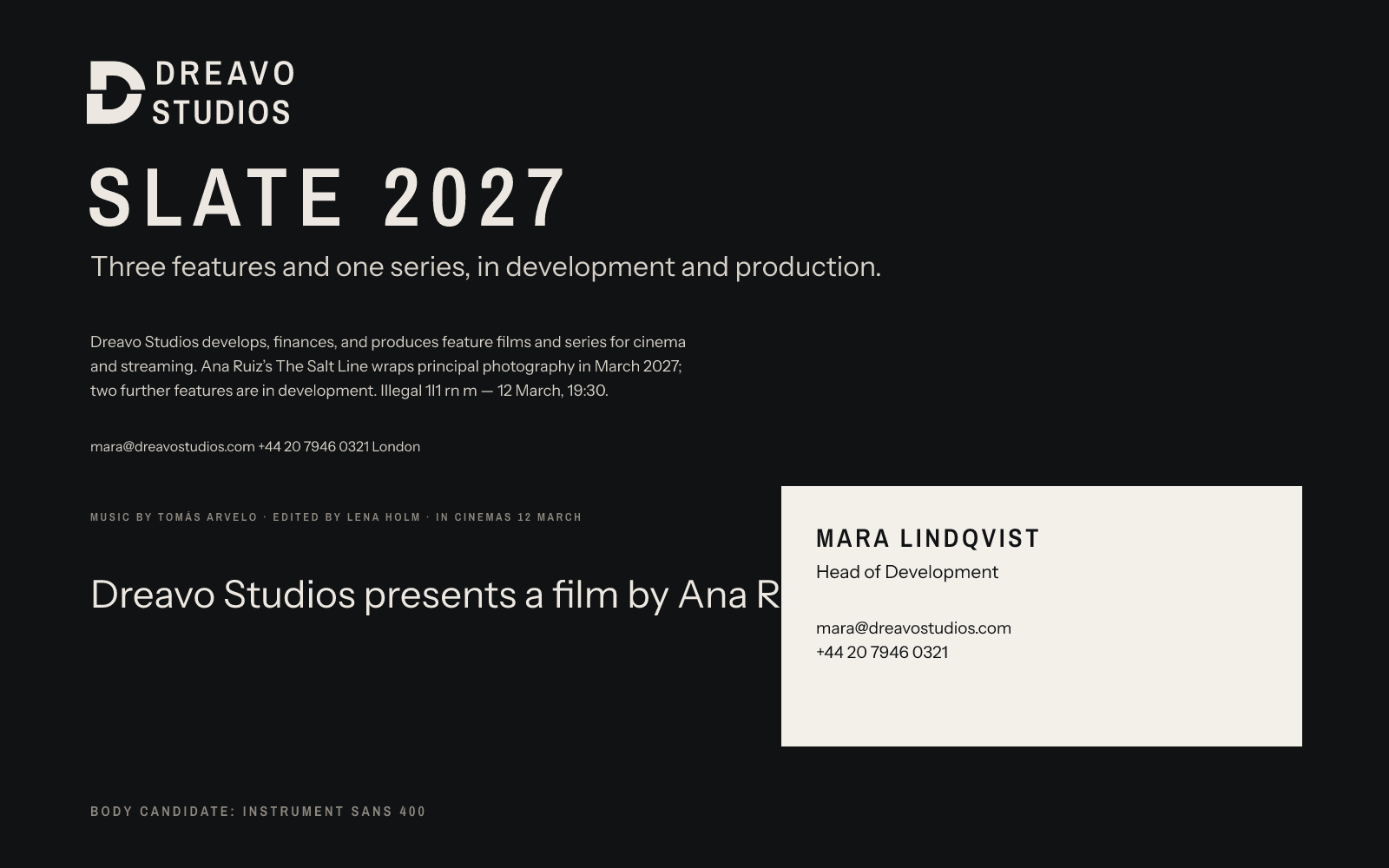
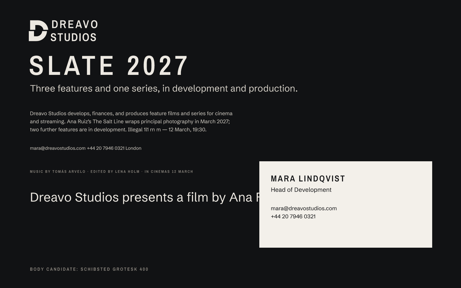
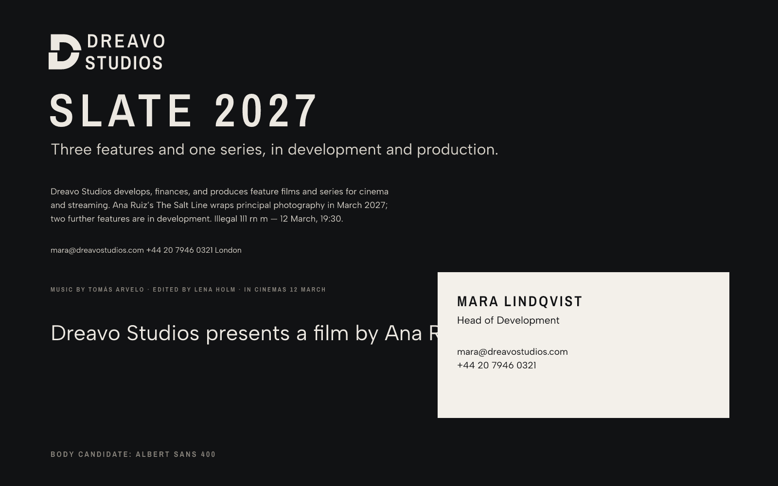
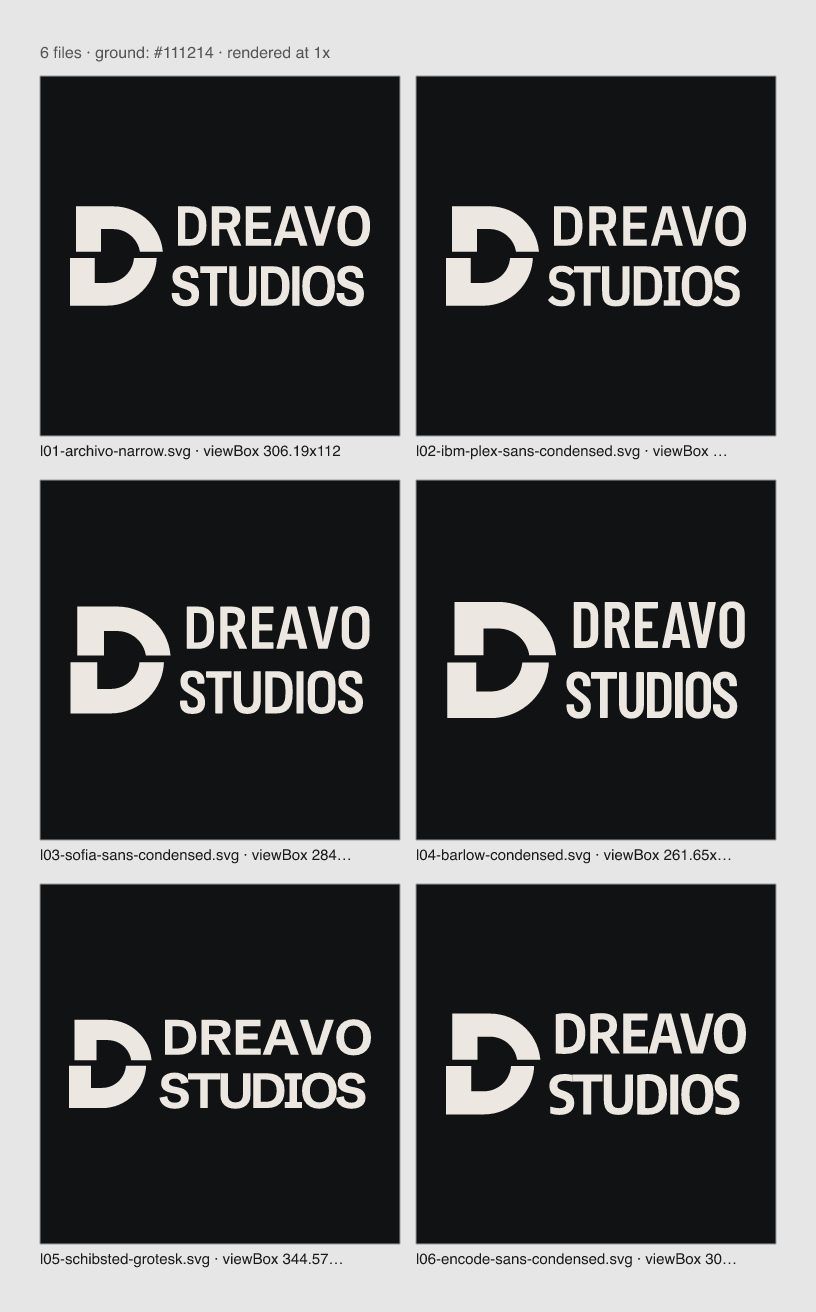
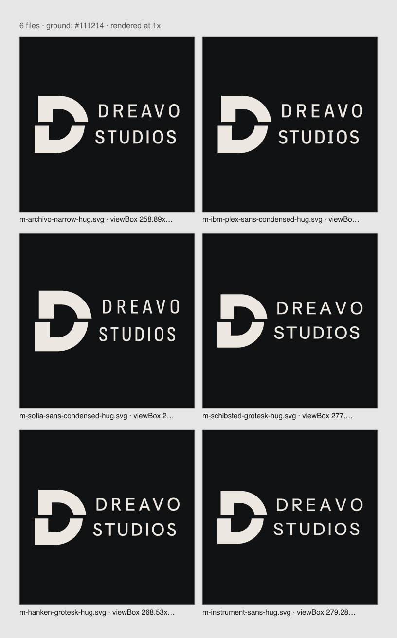
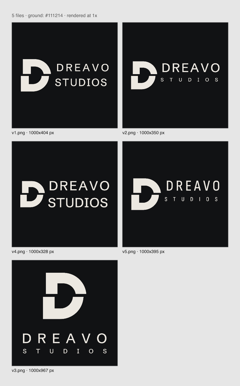
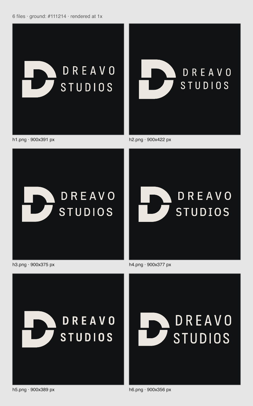
svg. It is pure construction: rectangles, semicircles, one horizontal gap, one offset. It needs exact numbers.bun lf outline; compare with Schibsted Grotesk Bold. Two lines to the right of the D, flush left, with a gap of 0.6 × the D's stem between D and text. DREAVO's caps top-align with the D and end just above the cut; STUDIOS's caps start just below the cut and sit on the D's baseline. Both lines have the same cap height (about 38 units of the D's 96); because the cut sits slightly above the middle, the clearance above and below it may differ by up to 2 units. The two words already measure close to equal width at equal size; make them flush by small tracking changes.mark.svg): the cut D alone, centered for a circle crop. Runner-up for stage 4: the same D with a vertical cut, top-to-bottom, offset down; reject it if it reads as a "P" or a broken letter.compare-09-marks.png) matched the type better but looked like a stock display face; the semicircle stays.compare-02-wordmarks.png) made the lockup look like an esports or agency badge, not a studio. The final face is Archivo Narrow 600, caps, DREAVO tracked +130 and STUDIOS tracked to the same ink width (+68), with small optical spacing corrections (D–R closed 0.6, U–D closed 1.0). Sofia Sans Condensed was the closest alternative; it was dropped because its softly rounded corners contradict the D's square corners.mark.svg uses viewBox -10 -1.5 104 104, which puts the cut exactly on a pixel row at 16 px and 32 px, so it renders as a crisp dark line (see primary-r05 renders and the sheet). The viewBox also places the D halfway between its bounding-box centre and its area centroid (x 39.3), so it does not look like it is drifting right.critique.md, judged on logo/sheet.png and primary-r05.png): concept 4 (one cut, with a second reading: the whole upper strip, DREAVO included, slides like a cut between shots); distinctiveness 3 (no D marks in the landscape audit apart from Dolby's double D, but sliced and offset letters are a known trope outside film); simplicity 5 (one slab, one cut; removing anything breaks the idea); craft 4 (geometry exact, mark on the pixel grid, spacing corrected; the type's squarish D and O bowls differ from the compass-drawn D, and DREAVO is airier than STUDIOS because both are set to equal width); scalability 4 (the cut is a sharp pixel row at 16 and 32 px, but goes gray at sizes off the 16-px grid, such as 20 px); one-color survival 5 (mono is identical to color); fit 4 (serious and classical, with the grammar of film; reads more as an institution than as spectacle).The user rejected bookish text serifs as "not sexy", so the body face Source Serif 4 was dropped. Six sans faces were set next to the logo using real application copy: the deck line, a synopsis paragraph, contact details, a credits caption, and the business card (logo/concepts/body-spec-1.png to -6.png). Chosen: Instrument Sans (400, 600, 400 italic). It is sleek and slightly narrow, contrasts with Archivo Narrow's condensed caps in width and case, and has a true italic for film titles. Runners-up: Albert Sans (elegant and airy, but its geometric roundness reads soft and friendly) and Schibsted Grotesk (confident, but too close in kind to Archivo Narrow, with a newspaper flavour). Also tried: Host Grotesk (too wide and quirky), Geist (reads as a developer product), and Archivo (correct but plain, close to Arial).
Approved by the user on 2026-11-15. No changes requested.
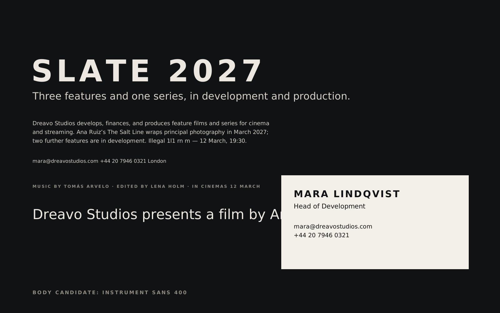
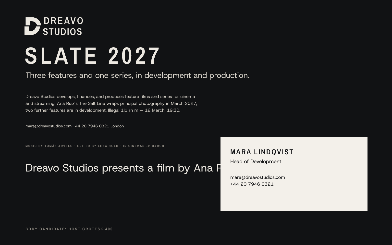
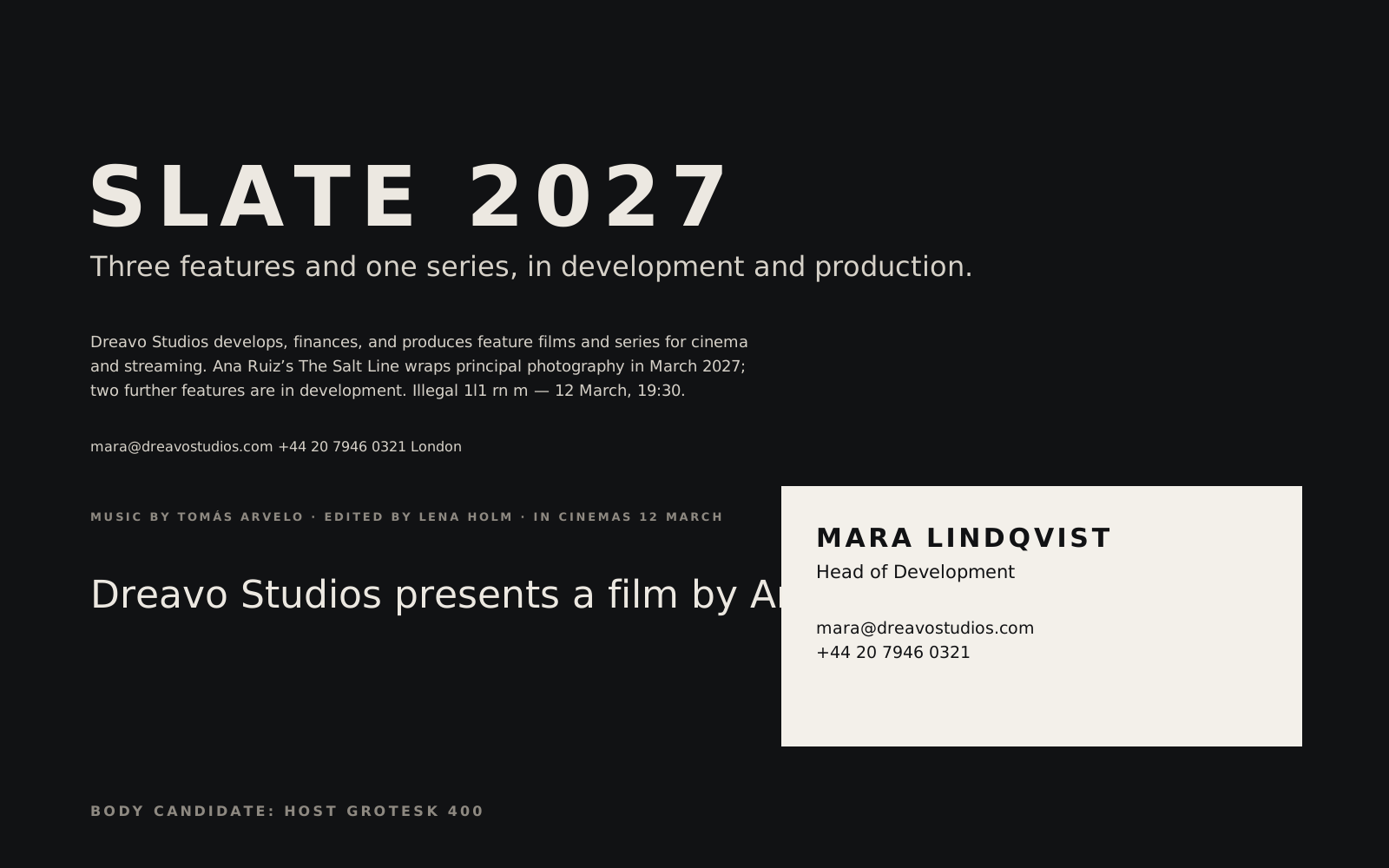
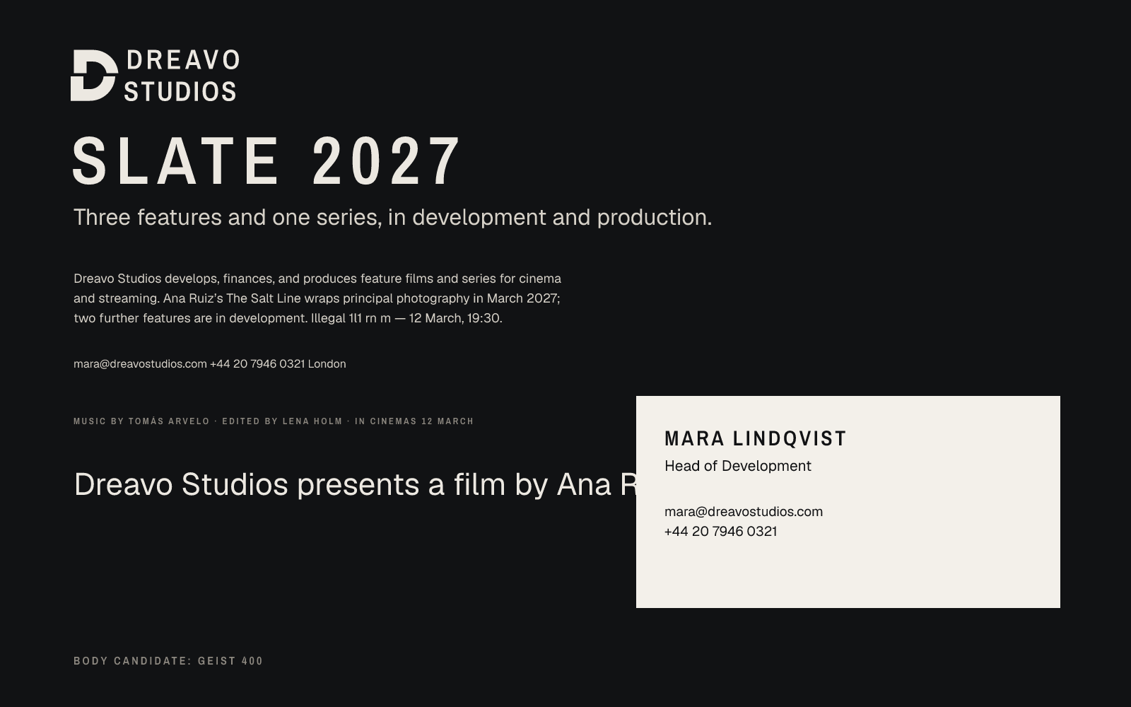
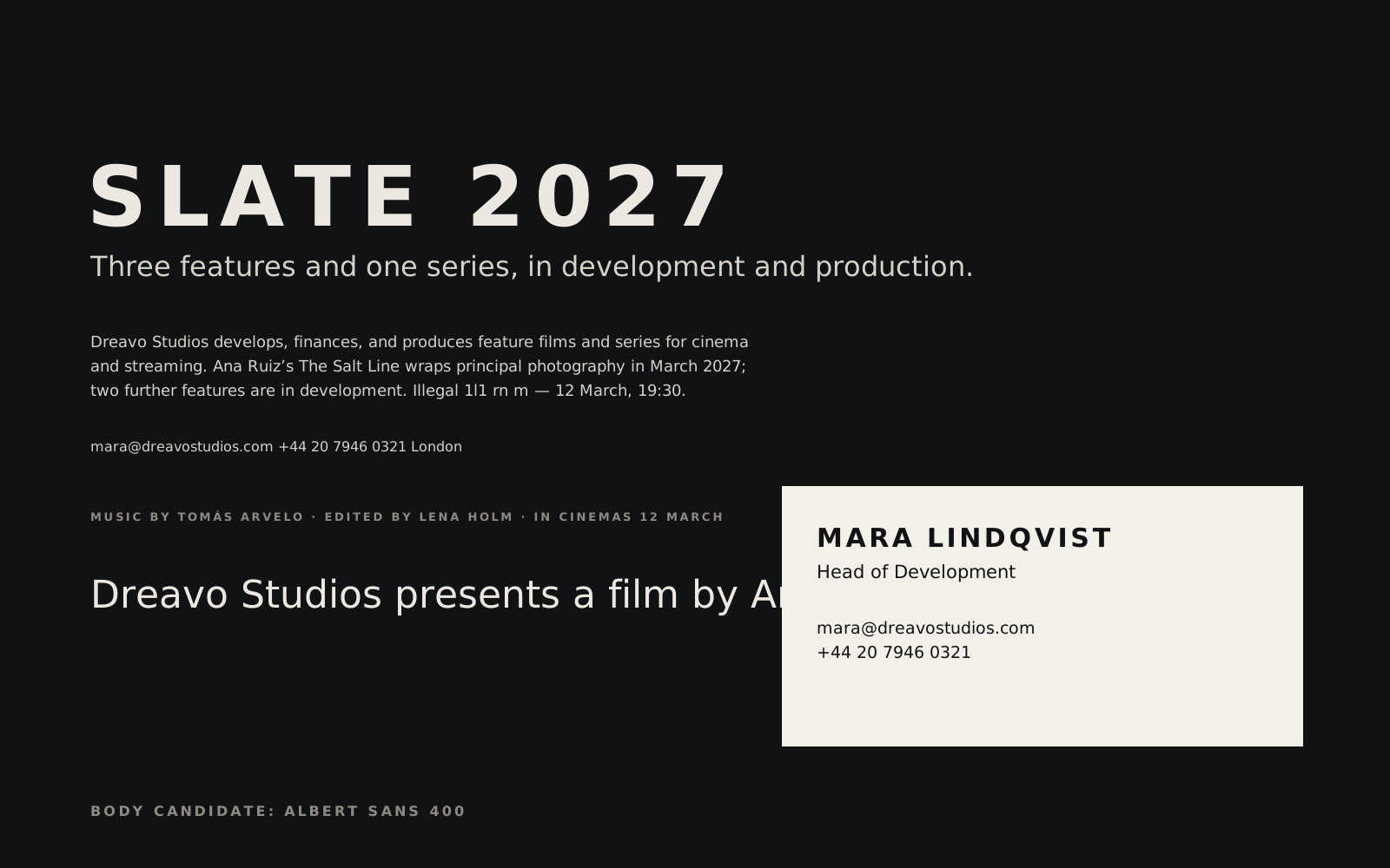
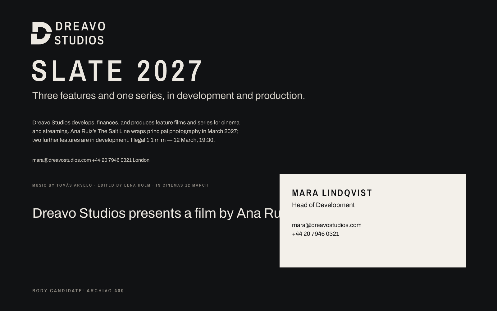
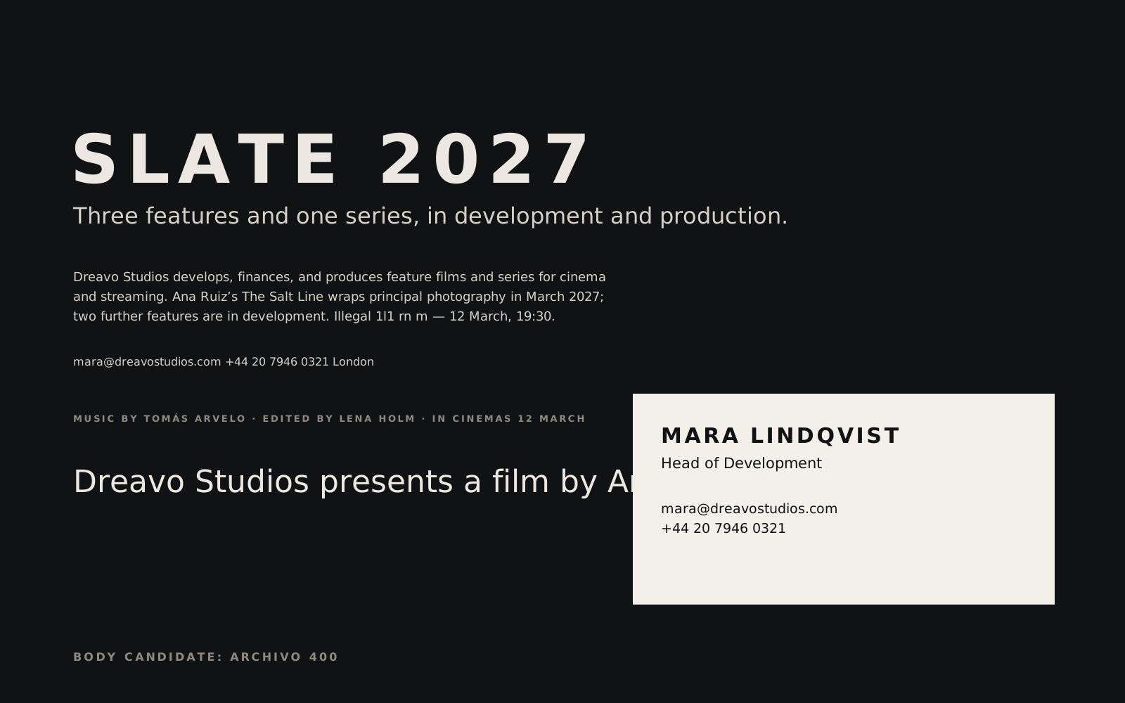








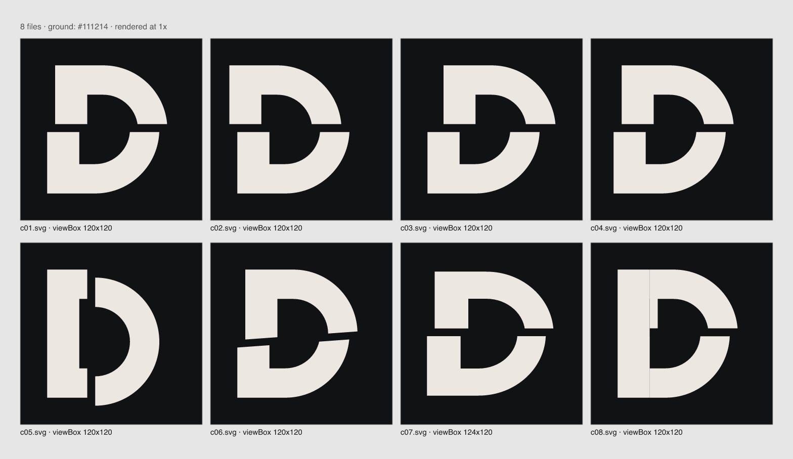
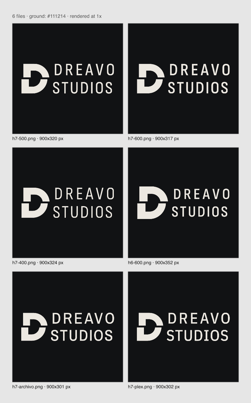
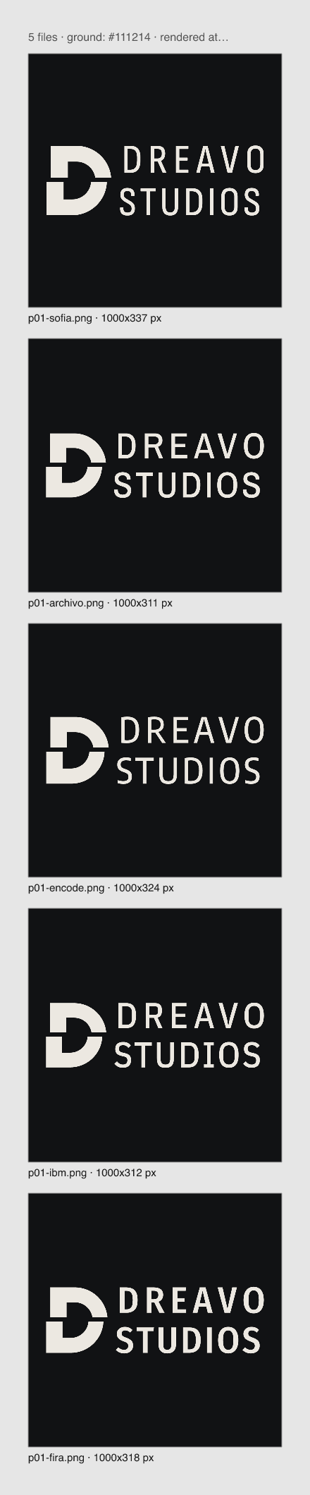
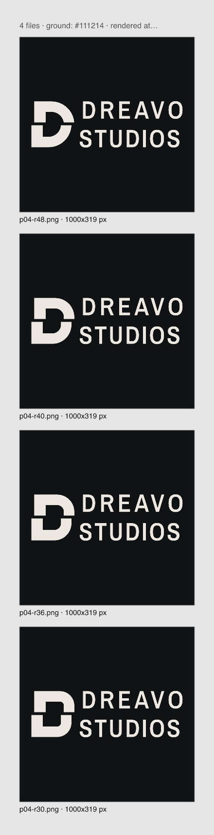


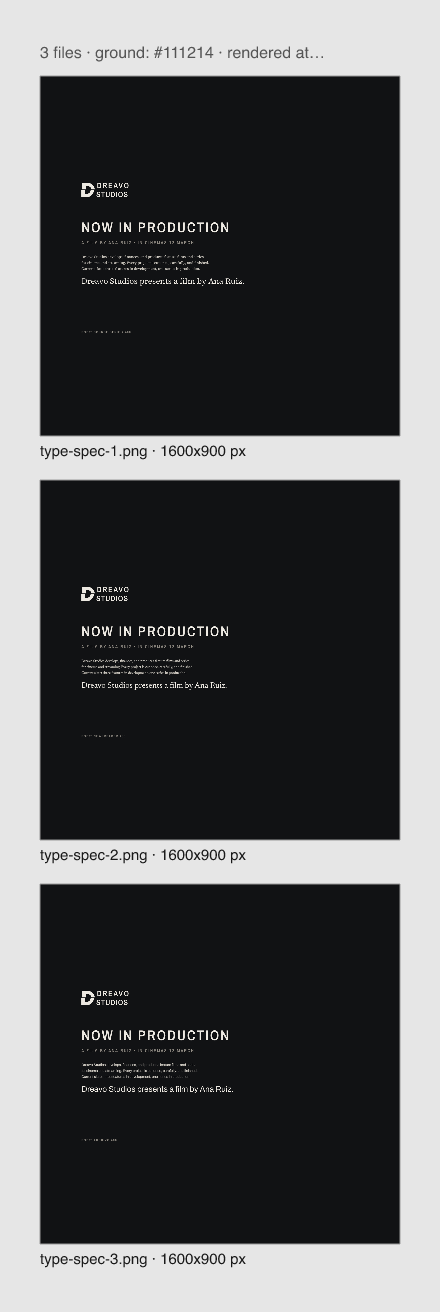




































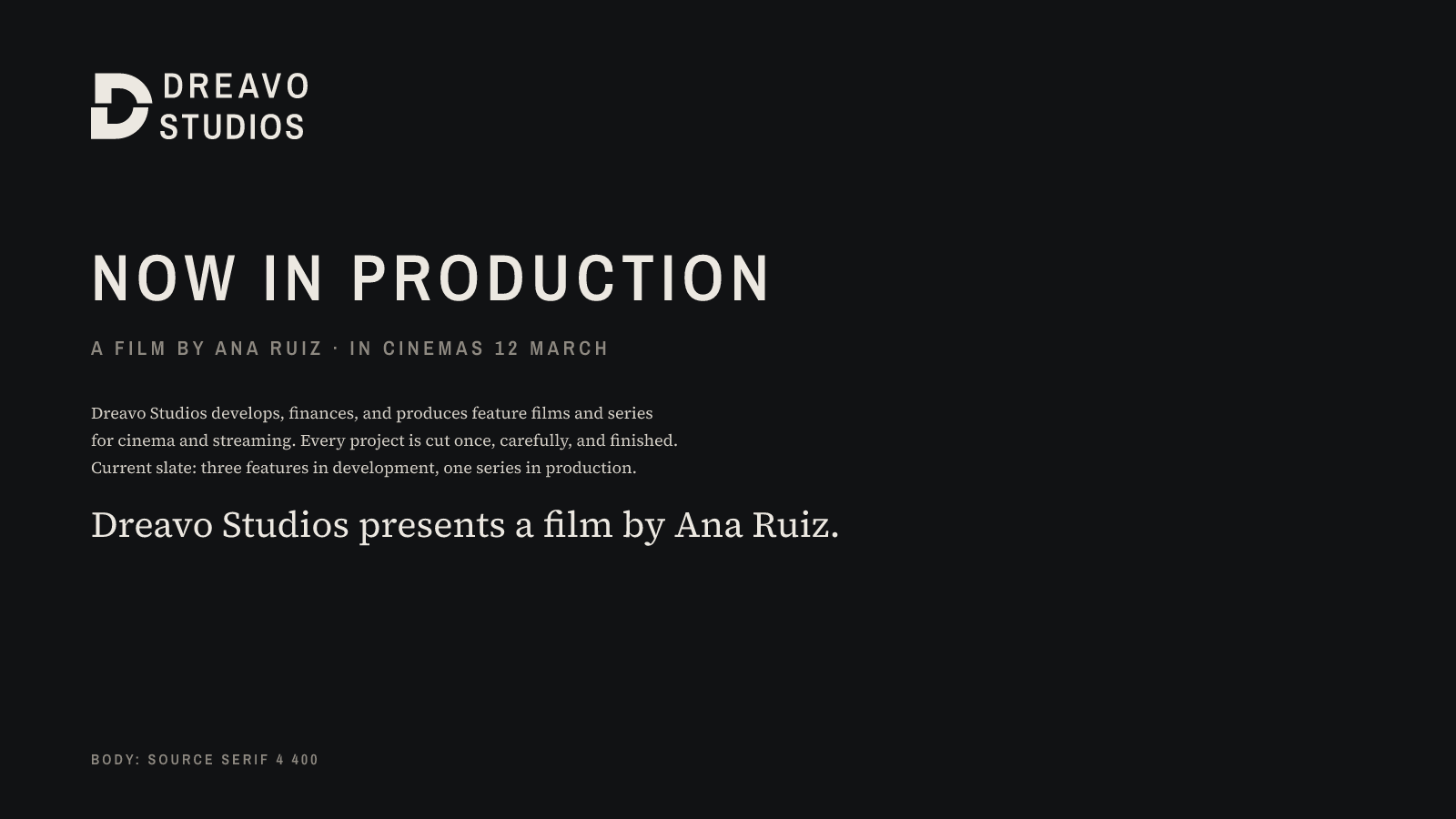
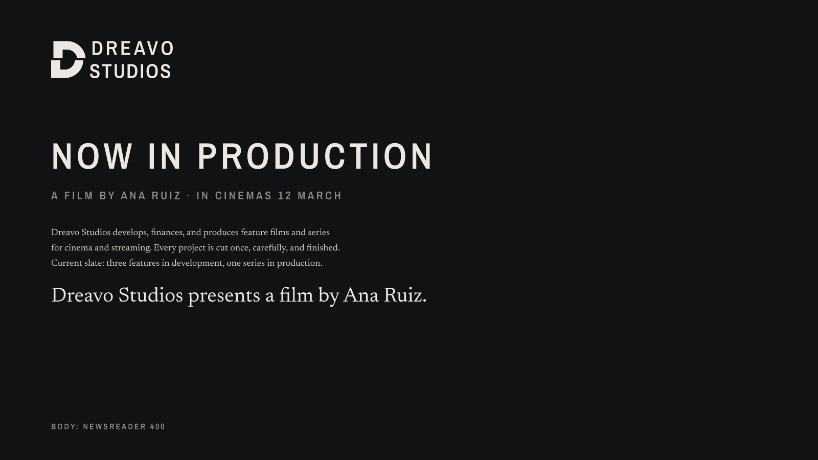




Study 04-splice. Version 1, 2026-11-15.
The cut turns footage into a film. The logo is a heavy D cut once by a horizontal line, with the upper part slid right by exactly the width of the cut: one edit, two shots, one film. The cut runs through the whole lockup, so DREAVO moves with the top of the D and STUDIOS stays with the bottom.
Personality: serious, not grim; epic, not bombastic; classic, not nostalgic; quiet, not anonymous. Scale comes from mass and space, never from effects.
This document is for anyone who places the Dreavo name: designers of posters, decks, and title sequences, the web developer, the printer, and the person who runs social accounts.
The system meets the strategy's five design principles like this:
| File | What it is | Use when | Do not use when |
|---|---|---|---|
logo/primary.svg |
Full lockup in Print Stock #ECE8E1 |
The default: on Cutting Room #111214, on Flatbed #1C1D20, and on dark areas of film stills |
On Paper or any light ground. It disappears (1.07:1 on Paper). |
logo/primary-alt.svg |
The same lockup in Cutting Room #111214 |
On Paper #F3F0EA, on white, and on pale areas of images such as an open sky |
On dark grounds |
logo/mark.svg |
The cut D alone in Print Stock, in a square optically centered viewBox | Avatars, favicons, app icons, the front of the business card, and any space where the lockup would fall below 120 px wide | As the only brand signal where the audience has not met the name yet, for example the first slide of a deck sent to a new financier |
logo/mono-black.svg |
Full lockup, #000000 only |
One-color print, stamps, embossing and engraving templates, other companies' black billing blocks | On dark grounds |
logo/mono-white.svg |
Full lockup, #FFFFFF only |
Poster billing blocks, end-credit logo pages, crew apparel, and over photographs | On light grounds |
logo/wordmark.svg |
DREAVO / STUDIOS without the D | Only where the D already appears large on the same surface, such as the spine of a script binder with the mark on its cover | As a replacement for the lockup |
The contact sheet shows every file on white, black, and Cutting Room, plus the small sizes:
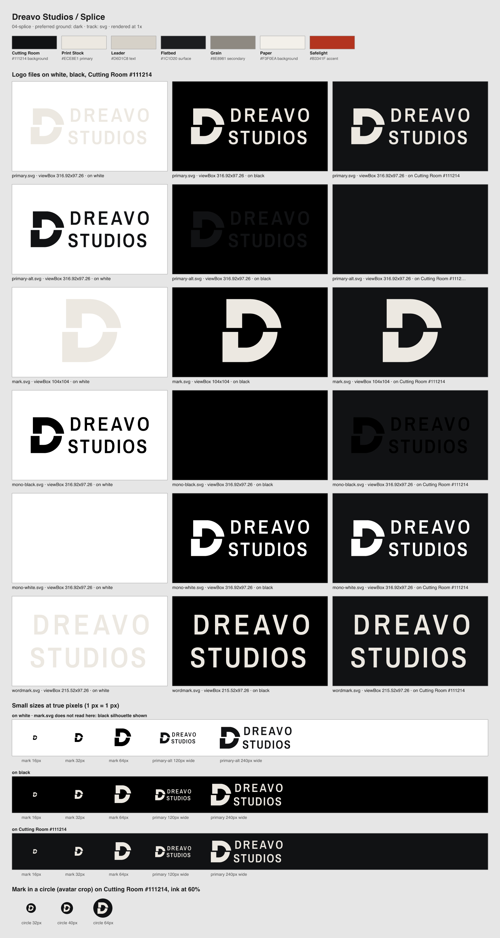
bun lf outline. Both are caps, cap height 36. DREAVO is tracked +130. STUDIOS is tracked +68 so its ink width matches DREAVO exactly (215.5 units). Optical spacing corrections: D–R closed by 0.6 units, U–D closed by 1.0, and the other gaps opened by 0.2 to keep the width. STUDIOS starts 0.6 units left of its stem line so the round S lines up optically.mark.svg is the same D with viewBox -10 -1.5 104 104. Rendered at 16 or 32 px, this places the cut exactly on a pixel row, so it shows as a sharp dark line instead of a gray smear. Horizontally, the D sits halfway between its bounding-box center and its area centroid.The clear-space unit X is the width of the D's stem (24 units, or 7.6% of the lockup's width; at 300 px wide, X is about 23 px).
The smallest detail is the cut and the letter stem, both 6 units. The rule "the smallest detail should stay at least 1.5 px or 0.2 mm" gives 79 px and 11 mm for the lockup. At that size, though, the letters are only about 9 px tall, which is not enough for credits. The sheet shows the lockup reading cleanly at 120 px, so these are the limits:
| Version | Screen | |
|---|---|---|
| Primary lockup (any color version) | 120 px wide | 20 mm wide (the poster billing block size) |
| Mark | 16 px | 5 mm |
Below 120 px or 20 mm, use mark.svg and set the name nearby in Archivo Narrow 600 caps. Rendered directly from mark.svg at 16, 32, 48, and larger multiples of 16, the cut lands on the pixel grid. The exported favicons (favicon.svg, favicon.ico, favicon-32.png) put the mark on a Cutting Room tile, re-padded to its ink, so the cut no longer lands exactly on a pixel row and reads as a soft line at 32 px. For a sharper tab icon, render mark.svg onto a Cutting Room square at 32 px.
primary.svg on Paper or white. Use primary-alt.svg.| Name | Hex | RGB | Role | Usage |
|---|---|---|---|---|
| Cutting Room | #111214 |
17, 18, 20 | background | Default ground for the logo, title cards, screens, and the dark face of print. 60 to 70% of any layout. |
| Print Stock | #ECE8E1 |
236, 232, 225 | primary | The logo on Cutting Room and display type. 15 to 25% of a layout. |
| Leader | #D6D1C8 |
214, 209, 200 | text | Body text on Cutting Room and Flatbed. |
| Flatbed | #1C1D20 |
28, 29, 32 | surface | Panels, cards, and the second plane of a dark layout. |
| Grain | #8E8981 |
142, 137, 129 | secondary | Captions, credits, rules, and metadata on dark grounds. |
| Paper | #F3F0EA |
243, 240, 234 | background | Light ground for letterhead, documents, and the back of the business card. |
| Safelight | #B3341F |
179, 52, 31 | accent | Key visuals and motion only: the one-frame flash of the cut in the ident. Under 5% of any layout. |
Proportion on dark layouts: Cutting Room and Flatbed 65 to 75%, Print Stock and Leader 20 to 30%, Grain up to 10%, Safelight under 5% and usually none. On light print: Paper about 85%, Cutting Room about 15%.
Approved pairings (WCAG contrast, computed):
| Foreground | Background | Ratio | Use |
|---|---|---|---|
| Print Stock | Cutting Room | 15.35:1 | Logo, headlines, body |
| Print Stock | Flatbed | 13.80:1 | Logo, headlines |
| Leader | Cutting Room | 12.33:1 | Body text |
| Leader | Flatbed | 11.09:1 | Body text |
| Grain | Cutting Room | 5.40:1 | Captions, credits, small labels |
| Grain | Flatbed | 4.85:1 | Captions |
| Cutting Room | Paper | 16.48:1 | Logo (primary-alt), all text on light print |
| Safelight | Paper | 5.39:1 | Graphic accents on light print |
| Safelight | Cutting Room | 3.06:1 | Graphic accent and light only, never text |
Never pair: Print Stock or Leader on Paper (1.07:1 and 1.34:1). Flatbed on Cutting Room for anything that must be read (1.11:1). Grain as small text on Paper (3.05:1, rules and large type only). Safelight as text on Cutting Room or Flatbed (3.06:1 and 2.75:1). Safelight anywhere in the logo.
| Role | Family | Weights | Source | Fallback |
|---|---|---|---|---|
| Display | Archivo Narrow | 600 | Fontsource, OFL 1.1 (fonts/archivo-narrow-600.ttf) |
"Arial Narrow", "Roboto Condensed", Arial, sans-serif |
| Body | Instrument Sans | 400, 600; italic 400 | Fontsource, OFL 1.1 (fonts/instrument-sans-400.ttf, -600.ttf, -400-italic.ttf) |
"Helvetica Neue", system-ui, -apple-system, "Segoe UI", Arial, sans-serif |
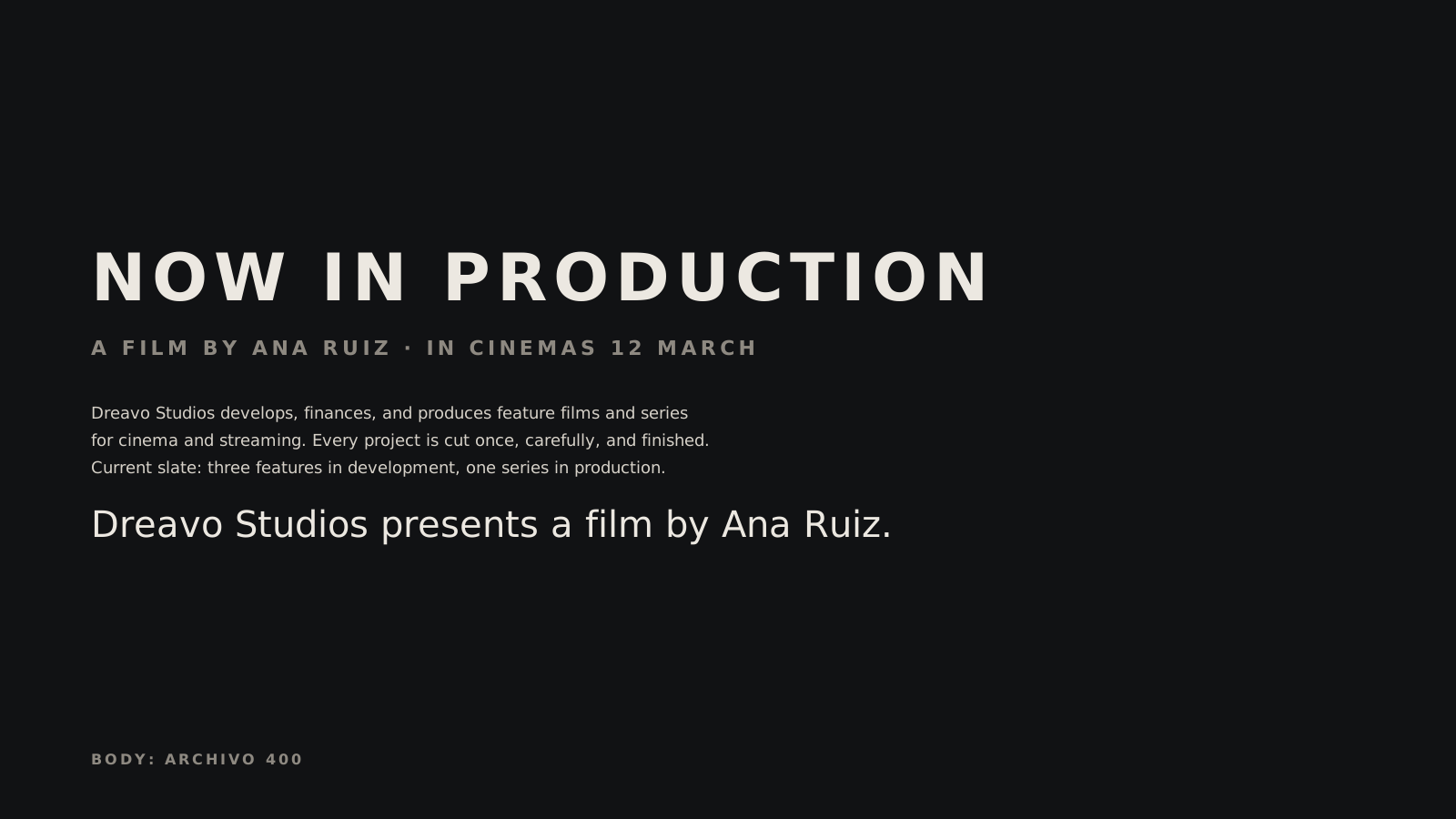
Archivo Narrow 600 is the wordmark's face, so headlines and the logo share one voice. It is always set in caps. Instrument Sans carries everything you read: a sleek, slightly narrow neo-grotesque in sentence case. It contrasts with the display face in width and case and shares its sharp, unsentimental finish. Italic is for film and series titles only, as in The Salt Line. Never set Instrument Sans in caps; caps belong to Archivo Narrow.
| Level | Face and weight | Size / line height | Case, tracking |
|---|---|---|---|
| Display | Archivo Narrow 600 | 72 / 76 px (screen), 48 pt (print) | Caps, +0.12 em |
| H1 | Archivo Narrow 600 | 40 / 48 px | Caps, +0.10 em |
| H2 | Instrument Sans 600 | 25 / 32 px | Sentence case, −0.01 em |
| Body | Instrument Sans 400 | 16 / 26 px, 9.5 / 14 pt | Sentence case, 0 |
| Caption, label, credits | Archivo Narrow 600 | 13 / 18 px | Caps, +0.20 em |
| Film titles in text | Instrument Sans 400 italic | As the surrounding text | Title case |
Rules:
mono-white.svg or primary.svg on dark areas and primary-alt.svg on pale skies, with at least 3:1 contrast and 1X clear space. Darken the area under the logo with a Cutting Room gradient if needed. Never place the logo across the cut line of an image.Key visual:
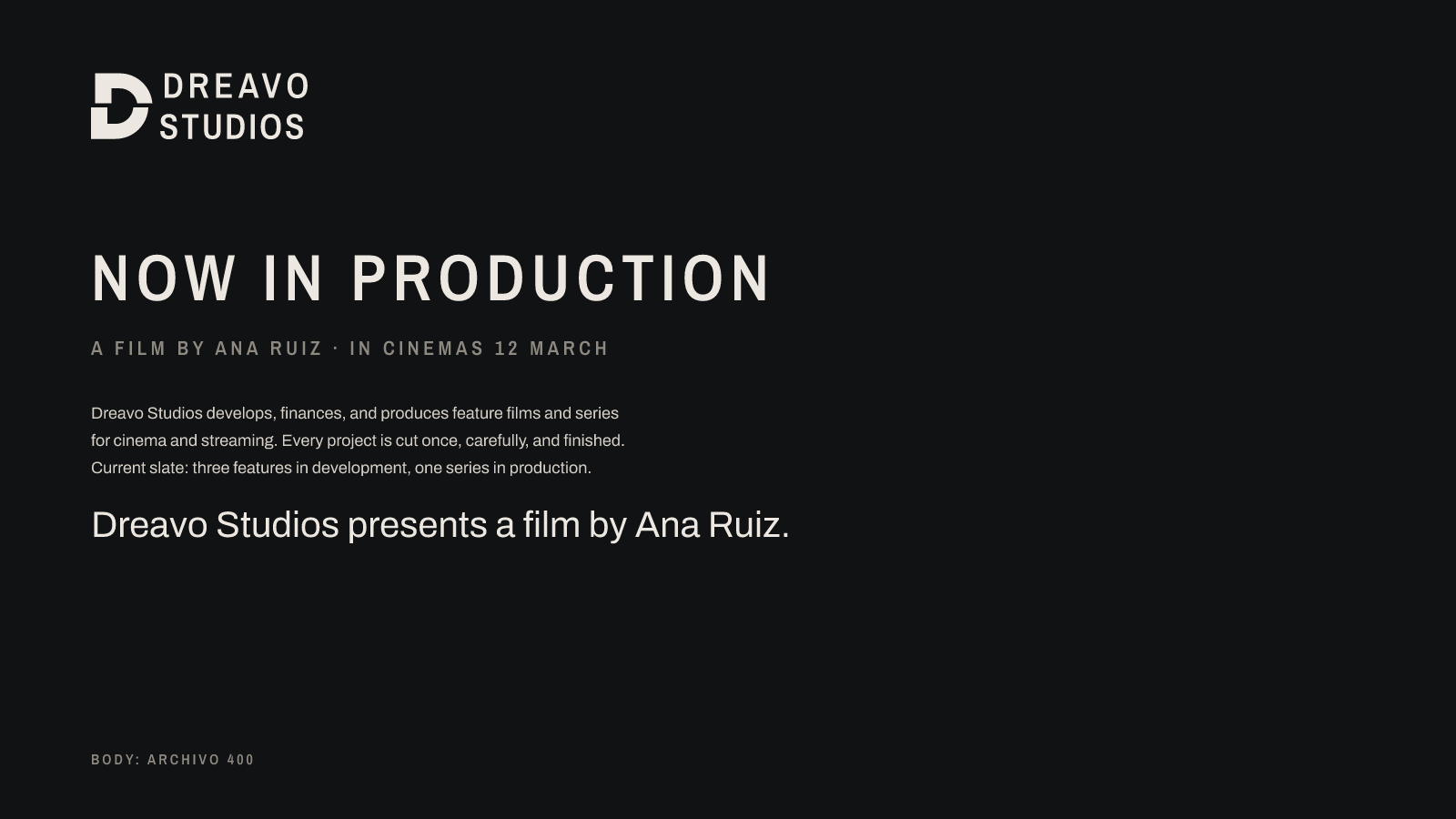
Dreavo writes like a title sequence: names, verbs, facts. Short declarative sentences in the present tense. No exclamation marks, no superlatives, and never the word "epic". The cut is the model for the copy: say it once, in the right place.
| Principle | Do | Don't |
|---|---|---|
| Say less, mean it | "Now in production." | "We're so excited to finally share our amazing new project!!" |
| Credits, not copy | "Dreavo Studios presents a film by Ana Ruiz." | "Your one-stop partner for premium creative content." |
| Confident, never loud | "In cinemas 12 March." | "The most unforgettable film of the year!" |
Example lines:
Tone by context: on social, one fact per post plus the title in italics. In decks, numbers and names before adjectives. In legal and press text, plain, complete sentences with no voice tricks.
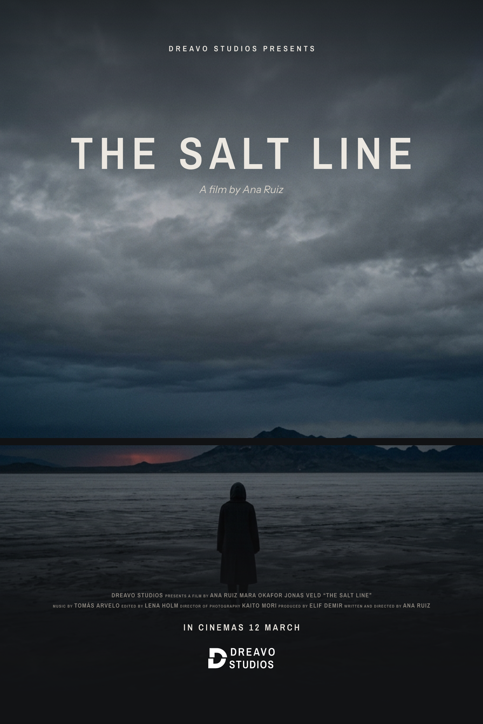
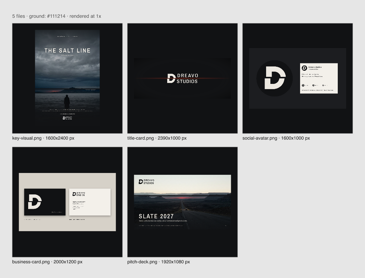
Key visual: film poster. The image carries the system's one cut through the mountain range, with the upper part slid right. The logo appears once, in the billing block, in mono-white.svg at 220 px wide, next to credits set to film convention.
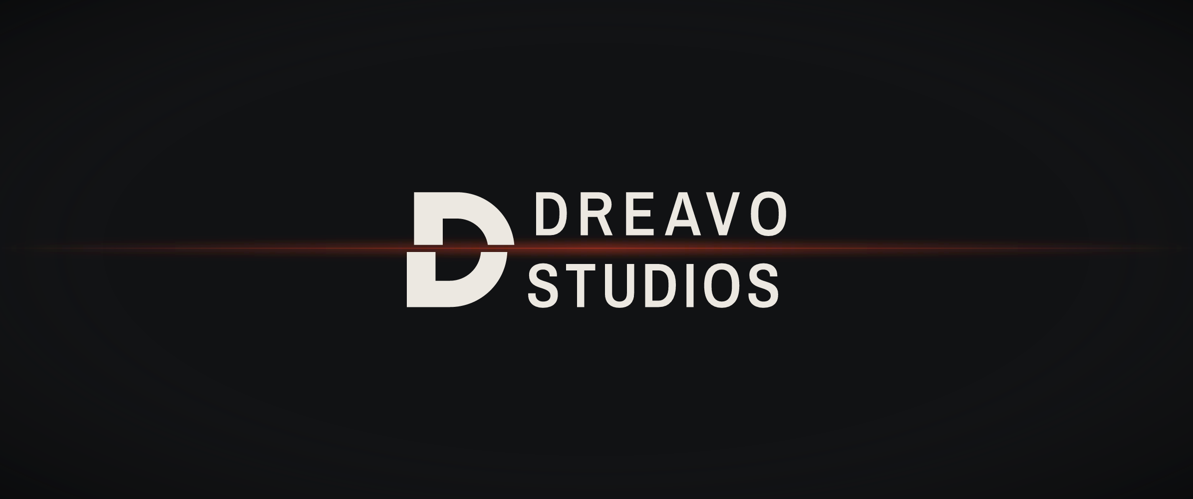
Production ident, 2.39:1. primary.svg centered on Cutting Room at 32% of the frame width. This frame is the ident's single moment of light: Safelight runs along the line of the cut, through the D and between the two words.
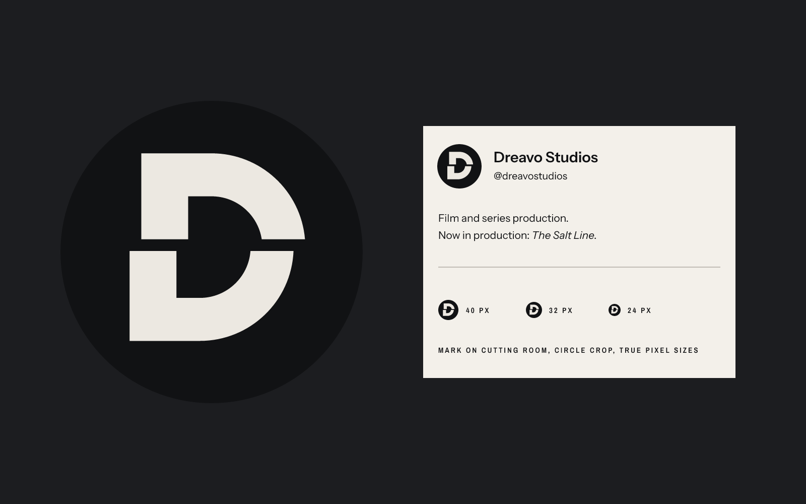
Social avatar. mark.svg in a circle crop on Cutting Room, with the D at about 62% of the circle's diameter, at 600 px and at true 40, 32, and 24 px in a profile card.
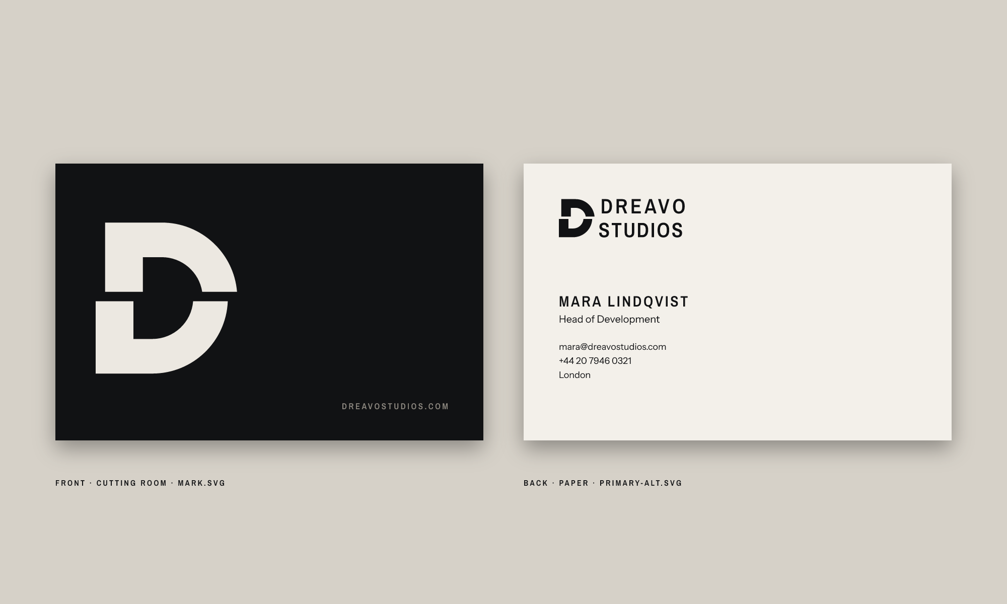
Business card, 85 × 55 mm. Front: the mark alone on Cutting Room stock. Back: primary-alt.svg on Paper with 1X clear space, the name in Archivo Narrow 600 caps, and details in Instrument Sans 400, all aligned to the D's lower stem.
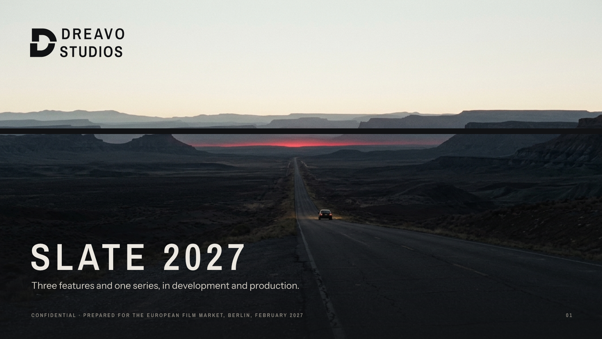
Pitch deck cover, 16:9. primary-alt.svg on the pale sky, the image cut once through the horizon, "SLATE 2027" in display type, and the line below in Instrument Sans 400.