background
House Dark
#0B0E16
- Contrast
- Reference ground
- Usage
- The default ground: title cards, screens, decks, the avatar, the dark face of print. 60 to 70% of any layout. A blue-black, the auditorium after the lights go down; never pure #000000.
Dreavo Studios, study 3 of 6
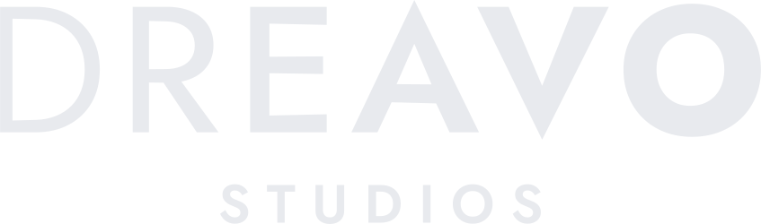
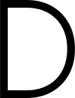
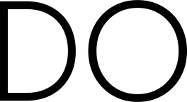
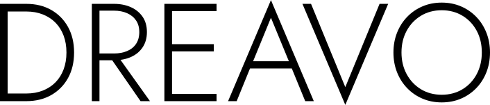
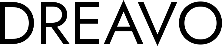
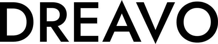
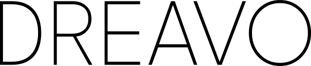
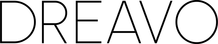
DREAVO in one line of geometric caps that swells without a break from a fine D to a full-weight O, so the name moves from the dream to the bravo like a picture fading in from black.





#0B0E16
#E8EAEE
#B9BFCB
#171C28
#7483AB
#EEEFF2
display
Dreavo Studios
Dreavo Studios
ABCDEFGHIJKLMNOPQRSTUVWXYZ
abcdefghijklmnopqrstuvwxyz
0123456789 & ! ? , . ( )
DREAVO in one line of geometric caps that swells without a break from a fine D to a full-weight O, so the name moves from the dream to the bravo like a picture fading in from black.
body
Dreavo Studios
Dreavo Studios
ABCDEFGHIJKLMNOPQRSTUVWXYZ
abcdefghijklmnopqrstuvwxyz
0123456789 & ! ? , . ( )
DREAVO in one line of geometric caps that swells without a break from a fine D to a full-weight O, so the name moves from the dream to the bravo like a picture fading in from black.
Study 05-hinge for Dreavo Studios. Created 2026-11-15.
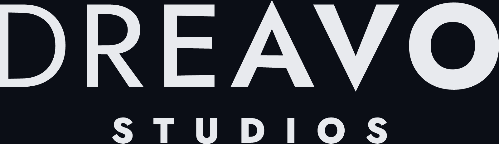
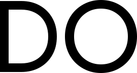
"Dreavo" is a coined word, and English ears hear two words in it: DREA- from "dream" and -AVO from the end of "bravo". A film runs the same course. It starts as a dream and ends, if it is good, in an ovation. The wordmark draws that course as weight. DREAVO is set in one line of geometric caps whose weight rises steadily from left to right. The D is drawn with a fine stroke, every letter after it is heavier than the one before, and the O lands at full weight. There is no break and no second font. The swell runs through the letters, so each one is lighter on its left side than on its right, and the turn sits inside the A, the letter "dream" and "bravo" share: its left leg belongs to the dream, its right leg to the bravo. On a black title card this reads as a fade-in from black in a single word.
Summary: DREAVO in one line of geometric caps that swells without a break from a fine D to a full-weight O, so the name moves from the dream to the bravo like a picture fading in from black.
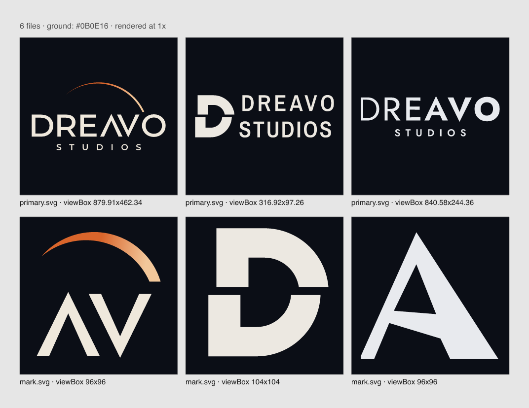
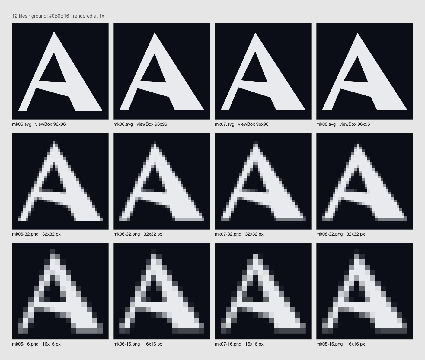
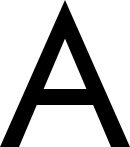
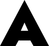
mark.svg is the swelling A on its own: the hinge letter, fine on the left and heavy on the right.svg. This is lettering with exact, rule-driven weights; an image model would garble the letters and the rule.H = DREAVO cap height.
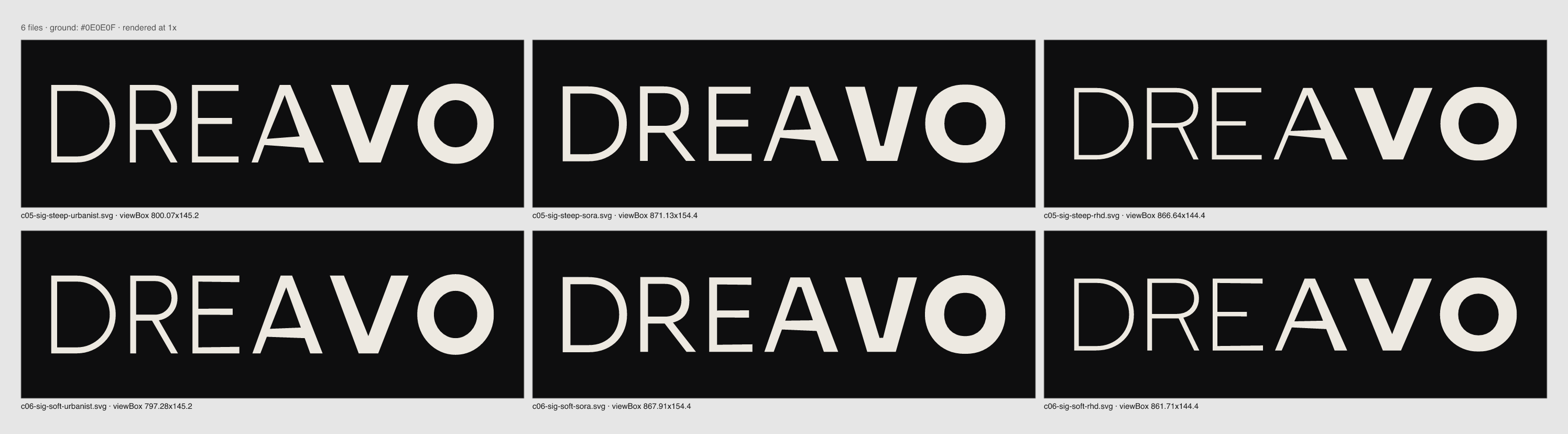
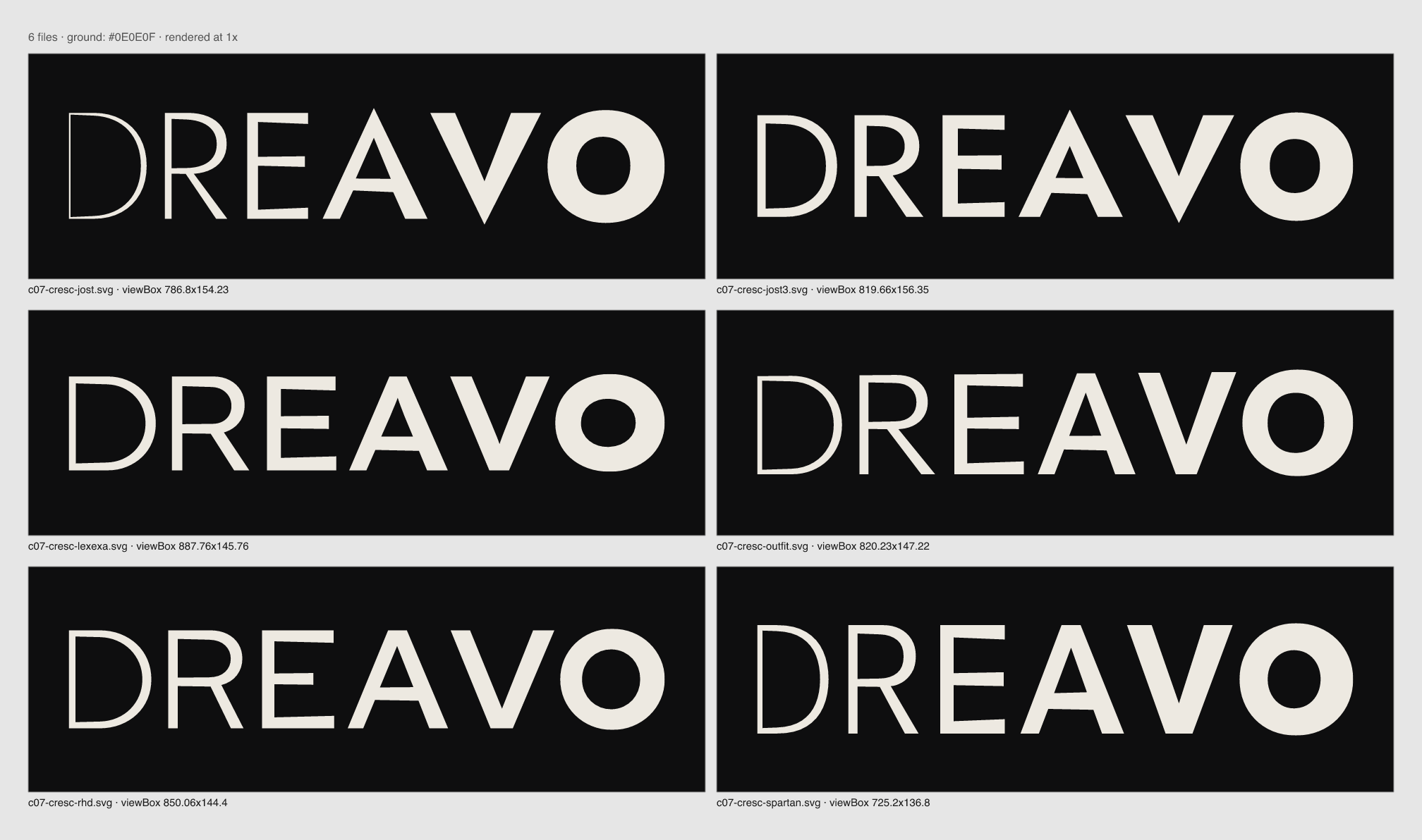
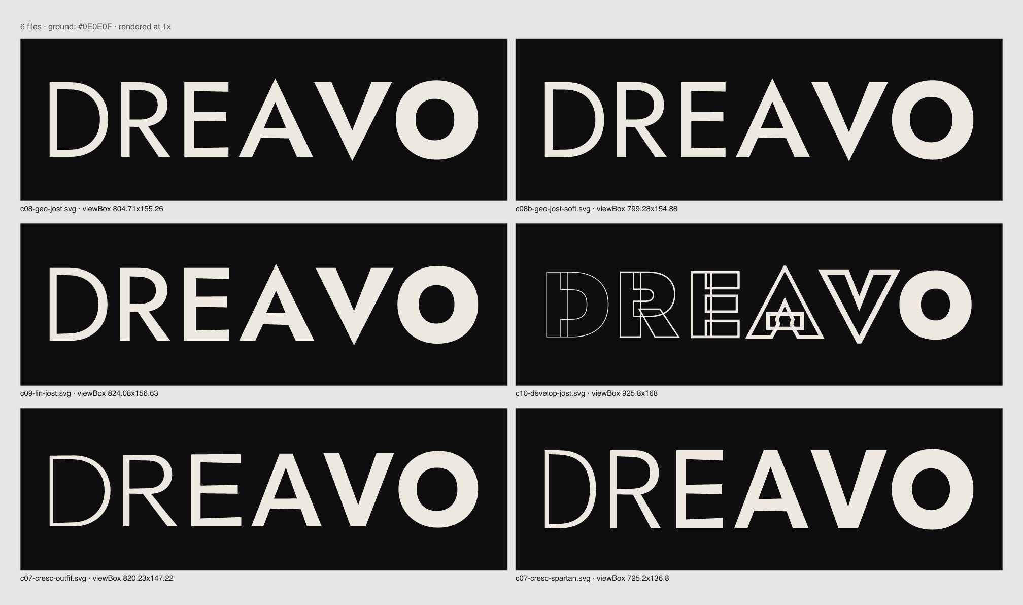
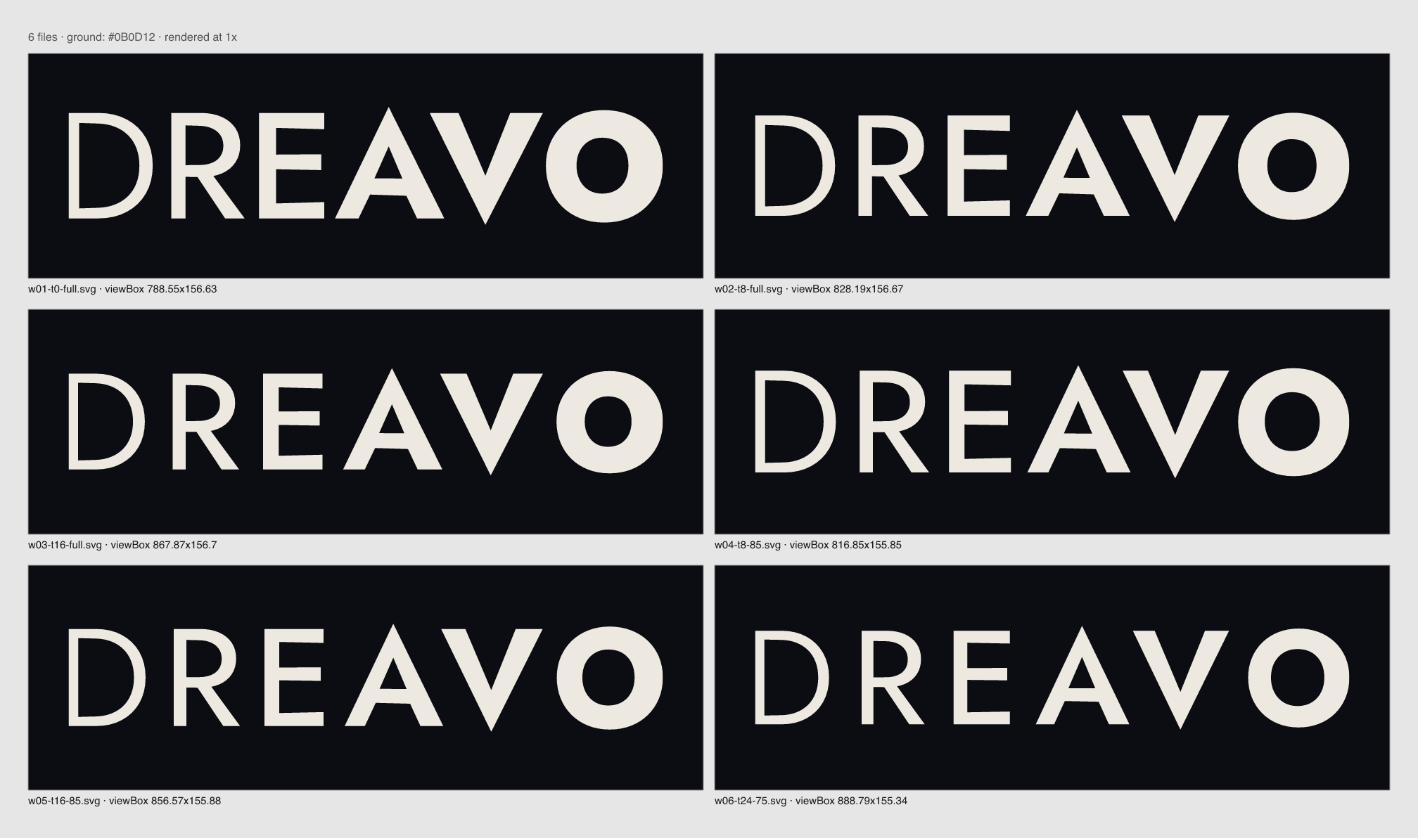
logo/concepts/compare-01.png, compare-03.png). Sora and Lexend Exa read as tech, Urbanist and Outfit as soft and friendly, Red Hat Display as corporate, and League Spartan is narrow and heavy at the bottom.factory/craft/wordmark-craft.md reserves for cases a concept demands. This concept is that case: weight is the idea. The blend is computed point by point from the two outlines (scratch script, not part of the workspace) and the result is outlined geometry, like any other outline.compare-10-align.png).mark.svg). The hinge A alone, with its own swell from a fine left leg (at least 6 units on the 96 grid) to a heavy right leg. Compare it at stage 4 with Eclipse's crossbarless Λ V and with Annapurna's uniform geometric A.logo/concepts/compare-01.png to compare-04.png):compare-marks-01.png.None
Awaiting user sign-off (Gate 2).






























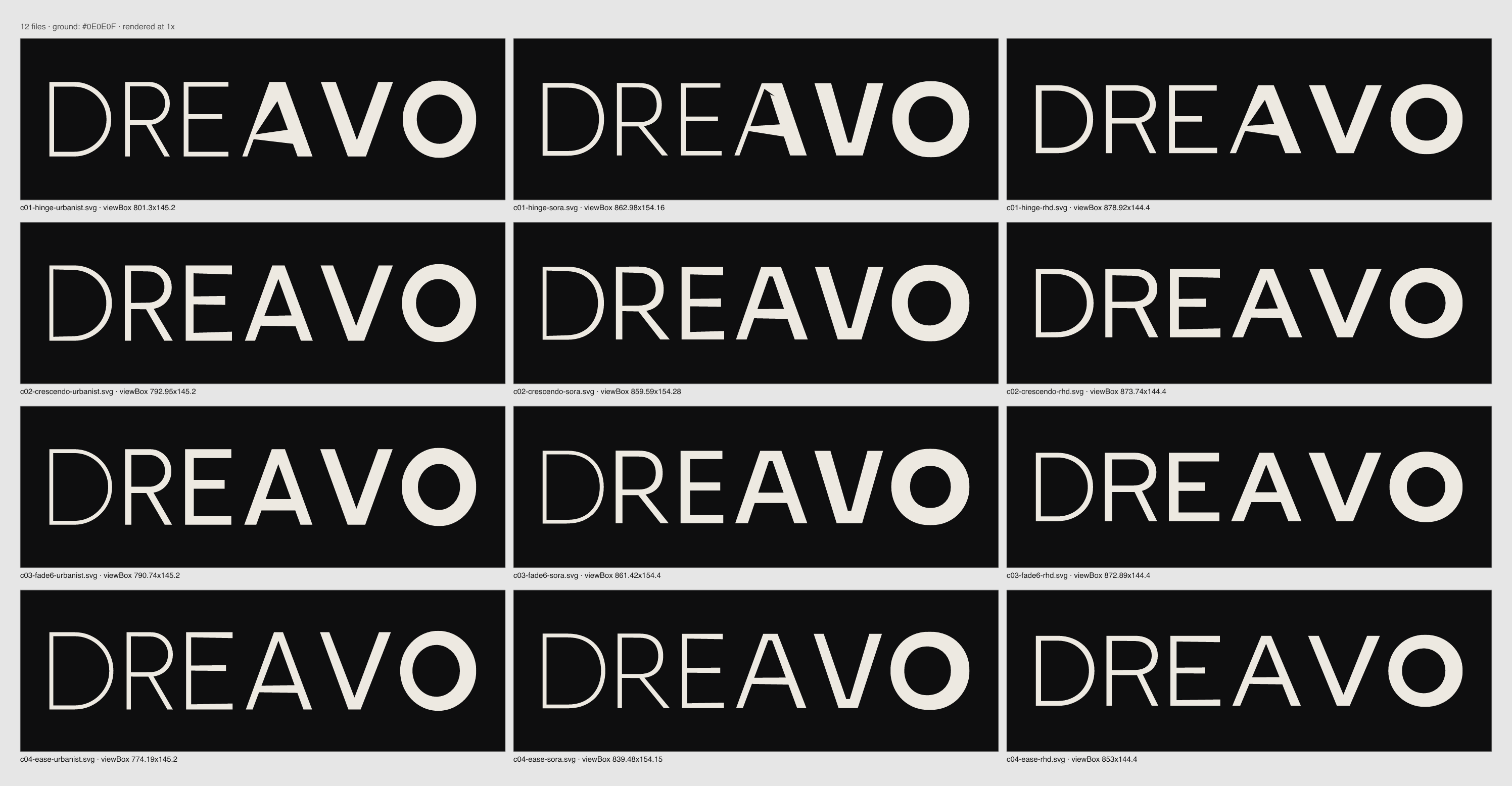
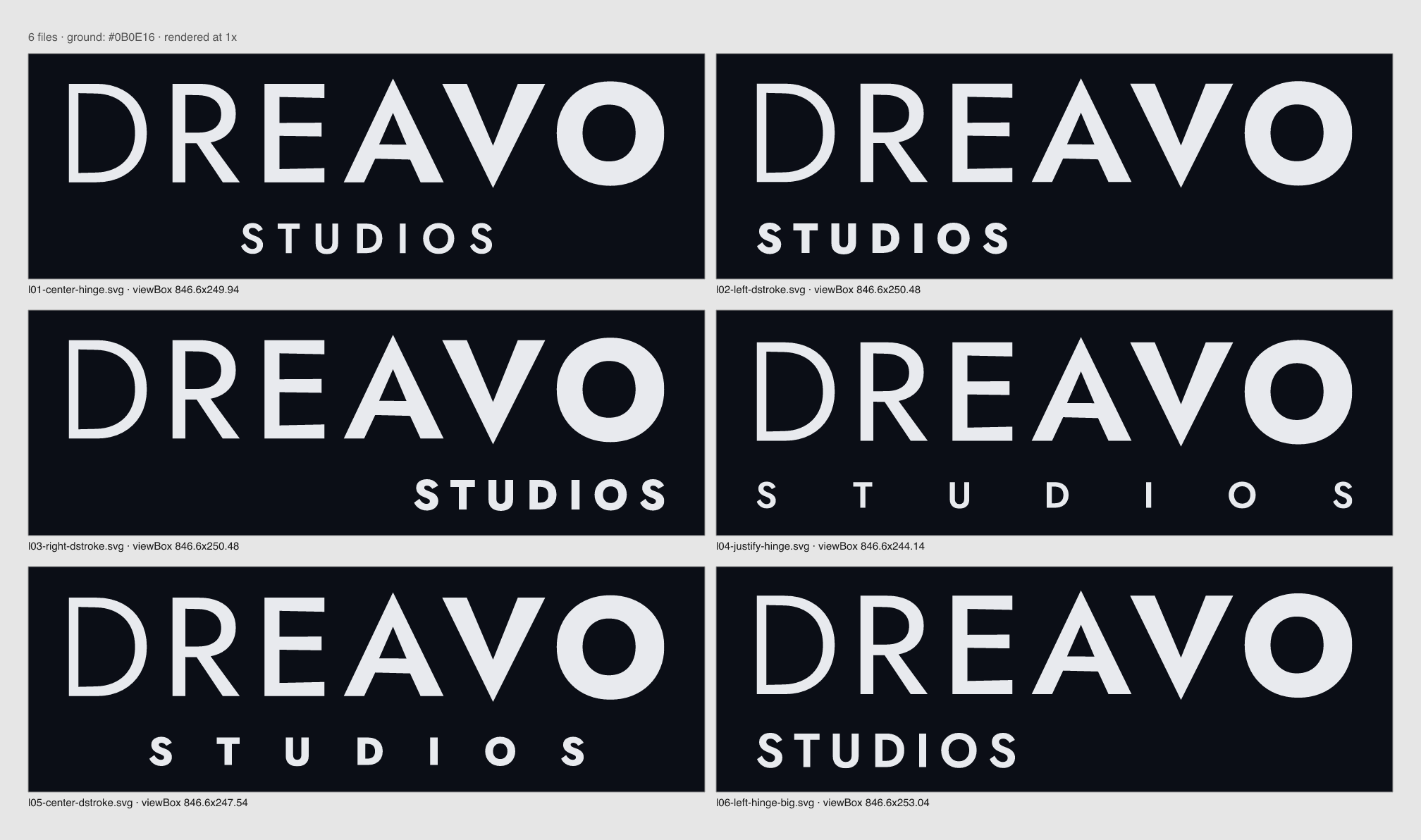
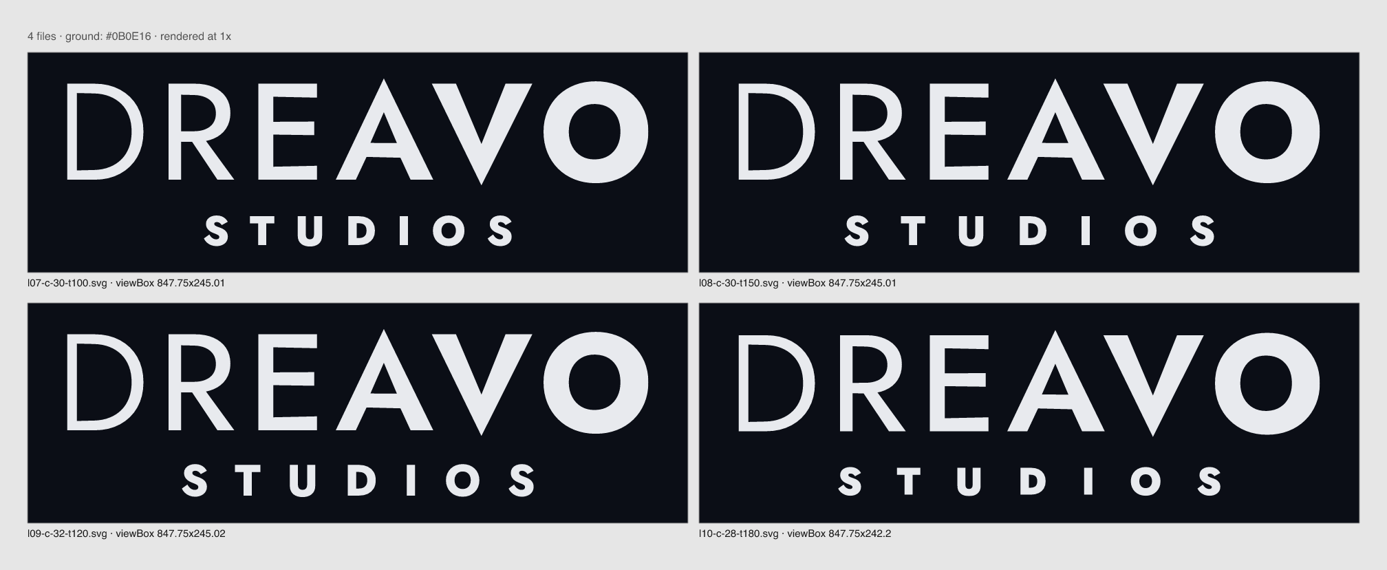


















































Study 05-hinge. Version 1, 2026-11-15.
"Dreavo" sounds like two words, the dream and the bravo, and a film follows the same course. The wordmark shows that course as weight: DREAVO swells without a break from a fine D to a full-weight O, like a picture fading in from black. The turn sits inside the A, the letter "dream" and "bravo" share, and that A is the mark.
Personality: serious, not grim; epic, not bombastic; classic, not nostalgic; quiet, not anonymous. This document is for designers of posters, decks, and title sequences, the web developer, the printer, and whoever runs the social accounts.
How the system meets the five design principles: (1) one flat color in every logo file, and the swell is shape, not tone; (2) the lockup reads at 160 px and the mark at 32 px in a circle (see Minimum size); (3) no cinema hardware, light, or effects; (4) one nameable feature, "the name swells"; (5) the name and STUDIOS only, with one weight rule for both.
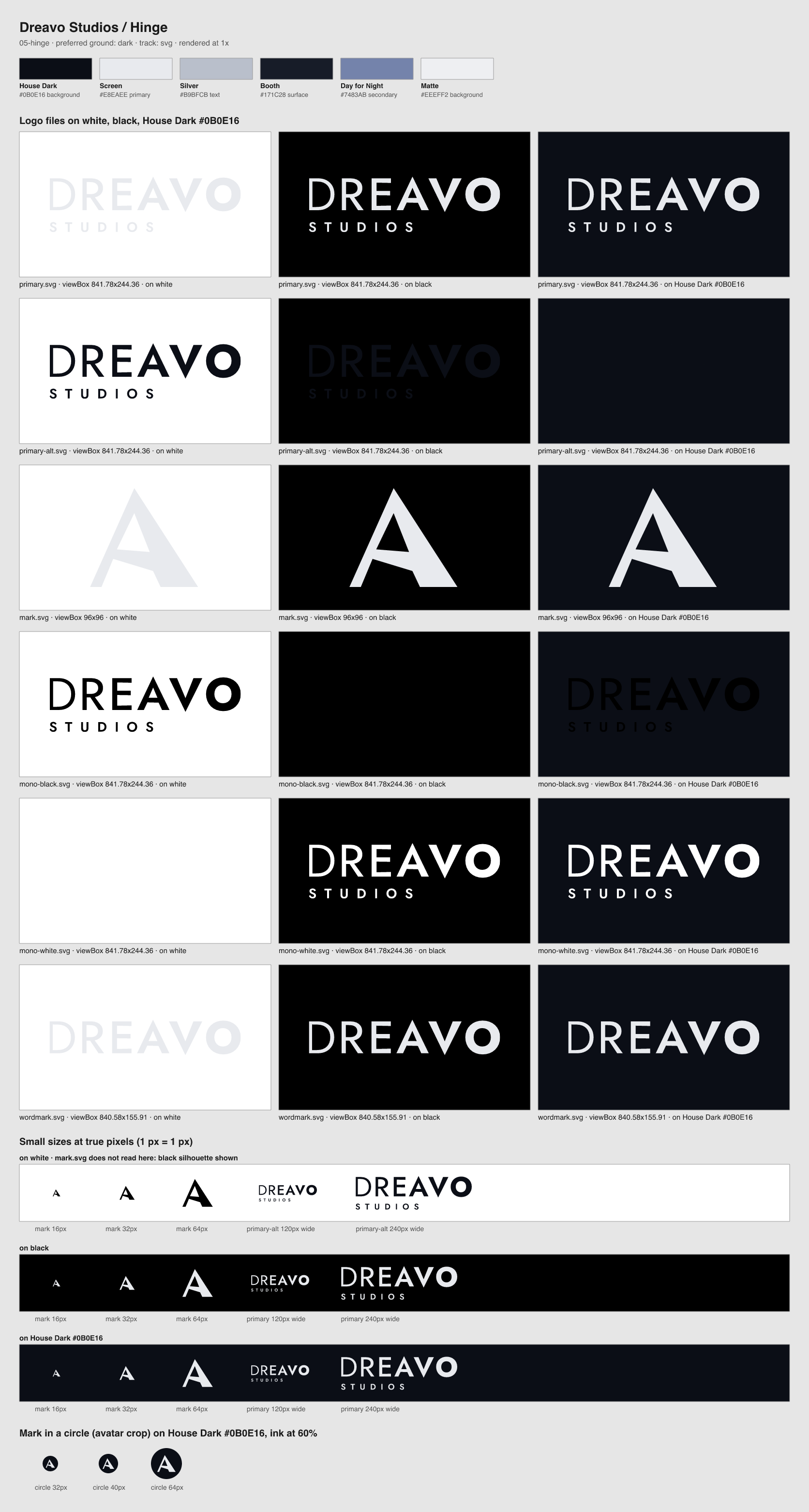
| File | Use when | Do not use when |
|---|---|---|
logo/primary.svg |
The default, in Screen #E8EAEE on House Dark #0B0E16 and Booth #171C28, and on dark areas of film stills |
On Matte or any light ground |
logo/primary-alt.svg |
The same lockup in House Dark, on Matte #EEEFF2, on white, and on pale image areas |
On dark grounds |
logo/mark.svg |
The hinge A alone: avatars, favicons, app icons, the back of the business card, and anywhere the lockup would fall below its minimum | As the only brand signal for someone who has not met the name yet |
logo/mono-black.svg |
One-color print, embossing, black billing blocks | On dark grounds |
logo/mono-white.svg |
Poster billing blocks, end-credit pages, over photographs, apparel | On light grounds |
logo/wordmark.svg |
DREAVO without STUDIOS, for print billing blocks narrower than 23 mm and wide formats where STUDIOS would fall below its minimum | Where the full name has to be shown and there is room for the lockup |
bun lf outline and blended point by point between the two masters (they share point structure). Each point's weight is set by its horizontal position: the blend factor rises evenly from 0.085 at the left edge of the D to 0.85 at the right edge of the O. Vertical stems stay parallel; horizontals taper slightly toward the right. The D's stem is 14.3 units, and the O's right side is about 0.3 of the cap height.X = the cap height of STUDIOS (42 units, 5% of the lockup width; at 300 px wide, X is 15 px). Keep 1X clear on all sides of the lockup and of the wordmark. Around the mark alone, keep 24 units (a quarter of its 96-unit box). Other logos, text, rules, frame edges, folds, and busy image detail all count as intrusions; in a billing block, 1X separates Dreavo from the neighbouring logos.
The thinnest stroke in the lockup is the crossbar of STUDIOS's T, 7.41 units. The formula in wordmark-craft.md (thinnest stroke at least 1.5 px or 0.2 mm) gives 170 px and 23 mm. Design principle 2 asks for 160 px, which overrides it on screen: at 160 px that crossbar is 1.4 px, and the sheet's 120 px row shows the lockup still reads.
| Version | Screen | |
|---|---|---|
| Primary lockup (any color) | 160 px wide | 23 mm wide |
| Wordmark (thinnest stroke 13.4 units, the D's top bar) | 95 px wide | 13 mm wide |
| Mark | 16 px | 5 mm |
For print billing blocks narrower than 23 mm, use wordmark.svg. Below 95 px or 13 mm, use mark.svg.
primary.svg on Matte or white (1.07:1); use primary-alt.svg.| Name | Hex | RGB | Role | Usage |
|---|---|---|---|---|
| House Dark | #0B0E16 |
11, 14, 22 | background | Default ground: title cards, screens, decks, the avatar. 60 to 70% of a layout. |
| Screen | #E8EAEE |
232, 234, 238 | primary | The logo on dark grounds, display type, titles. 15 to 25%. |
| Silver | #B9BFCB |
185, 191, 203 | text | Body text on House Dark and Booth. |
| Booth | #171C28 |
23, 28, 40 | surface | Panels, cards, slides, merchandise stock. |
| Day for Night | #7483AB |
116, 131, 171 | secondary | Captions, labels, rules, credits, the first frames of the ident. Under 20%; never in the logo. |
| Matte | #EEEFF2 |
238, 239, 242 | background | Light ground for letterhead and documents; carries primary-alt.svg and text in House Dark. |
Approved pairings (WCAG, computed): Screen on House Dark 16.0:1 (logo, all text); Screen on Booth 14.1:1; Silver on House Dark 10.5:1 and on Booth 9.2:1 (body); Day for Night on House Dark 5.1:1 and on Booth 4.5:1 (captions); House Dark on Matte 16.8:1 (logo, all text on light print). Never pair: Screen or Silver on Matte; Booth on House Dark for anything that must be read; Day for Night as small text on Matte (3.3:1, rules and large type only).
| Role | Family | Weights | Source | Fallback |
|---|---|---|---|---|
| Display | Jost | 300, 500 | Fontsource, OFL 1.1 | Futura, "Century Gothic", "Avenir Next", system-ui, sans-serif |
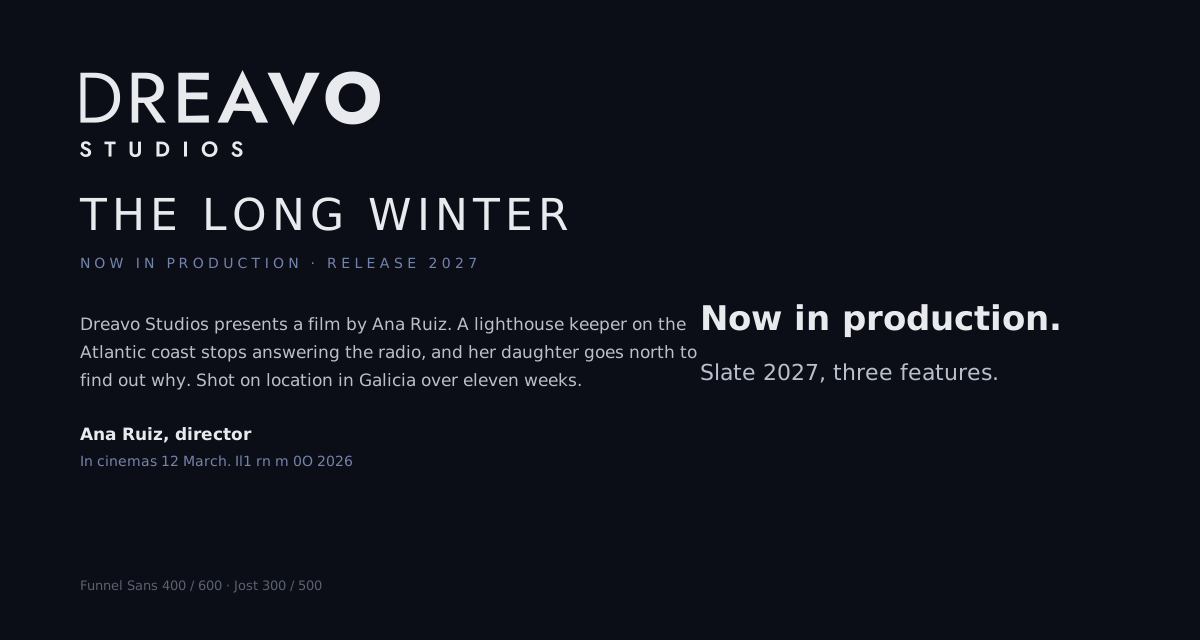
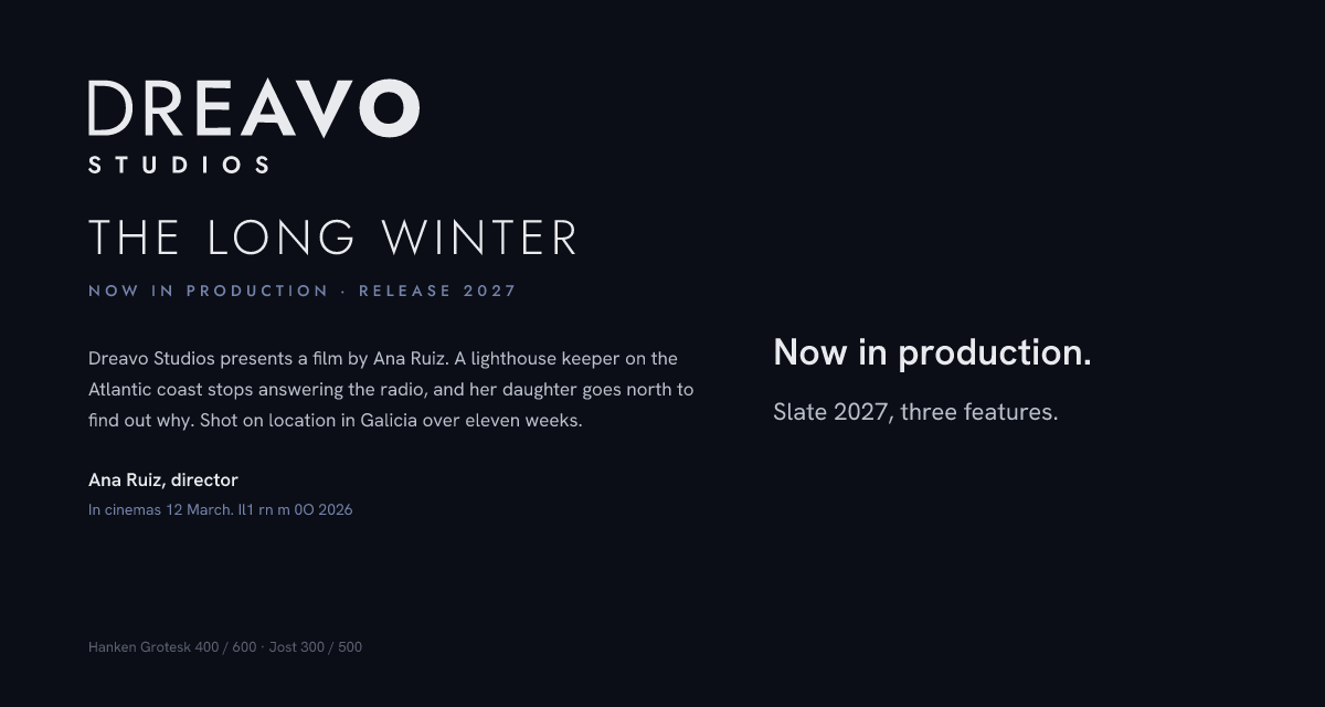
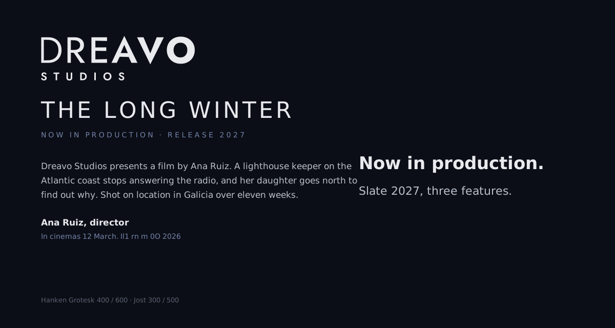
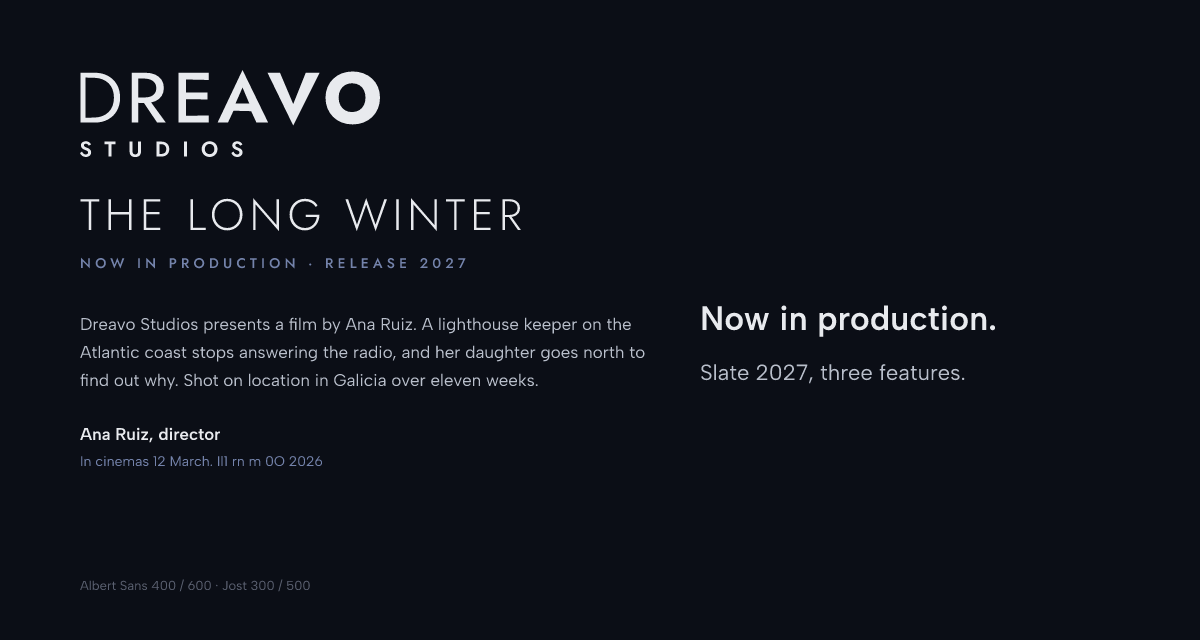
| Body | Funnel Sans | 400, 600 | Fontsource, OFL 1.1 | "Helvetica Neue", system-ui, -apple-system, "Segoe UI", Arial, sans-serif |
| Level | Face and weight | Size / line height | Case, tracking |
|---|---|---|---|
| Title | Jost 300 | 84 / 92 px | Caps, +100 to +120 |
| Headline | Funnel Sans 600 | 30 / 38 px | Sentence, -1% |
| Body | Funnel Sans 400 | 16 / 26 px (9.5 / 14 pt in print) | Sentence, 0 |
| Label, credit | Jost 500 | 11 to 16 px | Caps, +250 to +300 |
Body text is left-aligned, never justified, 55 to 75 characters per line. Dates are written "12 March". No italics: film titles go in Jost caps or Funnel Sans 600.
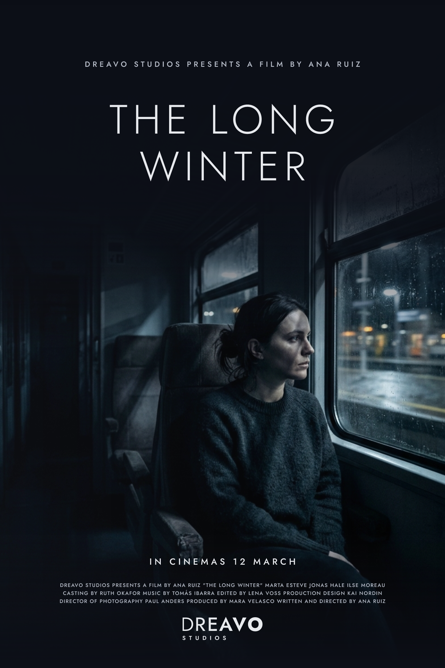
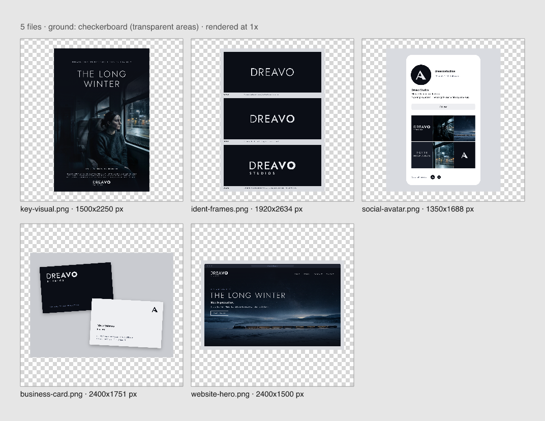
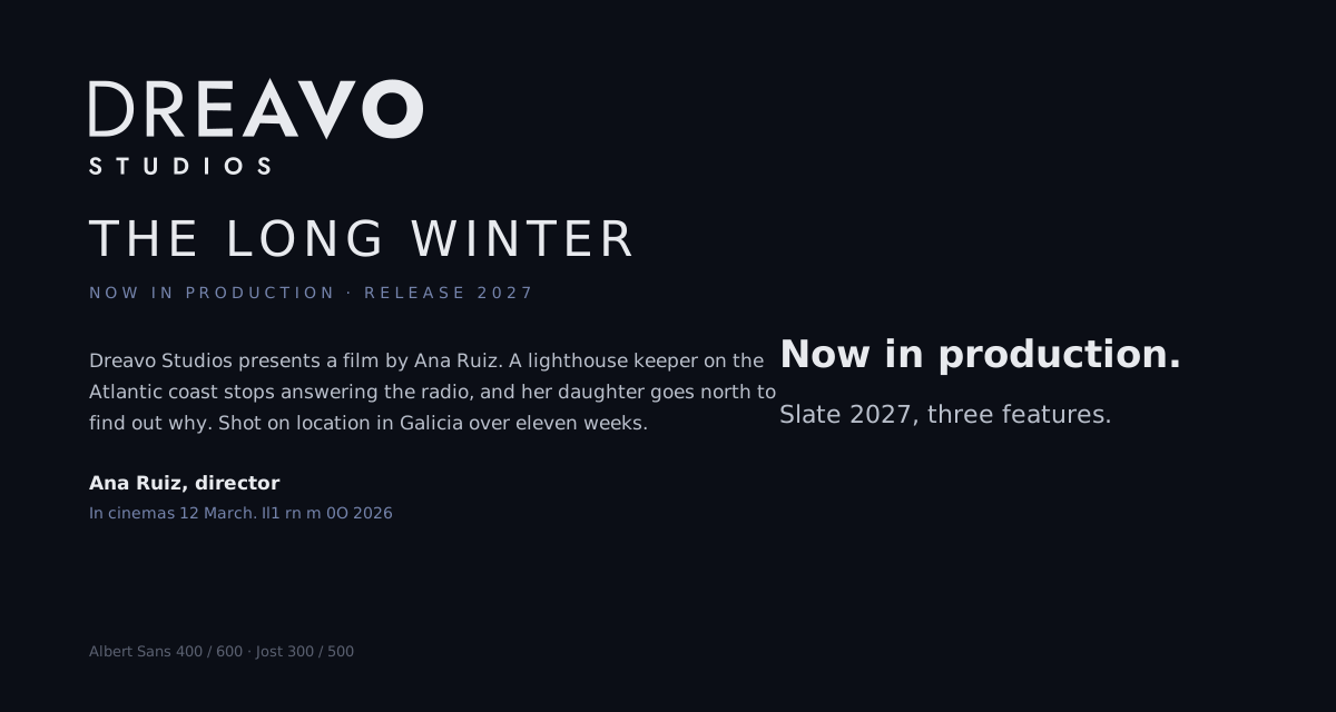
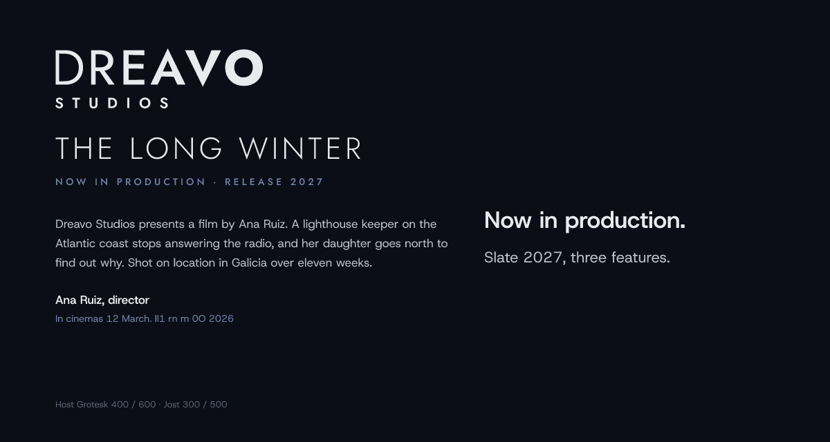
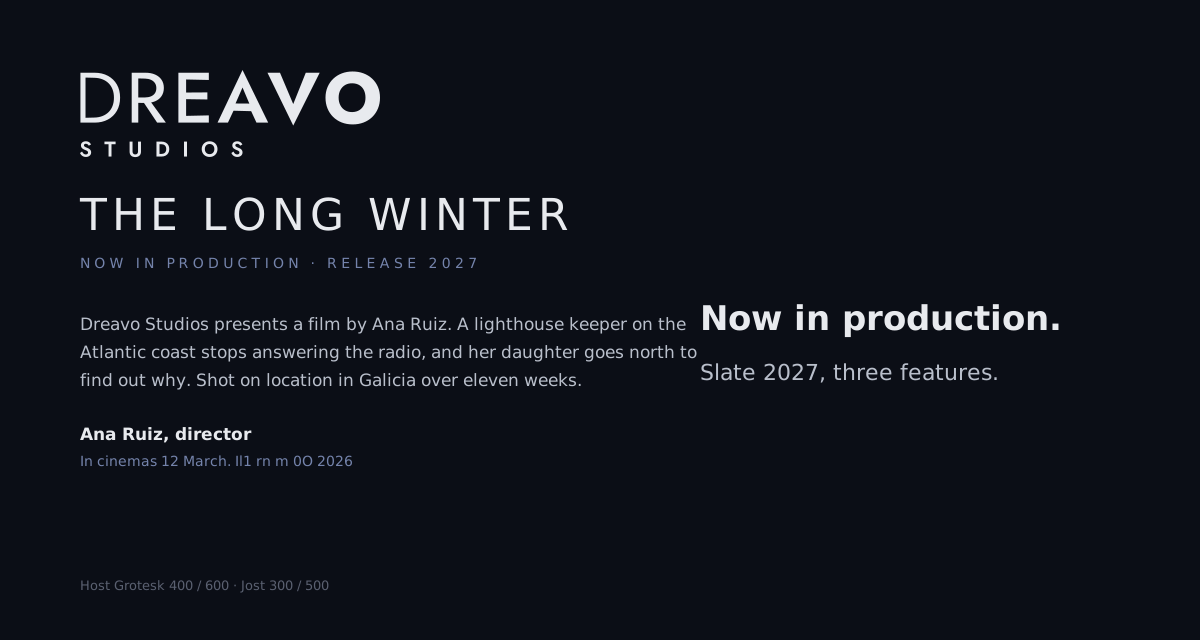
Stills look like prestige drama: night interiors and wide night exteriors, a single figure or a single light source, deep blacks lifted to House Dark, a cold blue-steel grade, fine grain. Images fade in from House Dark at the top of a layout, the way the name fades in from fine to heavy, and the logo sits in the dark part of the image in mono-white.svg or primary.svg, never over faces or bright detail. Glow and gradients belong here, never in the logo files. No warm sunsets, no saturated colour, no cinema hardware such as reels, lenses, or projector beams. See the key visual:
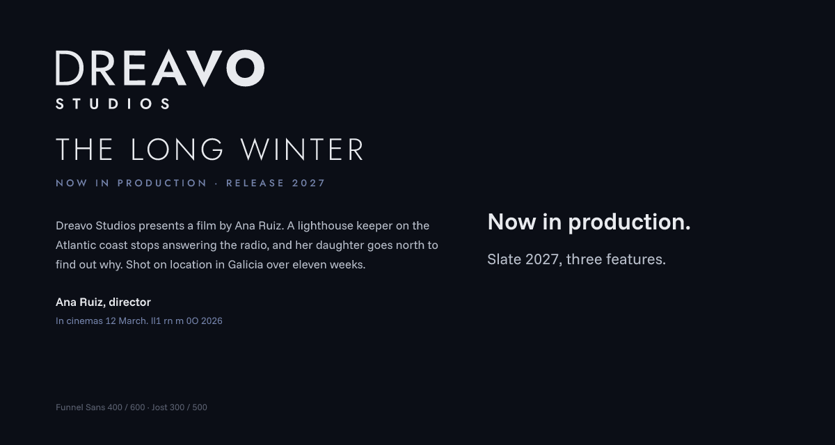
Dreavo writes like a title sequence: names, verbs, facts, present tense, no exclamation marks or superlatives.
| Principle | Do | Don't |
|---|---|---|
| Say less, mean it | "Now in production." | "We're so excited to share our amazing new project!!" |
| Credits, not copy | "Dreavo Studios presents a film by Ana Ruiz." | "Your partner for premium creative content." |
| Confident, never loud | "In cinemas 12 March." | "The most unforgettable film of the year!" |
Example lines. Headline: "The Long Winter. Now in production." Button: "Watch teaser". Social post: "Eleven weeks in Lapland. The Long Winter wraps today."
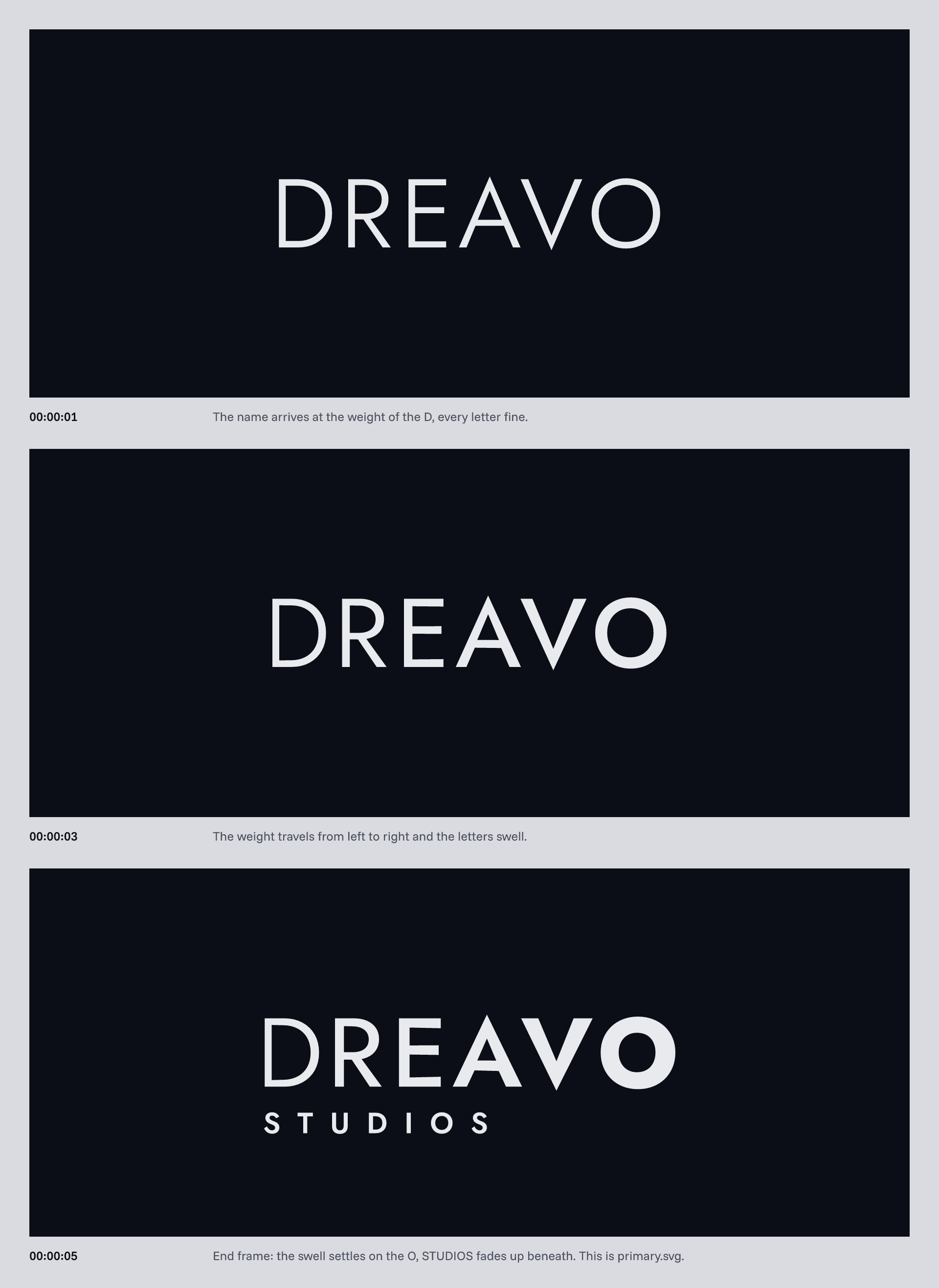
The ident is a fade-in where the weight moves rather than the brightness: the name arrives at the D's weight, the weight travels from D to O, and the end frame is primary.svg.
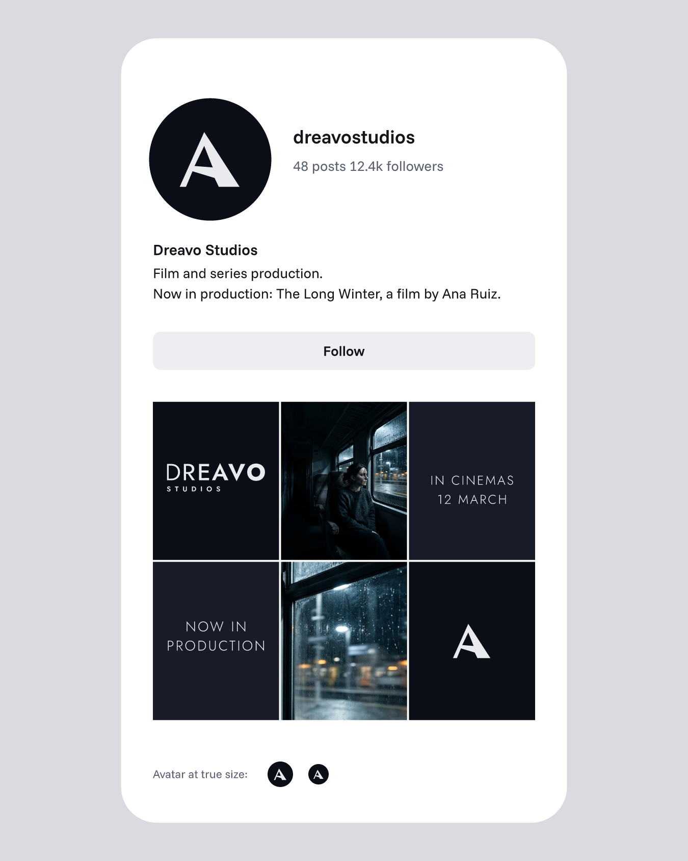
The hinge A on House Dark in a round crop, at 192, 40, and 32 px.