Dreavo Studios, study 6 of 6

Rimlight

Dreavo means to dream, and we dream in the dark: every letter of the name is eclipsed and drawn only by the light on its upper-right edge, warming from ember at the D to white at the O, the way a title appears when the house lights go down.

02

Small sizes

Mark at 16 px
16 px
Mark at 24 px
24 px
Mark at 32 px
32 px
Mark at 64 px
64 px
Primary at 120 px wide
120 px wide
Primary at 240 px wide
240 px wide
03

Palette

background

House Dark

#0B0A0A

Contrast
Reference ground
Usage
The default ground: the dark the letters are eclipsed against. Title cards, screens, decks, the avatar. 70% or more of any layout; never pure #000000.
text

Bone

#EFE8DC

Contrast
16.24:1 on House Dark, AAA text
Usage
All text on House Dark and Umbra (16.2:1), and the flat one-colour logo when the gradient cannot print.
primary

Ember

#E2793A

Contrast
6.62:1 on House Dark, AA text
Usage
The body of the rim gradient and the colour of light in key visuals: rules, one highlight per layout. 6.6:1 on House Dark; never as text on Paper.
secondary

Afterglow

#F3C08A

Contrast
11.97:1 on House Dark, AAA text
Usage
The warm end of the rim gradient (A, V, STUDIOS) and the core of glows. Release lines on House Dark. Dark grounds only.
accent

Deep Ember

#C2501F

Contrast
4.20:1 on House Dark, Large text only
Usage
The first stop of the rim gradient, at the thin D. 4.2:1 on House Dark: logo and large type only, never body text.
accent

White Heat

#FFF4E6

Contrast
18.21:1 on House Dark, AAA text
Usage
The last stop of the rim gradient, at the O and the mark's crescent. The single hottest point of a layout; never a fill for large areas.
accent

Rust

#A8431A

Contrast
3.28:1 on House Dark, Large text only
Usage
Start of the rim gradient on Paper (primary-alt), running to House Dark at the O. 5.2:1 on Paper; never on House Dark (3.3:1).
surface

Umbra

#181615

Contrast
1.10:1 on House Dark, Not for text
Usage
Cards, panels and deck slides one step off House Dark. Bone text 14.8:1.
background

Paper

#F3EEE5

Contrast
17.11:1 on House Dark, AAA text
Usage
The light ground for documents and print (letterhead, contracts, the back of the card), carrying primary-alt: Rust to House Dark rims.
04

Typography

display

Montserrat

Weights
300, 600, 800
Source
fontsource. Loaded from the brand's fonts folder.
Usage
800 is the wordmark's face only: DREAVO is outlined from it and never retyped. 600 caps for STUDIOS-style labels and credits, tracking +300 to +800, 11 to 16 px. 300 caps for film titles and headlines, tracking +120 to +200.
300

Dreavo Studios

600

Dreavo Studios

800

Dreavo Studios

ABCDEFGHIJKLMNOPQRSTUVWXYZ
abcdefghijklmnopqrstuvwxyz
0123456789 & ! ? , . ( )

Dreavo means to dream, and we dream in the dark: every letter of the name is eclipsed and drawn only by the light on its upper-right edge, warming from ember at the D to white at the O, the way a title appears when the house lights go down.
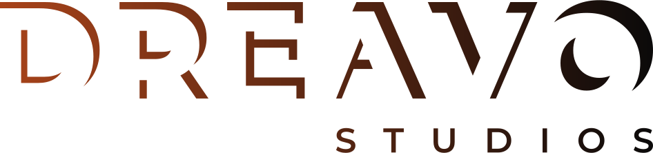
body

Hanken Grotesk

Weights
400, 500
Source
fontsource. Loaded from the brand's fonts folder.
Usage
Running text 16/26 and captions 13/20 in 400, sentence case, tracking 0; 500 for names, subheads and emphasis. No italics: emphasis is weight or Ember.
400

Dreavo Studios

500

Dreavo Studios

ABCDEFGHIJKLMNOPQRSTUVWXYZ
abcdefghijklmnopqrstuvwxyz
0123456789 & ! ? , . ( )

Dreavo means to dream, and we dream in the dark: every letter of the name is eclipsed and drawn only by the light on its upper-right edge, warming from ember at the D to white at the O, the way a title appears when the house lights go down.

05

Applications

Key visual: one-sheet
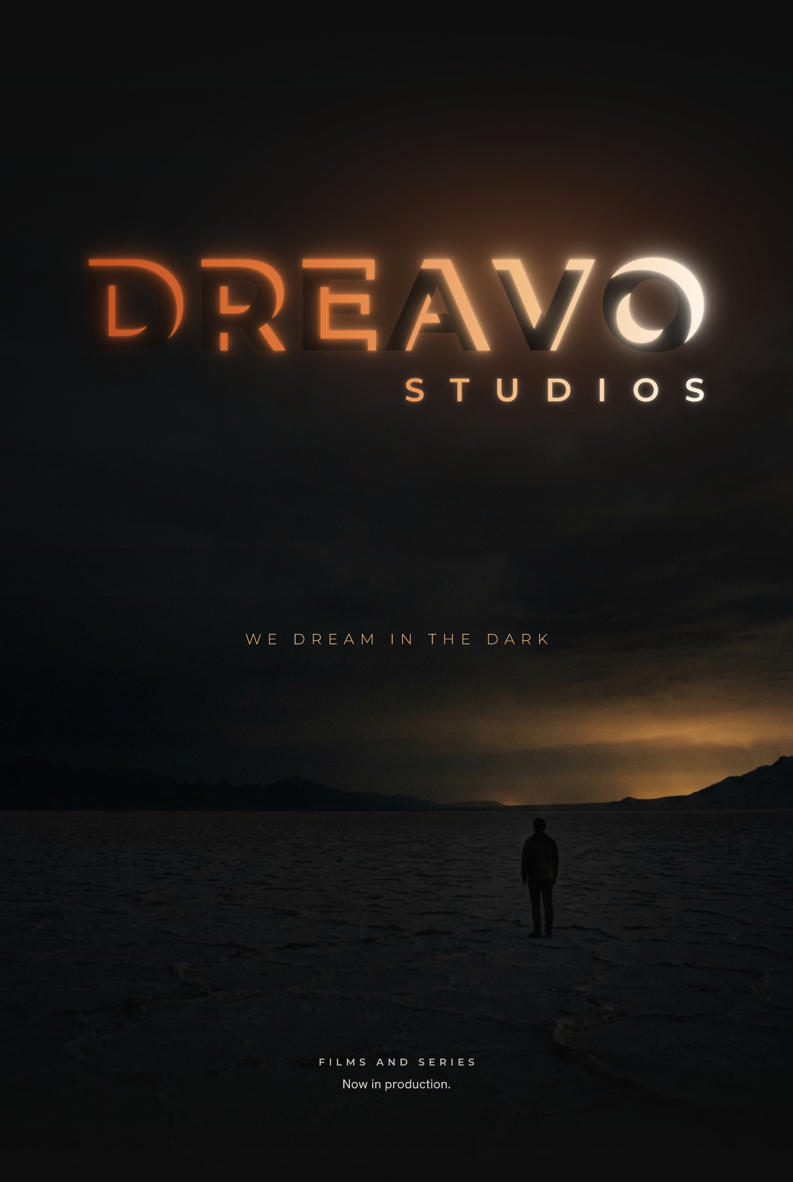
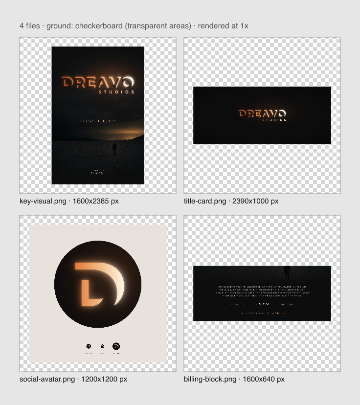
Key visual: one-sheetThe rims become real light: the dark letter bodies stand in front of an ember haze, the flat rims bloom, over a night plate. Glow lives here, never in the logo files.
Sample film poster
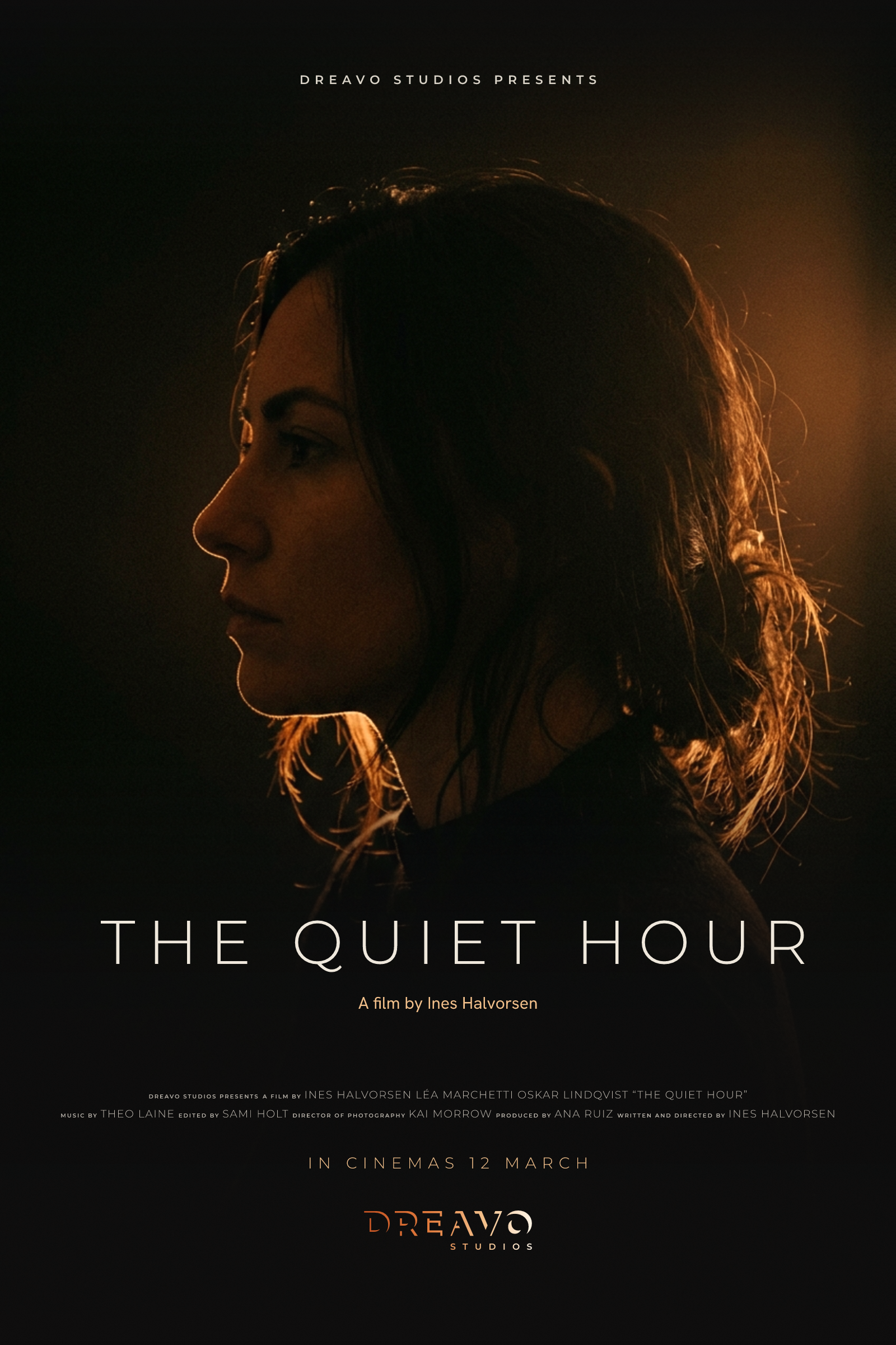
Sample film posterA one-sheet for an invented film, The Quiet Hour: a rim-lit profile graded to the ember palette carries the idea into photography, with plain Montserrat 300 title type, the billing credits, and the primary lockup at 300 px at the foot.
Production ident, 2.39:1
Production ident, 2.39:1End pose of the opening ident on House Dark: primary lockup at 34% of frame width, the bodies barely visible against a faint haze, light only on the edges.
Social avatar
Social avatarThe D mark (heavy rim) in a round crop on House Dark, large and at true 40, 32 and 64 px: the crescent still reads at 32.
Poster billing block
Poster billing blockMono-white lockup at 160 px wide, true scale, between other company logos under the credits: every letter and STUDIOS still hold.
06

Concept

Written

Study 08-rimlight for Dreavo Studios. Created 2026-11-15.

Idea

Dreavo means to dream, and we dream in the dark. In the user's eclipse reference, light survives only as a thin rim around a dark body. Rimlight applies that to the name itself: every letter of DREAVO is eclipsed, a dark body with the light behind it, and the word is drawn only by the slivers of light on the upper-right edge of each letter. The name appears the way a title appears when the house lights go down. Across the word the rims grow and warm, from a thin ember line at the D to a full white crescent at the O, so the name reads as light coming up from left to right.

Why it fits

  • Positioning. "The weight of a studio picture" comes from restraint: the logo is mostly darkness, and one consistent light does all the work. Nothing is added to the letters; something is taken away.
  • Personality. Serious, not grim: the light is warm and rising, not shadow play. Epic, not bombastic: scale comes from the darkness around the letters, not from chrome or flares. Classic, not nostalgic: wide geometric caps, no searchlights or deco.
  • Principle 4 (one drawn feature you can name): "every letter is an eclipse". One phrase, visible in every letter.
  • Principle 1 (one flat color): the rims are solid shapes, not glows. The ember gradient is finish on the primary; the mono files carry the full idea.
  • The name. It ties the eclipse the user loves directly to the meaning they gave the name (to dream), instead of placing an eclipse symbol next to a plain word.

Logo type and track

  • Wordmark plus monogram. The lockup is DREAVO in rims over STUDIOS; the mark is the D alone as a heavy rim (a crescent around a dark D).
  • Track: svg. The construction is exact geometry (glyph minus a shifted copy of itself), computed as real boolean paths. An image model cannot draw it.
  • Ground: dark. The idea is light on darkness; near-black is its home. The light-ground version inverts the logic honestly (see Form notes).
  • Built in spirit from references/eclipse-reference.jpg: near-black ground, a thin warm arc, wide geometric caps. This study does not copy its composition.

Form notes

  • Lettering outlined from Montserrat 800 (bold, wide, geometric). Each rim = glyph minus the glyph shifted down-left; the result is computed with skia-pathops in logo/concepts/build/.
  • Pitch sketch: research/pitches/rimlight.png. Variant C+ (rims thickening from D to O with an ember-to-white gradient) was chosen by the user, with the note "ember versions".
  • The fragmentation risk named in the pitch (E, R, A reading as broken stencil pieces) is treated in stage 4 by tuning the shift per letter and keeping the counter rims only where they help.
  • Colour: warm near-black ground, bone light, an ember ramp from deep ember to white-hot for the gradient.
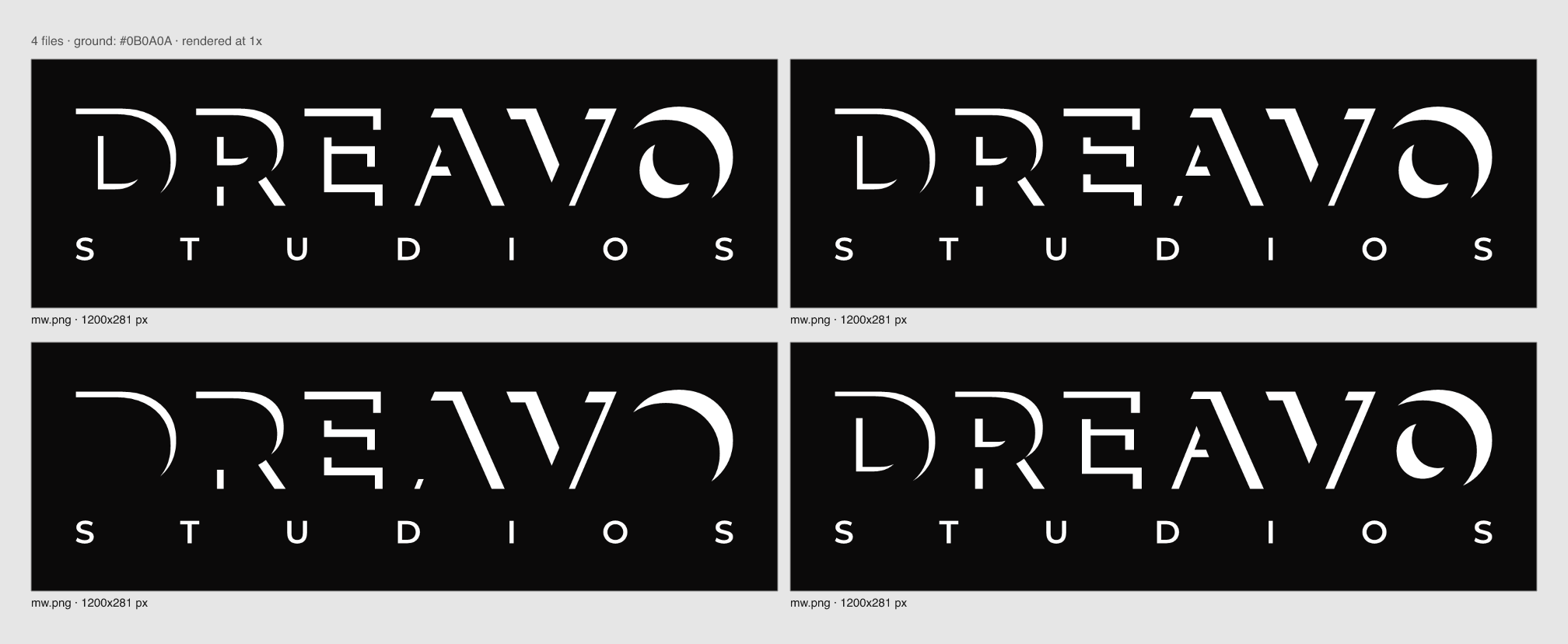
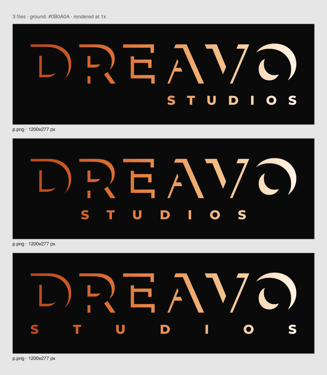
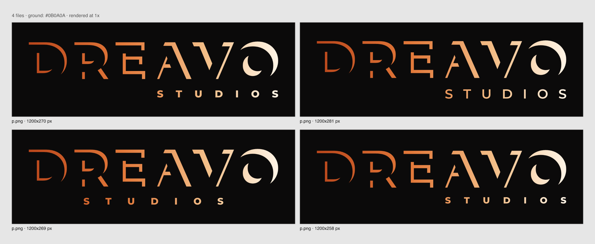
  • Stage 4 choice (logo/concepts/compare-01.png to compare-04-alt.png): 45° light, the counter rims kept (without them the D reads as a bracket), the A's leg and the E's stem rejoined through their crossbars, rims growing D 9 to O 18.5 units so the D holds at 120 px, and STUDIOS in Montserrat 600 flush under the lit half AVO. Runner-up: STUDIOS in Montserrat 800 with its stem matched to the D rim. It met 160 px by the formula but shouted over the word. On light ground: Rust-to-black rims over flat black.

Risks

  • Fragmentation. Thin rims split E, R, and A into loose pieces that look like a stencil or a glitch. Guard: per-letter shift tuning, rejoining pieces, a minimum rim that holds at 120 px.
  • Small sizes. The thin end at the D can vanish in a 160 px billing block. Guard: a raised minimum rim; the D mark carries the brand below the lockup's minimum.
  • Light grounds. Light on light makes no sense; dark rims on bone read as shadows, not light. Guard: test and state the rule honestly in the guidelines.
  • Neighbour. Focus Features' ident also reveals letters with light. Guard: Rimlight is a fixed, flat letterform construction, not an ident effect.

Deviations

None

Sign-off

Approved by the user on 2026-11-15 from the pitch sketch. Note: "ember versions".

07

Concept sketches

applications-check.png
build/d.svg
build/d.svg
build/final/bodies.svg
build/final/mark-flat.svg
build/final/mark.svg
build/final/mono-black.svg
build/final/mono-white.svg
build/final/primary-alt.svg
build/final/primary.svg
build/final/wordmark.svg
build/word.svg
build/word.svg
compare-01.png
compare-01.png
compare-02.png
compare-02.png
compare-03-160.png
compare-03-160.png
compare-03.png
compare-03.png
compare-04-alt.png
compare-04-alt.png
exports-check.png
exports-check.png
mark-16.png
mark-16.png
mark-32.png
mark-32.png
mark-64.png
mark-64.png
mark-600.png
mark-600.png
primary-120.png
primary-120.png
primary-240.png
primary-240.png
primary-r01.png
primary-r01.png
small-01.png
small-01.png
08

Moodboard

Not yet madeNothing in moodboard/ yet
09

Guidelines

Written

Study 08-rimlight. Version 1, 2026-11-15.

Overview

Dreavo means to dream, and we dream in the dark. Every letter of DREAVO is eclipsed: a dark body with the light behind it, drawn only by the sliver of light on its upper-right edge. Across the word the light comes up, from a thin ember rim at the D to a full white crescent at the O, the way a title appears when the house lights go down.

Personality: serious, not grim; epic, not bombastic; classic, not nostalgic; quiet, not anonymous.

This document is for designers, editors, motion artists, and developers who place the Dreavo logo on title cards, posters, decks, screens, and print.

Logo

Versions

Primary

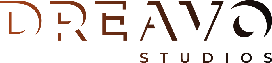
logo/primary.svg: the default. The DREAVO rims carry one ember-to-white gradient across the whole lockup (Deep Ember, Ember, Afterglow, White Heat), and STUDIOS shares it. Use it on House Dark and Umbra: title cards, the website, decks, social, the front of the card.

Primary on light

logo/primary-alt.svg: for Paper and other light grounds (letterhead, contracts, press notes). Rust to House Dark: the rims are strongest where the light is strongest (at the O). On light ground the rims read as a drawn edge, not as light; the idea is at home on dark. Use the light version only where the page has to be light.

Mark

logo/mark.svg: the D alone, with a heavier rim than the D in the lockup (the rim that holds at 32 px), in the Ember to White Heat gradient. Use it for avatars, favicons, app icons, end-credit bugs, and anywhere the lockup would fall below its minimum size. It sits on House Dark.

logo/mono-white.svg: solid white. Billing blocks, end credits, photographs and footage, embossing and foil, and any one-colour job on a dark ground.

logo/mono-black.svg: solid black. Newsprint, faxed and photocopied documents, rubber stamps, one-colour print on light stock.

Wordmark

logo/wordmark.svg: DREAVO without STUDIOS, in the primary gradient. Only where STUDIOS is already said nearby: a website header next to the company name, merchandise, the second appearance on a page.

Construction

  • Lettering. DREAVO is outlined from Montserrat 800 at a 200-unit em with +40 tracking. Never retype it.
  • The rim. Each letter's rim is the glyph minus a copy of itself shifted down and to the left at 45°: the light comes from behind the letters, up and to the right. It is a real boolean path (skia-pathops), not a mask, with two-decimal coordinates. The script is logo/concepts/build/build.py.
  • Rising light. The shift grows letter by letter across the word: D 9, R 10.5, E 12, A 13.5, V 15.5, O 18.5 units (the cap height is 142.8). So the rim grows from 6% to 13% of the cap height.
  • Counters. The rims inside counters stay in: they are the light that comes through the letter and falls on its inner lower-left edge. Without them the D reads as a bracket and the O as a crescent alone.
  • Rejoined strokes. In the A and the E the rim of the main stroke runs straight through the crossbar (the A's left leg, the E's stem), so each letter reads as one lit edge rather than loose stencil pieces. Contours under 6 square units are removed; there are no specks.
  • STUDIOS. Montserrat 600, solid, cap height a quarter of DREAVO's (35 units). It is set flush right, spanning exactly the lit half of the word, from the A's left foot to the O's right edge, where the name splits when spoken (dre | avo). It sits 0.3 cap heights (42.84 units) below the baseline. It is a credit, not light, so it is never rimmed.
  • Mark. The D from the same face with a 20-unit shift (14% of its height). This is the heavy rim that still reads as a crescent at 32 px.

Clear space

X = half the cap height of DREAVO (71.4 units in the 946.4-unit lockup, 7.5% of the lockup width). Keep 1X clear on all sides of the lockup, measured from the outermost rim and from STUDIOS. For the mark, X = a quarter of the mark's height; keep 1X on all sides, and more inside a circle (the avatar crop uses the mark at 56% of the diameter).

Minimum size

  • Formula. The smallest detail is the STUDIOS stem at 6.5 units; the thinnest rim, at the D, is 9 units. Minimum width = 946.4 × 1.5 ÷ 6.5 = 218 px on screen and 946.4 × 0.2 ÷ 6.5 = 29 mm in print. Above this size every detail of the full-colour lockup stays at 1.5 px or 0.2 mm or more.
  • Billing-block floor (principle 2 overrides). In mono-white or mono-black only, the lockup may go down to 160 px / 20 mm wide in billing blocks and end credits. It is checked in applications/billing-block.png at true scale: every letter and STUDIOS still read. Never use the gradient primary below 218 px: the Deep Ember end at the D gets too dim.
  • Below 160 px, use logo/mark.svg. The mark is recognisable at 16 px and its crescent is clear from 32 px. Give it at least 24 px on screen and 6 mm in print.

Misuse

  • Do not use one rim offset for all letters, or reverse the growth: the light rises from D to O.
  • Do not change the light direction, mirror the lockup, or rotate it.
  • Do not fill the letter bodies with a colour, an outline, or a tint in any logo file. The bodies are the dark itself.
  • Do not add glow, blur, bloom, lens flare, or texture to the logo files. Light effects belong to key visuals and the motion ident only.
  • Do not run the gradient in another direction or with colours outside the ember ramp, and never put the gradient primary on Paper or white (Afterglow and White Heat disappear).
  • Do not rim STUDIOS, re-space it, centre it, or move it off the lit half.
  • Do not place the logo on mid-tone or busy images where the dark around the rims is lost. Darken the plate first.
  • Do not retype DREAVO in Montserrat 800 or any font. Always use the files.

Color

Name Hex Role Usage
House Dark #0B0A0A background The default ground: the dark the letters are eclipsed against. Title cards, screens, decks, the avatar. 70% or more of any layout; never pure #000000.
Bone #EFE8DC text All text on House Dark and Umbra, and the flat one-colour logo when the gradient cannot print.
Ember #E2793A primary The body of the rim gradient and the colour of light in key visuals: rules, one highlight per layout.
Afterglow #F3C08A secondary The warm end of the rim gradient (A, V, STUDIOS) and the core of glows. Release lines on House Dark. Dark grounds only.
Deep Ember #C2501F accent The first stop of the rim gradient, at the thin D. Logo and large type only.
White Heat #FFF4E6 accent The last stop of the rim gradient, at the O and the mark's crescent. The single hottest point of a layout.
Rust #A8431A accent Start of the rim gradient on Paper (primary-alt), running to House Dark at the O.
Umbra #181615 surface Cards, panels and deck slides one step off House Dark.
Paper #F3EEE5 background The light ground for documents and print, carrying primary-alt.

Approved pairings (WCAG contrast):

  • Bone on House Dark 16.2:1, on Umbra 14.8:1: all text.
  • White Heat on House Dark 18.2:1; Afterglow on House Dark 12.0:1: logo, display type, release lines.
  • Ember on House Dark 6.6:1: highlights, labels, large text.
  • Deep Ember on House Dark 4.2:1: the logo's thin end and display type at 24 px and up, never body text.
  • House Dark on Paper 17.1:1: text and the dark end of primary-alt.
  • Rust on Paper 5.2:1: the light end of primary-alt, labels on Paper.

Never pair: Bone, Afterglow, or White Heat on Paper (1.1 to 1.4:1); Ember on Paper (2.6:1); Rust on House Dark or Umbra (3.3:1 and 3.0:1); the gradient primary on any light ground.

Typography

Role Family Upright weights Italics Fallback Source
Display Montserrat 300, 600, 800 none "Avenir Next", "Century Gothic", system-ui, sans-serif Fontsource, OFL-1.1
Body Hanken Grotesk 400, 500 none "Helvetica Neue", Arial, system-ui, sans-serif Fontsource, OFL-1.1
  • Montserrat 800 is the wordmark's face only. DREAVO is outlined from it; never set text in 800.
  • Montserrat 600, caps, tracking +300 to +800 (+770 in the lockup): labels, credits, section heads, 11 to 16 px. The same voice as STUDIOS.
  • Montserrat 300, caps, tracking +120 to +200: film titles, headlines, release lines ("IN CINEMAS 12 MARCH"), 24 px and up.
  • Hanken Grotesk 400: running text 16/26 and captions 13/20, sentence case, tracking 0. 500 for names, subheads and emphasis. No italics: emphasis is weight or Ember.

Hierarchy:

  • Headline: Montserrat 300, caps, 48 to 96 px, tracking +150, Bone or Afterglow.
  • Subhead: Montserrat 600, caps, 14 to 16 px, tracking +400, Bone.
  • Body: Hanken Grotesk 400, 16/26, Bone on House Dark.
  • Caption: Hanken Grotesk 400, 13/20, Bone at 70%.

Imagery and key visuals

  • Subject. Night, dusk, interiors before the lights come up: wide frames with one small human figure, a lot of darkness, and one warm light source low and to the right, the same side the rims are lit from.
  • Grade. Crushed, warm blacks (toward House Dark, never blue-black), highlights in ember and sodium tones, fine grain. No teal and orange, no saturated skies.
  • Where effects live. Glow, bloom, haze, and grain are allowed in key visuals, the motion ident, and title cards: the flat rims bloom, and the letter bodies may appear as dark silhouettes against an ember haze. The logo files never carry them.
  • The ident. It opens on black. The haze rises behind the letters from the right, the rims catch light from the O back to the D, then the bloom settles to the flat end pose.
  • Logo on images. Primary or mono-white only, on the darkest third of the frame. Darken the plate under the lockup to House Dark at 60% or more. Keep 1X clear space.
  • Reference: Key visual

Voice

Dreavo writes like a title sequence: names, verbs, facts, present tense, no exclamation marks, no superlatives. Rimlight adds one rule: say it the way the light arrives, little and late, then exactly.

  • Do: "Now in production." Don't: "We're so excited to finally share our amazing new project!!"
  • Do: "Dreavo Studios presents a film by Mara Okafor." Don't: "Your one-stop partner for premium creative content."
  • Do: "In cinemas 12 March." Don't: "The most unforgettable film of the year!"

Example lines:

  • Headline: "We dream in the dark."
  • Button label: "See the slate"
  • Social post: "The Long Quiet. Written and directed by Mara Okafor. In cinemas 12 March."

Applications

Key visual

Key visual: one-sheet. The rims become real light: the dark letter bodies stand in front of an ember haze and the flat rims bloom, over a night plate. Glow lives here, never in the logo files.

Sample film poster

Sample film poster. How Dreavo signs a film: the idea lives in the photography (a rim-lit profile graded to the ember palette), the title stays plain Montserrat 300, and the primary lockup sits at the foot at 300 px wide, above the 218 px minimum, under the billing credits and release line.

Title card

Production ident, 2.39:1. The end pose on House Dark: the primary lockup at 34% of frame width, light only on the edges.

Social avatar

Social avatar. The D mark in a round crop on House Dark, at 56% of the diameter; it still reads at 32 px.

Billing block

Poster billing block. Mono-white lockup at 160 px wide, true scale, between other company logos: the floor set by principle 2.