background
Eclipse Black
#0B0A0A
- Contrast
- Reference ground
- Usage
- The sky at totality. Default ground for the logo, title cards, screens, decks and the avatar; 60 to 70% of any layout. A warm near-black, never pure #000000.

Dreavo Studios, study 5 of 6
The name ends in an eclipse: the O of Dreavo is the moment the sky closes its eye and the dream begins, a ring hair-thin on one side and a bright crescent on the other.





#0B0A0A
#EFE8DC
#D9652B
#F4C99B
#A8431A
#1A1817
#F3EEE5
display
Dreavo Studios
Dreavo Studios
ABCDEFGHIJKLMNOPQRSTUVWXYZ
abcdefghijklmnopqrstuvwxyz
0123456789 & ! ? , . ( )
The name ends in an eclipse: the O of Dreavo is the moment the sky closes its eye and the dream begins, a ring hair-thin on one side and a bright crescent on the other.
body
Dreavo Studios
Dreavo Studios
ABCDEFGHIJKLMNOPQRSTUVWXYZ
abcdefghijklmnopqrstuvwxyz
0123456789 & ! ? , . ( )
The name ends in an eclipse: the O of Dreavo is the moment the sky closes its eye and the dream begins, a ring hair-thin on one side and a bright crescent on the other.
Study 07-totality for Dreavo Studios. Created 2026-11-15.
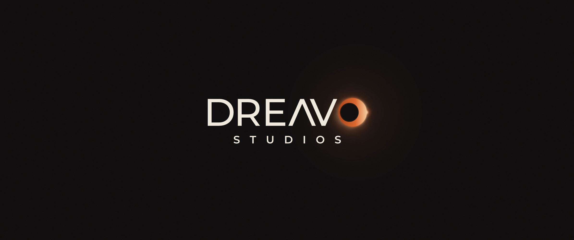
Dreavo means to dream. Totality is the moment of a solar eclipse when the moon closes over the sun: the sky shuts its eye, the day goes dark, and a ring of light hangs where the sun was. That is where the dream begins, and it is also what a cinema does when the lights go down. In this logo the eclipse is not a picture placed above the name: the last letter is the eclipse. DREAV is set in wide, sleek geometric caps and the name closes on an eclipsed disc, a ring that runs hair-thin around one side and swells into a bright crescent on the other. Read as a word it is DREAVO; read alone, the O is the mark.
One sentence: the name ends in an eclipse, so the O of Dreavo is the moment the sky closes its eye and the dream begins.
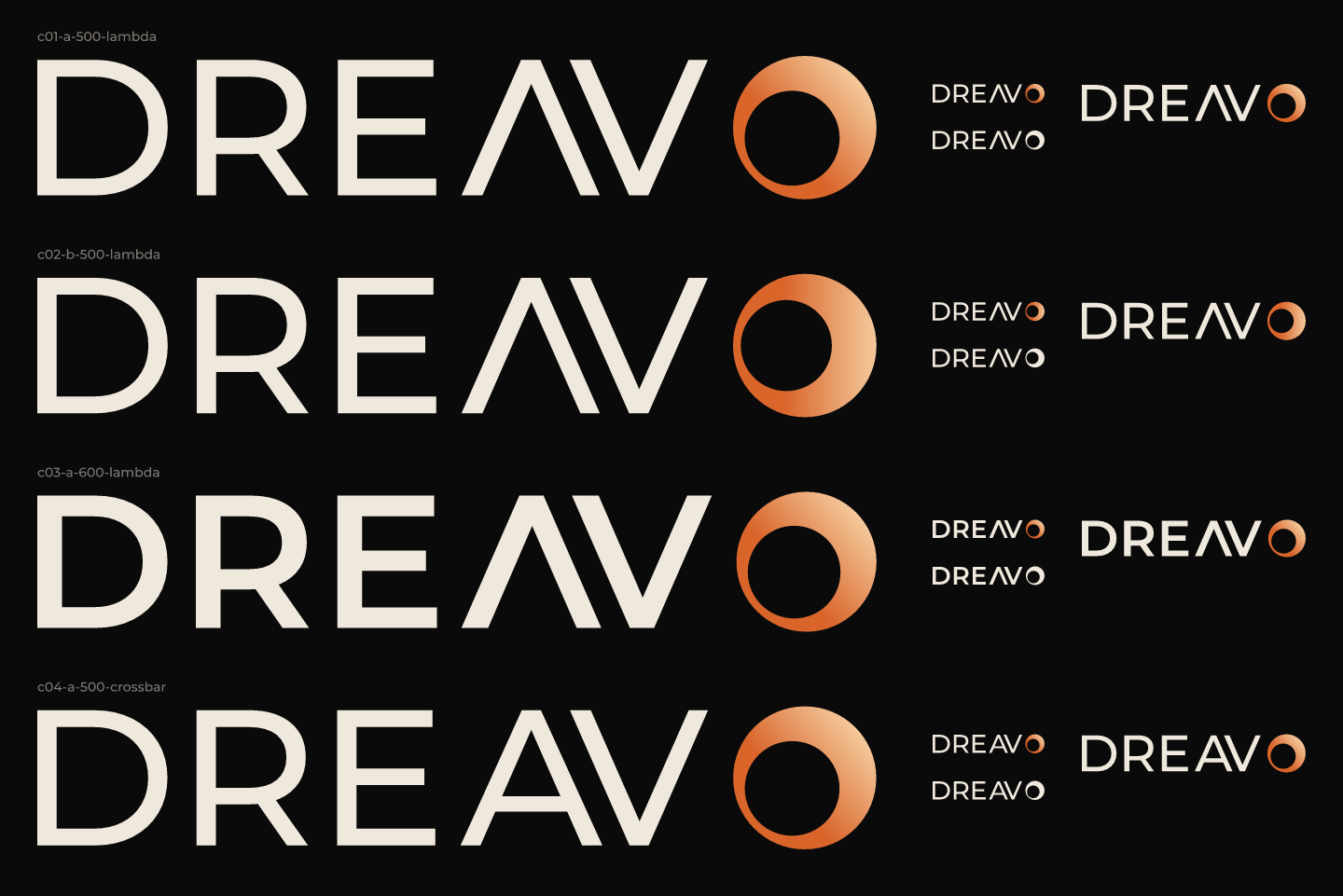
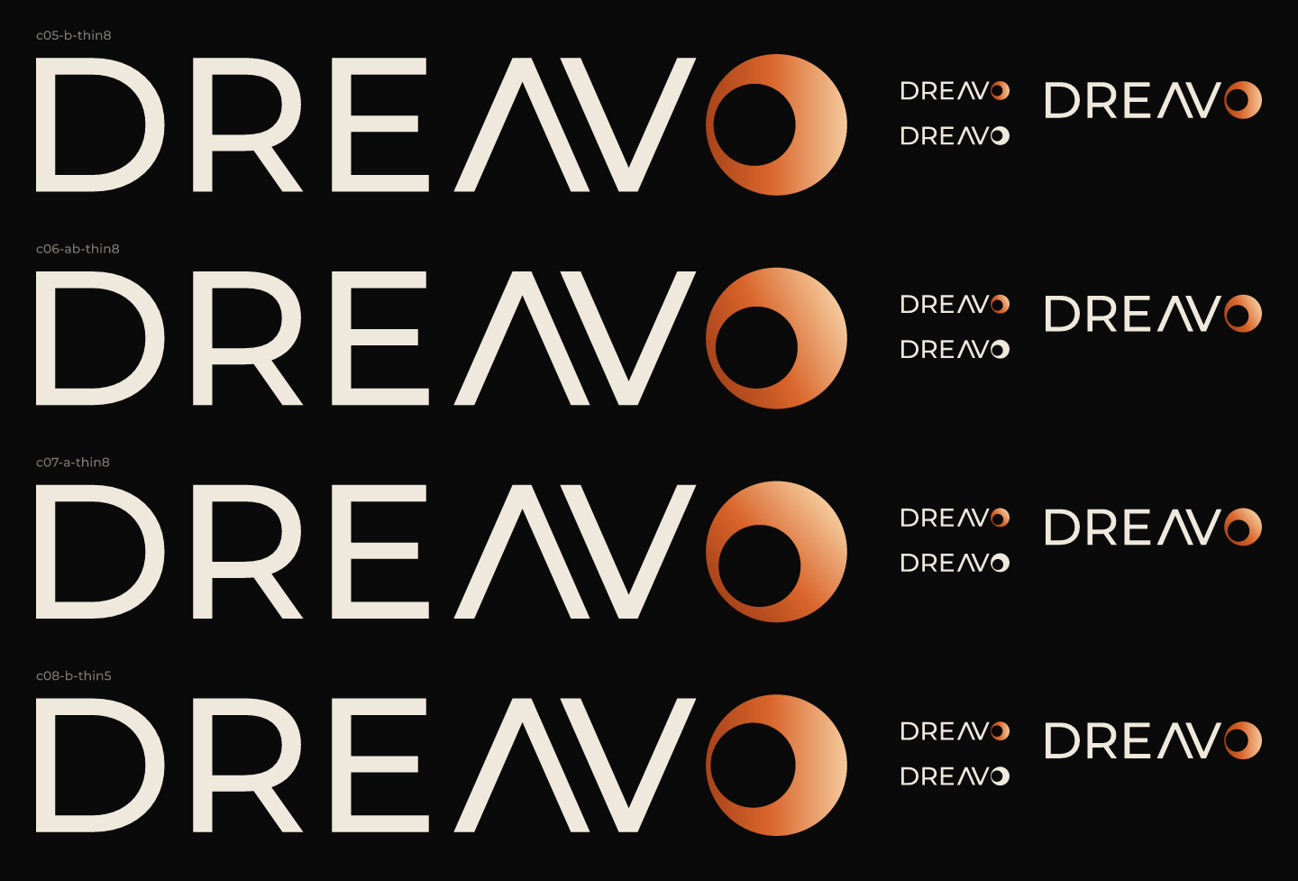
references/eclipse-reference.jpg (a thin ember eclipse arc over wide caps) and the eclipse logo that came before it. Totality keeps their eclipse and their lettering style but moves the eclipse into the name, so it is no longer a decoration floating above it.svg. The idea is exact geometry (two circles, one offset), which is best built by hand; the lettering is outlined from Montserrat with bun lf outline.primary-alt.svg covers light print.references/eclipse-reference.jpg. Preserved from it: near-black ground, bone caps that are wide and geometric, an ember-colored eclipse that is thin on one side and bright on the other. Not carried over: the arc floating above the word (owned by 01-eclipse) and the glow (it moves to the key visuals).research/pitches/totality.png (variants A, B, C). The user picked the direction and asked for "ember versions": the ember crescent is the primary look.logo/concepts/compare-01.png and compare-02.png. At 120 px the A form read as a slanted bold O; B read as a ring with a crescent, which is the eclipse. B is also symmetric top to bottom like D and E. Runner-up: A at -25°, which echoes the reference's light but loses the eclipse reading at small size.mark.svg is the same eclipse drawn heavier (11 and 40 units) for 16 to 64 px use.mark.svg, which is the version used at avatar and favicon sizes.None
Approved by the user on 2026-11-15 from the pitch sketch. Note: "ember versions".


















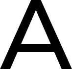
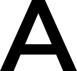








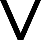



Study 07-totality. Version 1, 2026-11-15.
Dreavo means to dream. Totality is the moment of a solar eclipse when the sky closes its eye and the dream begins, and in this identity that moment is a letter: the name ends in an eclipse. DREAV is set in wide geometric caps, and the O is an eclipsed disc, a ring hair-thin on one side that swells into a bright ember crescent on the other.
Personality: serious, not grim; epic, not bombastic; classic, not nostalgic; quiet, not anonymous.
This document is for anyone who places the logo or builds with the system: designers, printers, web developers, editors cutting the ident, and the people running social accounts. The system meets the five design principles in strategy.md:
mono-black.svg and mono-white.svg carry the whole idea. The ember gradient is finish, not structure.wordmark.svg holds at 160 px wide. mark.svg is drawn heavier for small sizes and keeps its hairline side at 32 px inside a circle.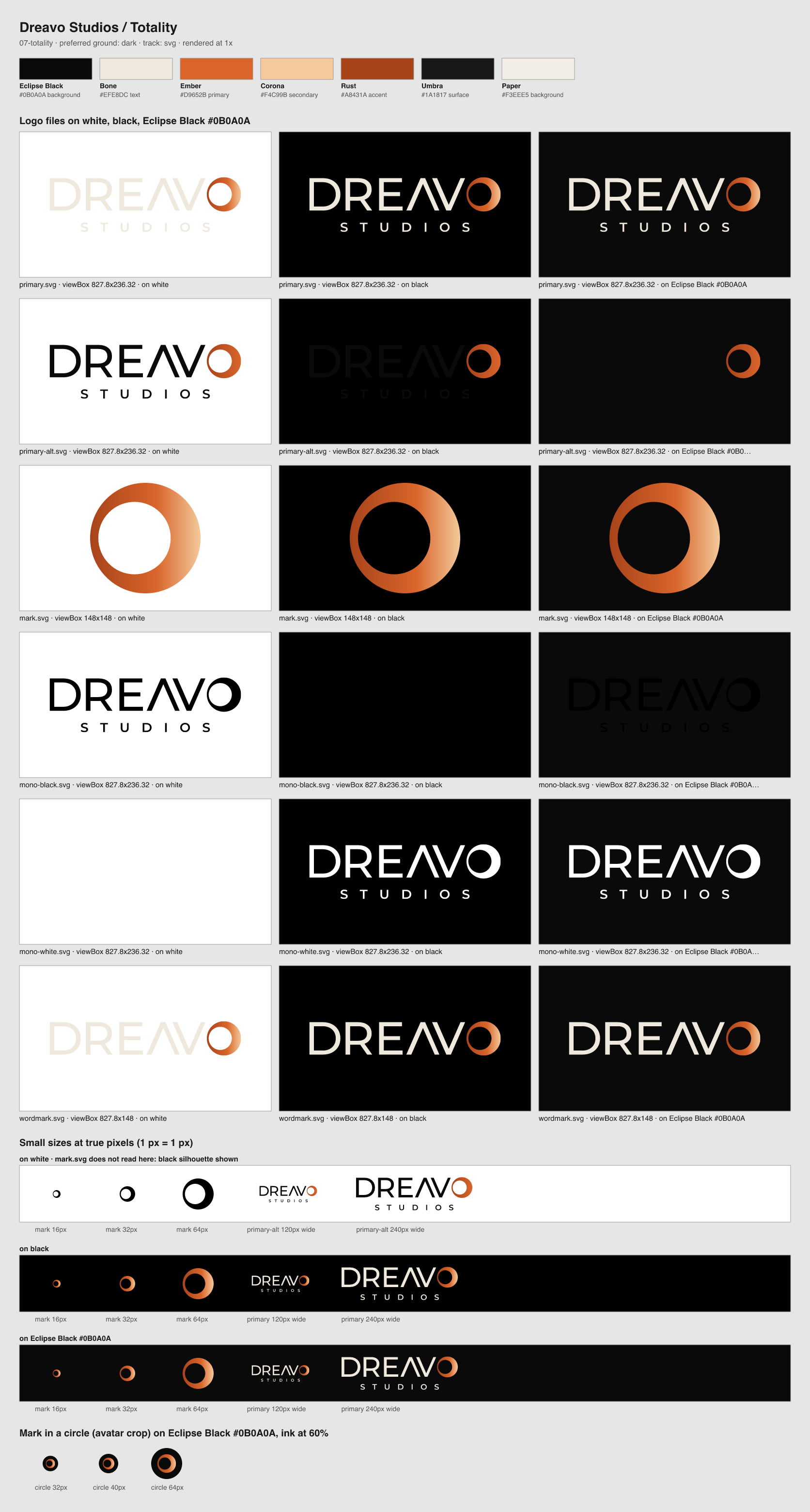
| File | Use when | Do not use when |
|---|---|---|
primary.svg |
The default: Bone lettering and an ember crescent (Rust to Ember to Corona) on Eclipse Black, Umbra, or dark, calm image areas. Title cards, decks, web, the front of the business card. | On light grounds, or below 210 px wide. |
primary-alt.svg |
On Paper and other light grounds: Eclipse Black lettering, the crescent from Rust to Ember. Letterhead, contracts, press notes. | On dark grounds: the lettering disappears. |
mark.svg |
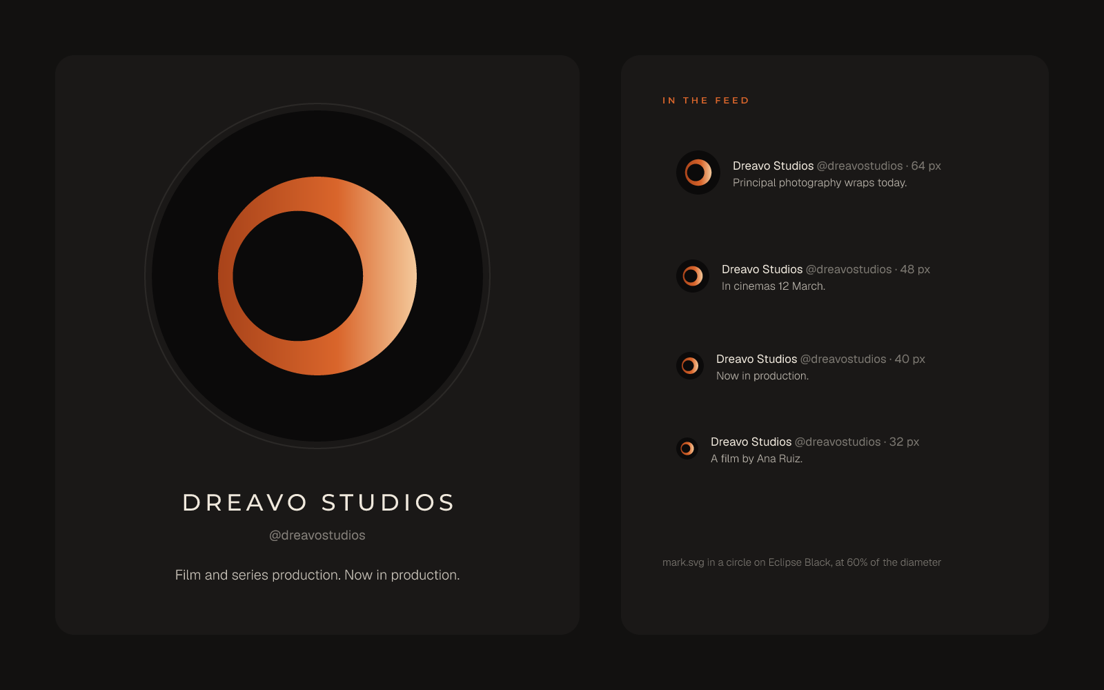
The eclipse alone: avatars, favicons, app icons, watermarks, the back of the card, and anywhere even the wordmark would fall below 160 px wide. It is drawn heavier than the O in the lockup (ring 11 and 40 units on a 148-unit disc, against 8 and 40 in the lockup) so the thin side survives at 16 to 32 px. | As a replacement for the O inside the name: the lockup always uses its own, finer O. |
mono-black.svg |
One-color print on light stock: billing blocks, stamps, engraving, newspaper, fax. | On dark grounds. |
mono-white.svg |
One-color print on dark stock, over photography, and in other studios' billing blocks on dark posters. | On light grounds. |
wordmark.svg |
DREAVO without STUDIOS: billing blocks, end credits and narrow formats where STUDIOS would drop below its minimum (lockup under 210 px wide). Down to 160 px wide. | Where the full company name must appear and space allows the lockup. |
For billing blocks, use wordmark.svg recolored in one flat color: black (as in mono-black.svg) on light posters, white (as in mono-white.svg) on dark ones.
bun lf outline at a 140-unit cap height. DREAV is Montserrat 500 (stem 20 units). STUDIOS is Montserrat 600 at 28% scale, tracked +900/1000 and centered under the full width of DREAVO; it sits one weight heavier so its stems hold at small sizes. Its top is 52 units below the baseline.primary.svg the crescent's linear gradient (gradientUnits="userSpaceOnUse") runs along the horizontal axis from the outer edge of the thin side to the crescent's peak: Rust #A8431A at 0, Ember #D9652B at 0.6, Corona #F4C99B at 1. In primary-alt.svg it runs Rust at 0 to Ember at 1. The mono files are flat.logo/concepts/build.ts final.X = the crescent's width at its peak: 40 units, which is 2 letter stems or 0.29 of the cap height.
primary.svg, primary-alt.svg, the mono files and wordmark.svg, measured from the outermost ink (the O's overshoot on the right, the ends of STUDIOS at the bottom).mark.svg, which is 27% of the disc's diameter. In avatar and app-icon tiles the disc fills at most 60% of the tile.Smallest-detail formula from factory/craft/wordmark-craft.md:
| File | Smallest detail (units) | Width (units) | Screen minimum | Print minimum |
|---|---|---|---|---|
primary.svg and its alt and mono files |
STUDIOS stroke (the S's horizontal strokes, 21.6 × 0.28), 6.05 | 827.8 | 827.8 × 1.5 ÷ 6.05 = 205, so 210 px | 827.8 × 0.2 ÷ 6.05 = 27.4, so 28 mm |
wordmark.svg |
the ring's thin side, 8 | 827.8 | 827.8 × 1.5 ÷ 8 = 155, so 160 px (meets principle 2's billing block) | 827.8 × 0.2 ÷ 8 = 20.7, so 21 mm |
mark.svg |
the ring's thin side, 11 of 148 | 148 | 16 px (recognizable; the thin side is about 1.2 px); details clear from 32 px | 6 mm |
Below 210 px, use wordmark.svg. Below 160 px, use mark.svg, and set the name in type next to it if the audience may not know the brand. The contact sheet shows the primary at 120 px wide only as a check: STUDIOS fills in there, which is why the 210 px rule exists.
mark.svg ring as the O in the name, and do not put the lockup's fine O in an avatar.primary.svg on Paper or other light grounds; use primary-alt.svg.mono-white.svg.| Name | Hex | Role | Usage |
|---|---|---|---|
| Eclipse Black | #0B0A0A | background | The sky at totality. Default ground for the logo, title cards, screens, decks and the avatar; 60 to 70% of any layout. A warm near-black, never pure #000000. |
| Bone | #EFE8DC | text | DREAV, STUDIOS and all text on Eclipse Black and Umbra. Never pure white. |
| Ember | #D9652B | primary | The body of the crescent gradient and the one warm accent per layout: a rule, a date, a role line. Under 5% of any surface. |
| Corona | #F4C99B | secondary | The bright peak of the crescent and the hot core of glows in key visuals. Dark grounds only. |
| Rust | #A8431A | accent | The dim side of the ring, at the cool end of the crescent gradient on both grounds; small text accents on Paper. |
| Umbra | #1A1817 | surface | Panels, cards, deck slides and card stock one step off Eclipse Black. |
| Paper | #F3EEE5 | background | The light ground for print and documents. Carries primary-alt.svg. |
Proportions: Eclipse Black about 65%, Umbra 20%, Bone 12%, and the ember ramp (Rust, Ember, Corona together) 3% or less, except in key visuals, where the eclipse may carry more light.
Approved pairings (WCAG contrast):
| Foreground | Ground | Ratio | Use |
|---|---|---|---|
| Bone | Eclipse Black | 16.2:1 | All text, the logo |
| Bone | Umbra | 14.5:1 | Text on panels and cards |
| Corona | Eclipse Black | 12.9:1 | Crescent peak, large display accents |
| Ember | Eclipse Black | 5.5:1 | Accent text, rules, the crescent |
| Ember | Umbra | 4.9:1 | Accent text on panels |
| Eclipse Black | Paper | 17.1:1 | All text on Paper, primary-alt.svg lettering |
| Rust | Paper | 5.2:1 | Accent text on Paper, crescent in primary-alt.svg |
| Ember | Paper | 3.1:1 | The crescent peak in primary-alt.svg and display type 24 px and up only |
| Rust | Eclipse Black | 3.3:1 | The dim side of the crescent only; never text |
Never pair: Corona on Paper (1.3:1), Bone on Paper (1.1:1), Rust as text on Eclipse Black, Ember text under 24 px on Paper.
| Role | Family | Upright weights | Fallback | License | Usage |
|---|---|---|---|---|---|
| Display | Montserrat | 500, 600 | "Avenir Next", "Helvetica Neue", Arial, sans-serif | OFL-1.1, via Fontsource (fonts/LICENSES.md) |
The face the logo is outlined from. Headlines and titles in caps at 500, tracked +120 to +200/1000. Small caps-only labels, credits, role lines and STUDIOS-style descriptors at 600, tracked +300 to +900/1000. Never lowercase in display. |
| Body | Geist | 300, 400 | "Helvetica Neue", Arial, sans-serif | OFL-1.1, via Fontsource (fonts/LICENSES.md) |
Body copy, decks, captions, UI and legal lines. 400 for text at 14 to 18 px, line height 1.5, tracking 0. 300 for large sentence-case lines (24 px and up) under a Montserrat headline. |
No italics are used.
Hierarchy:
mono-white.svg over a darkened area. The corona may sit behind the logo's O in title cards, at low intensity, as in the title card below.Dreavo writes like a title sequence: names, verbs, facts, short declarative sentences in the present tense. No exclamation marks, superlatives or filler. Totality adds one register: darkness and beginnings, said plainly, never mystically.
Example lines:
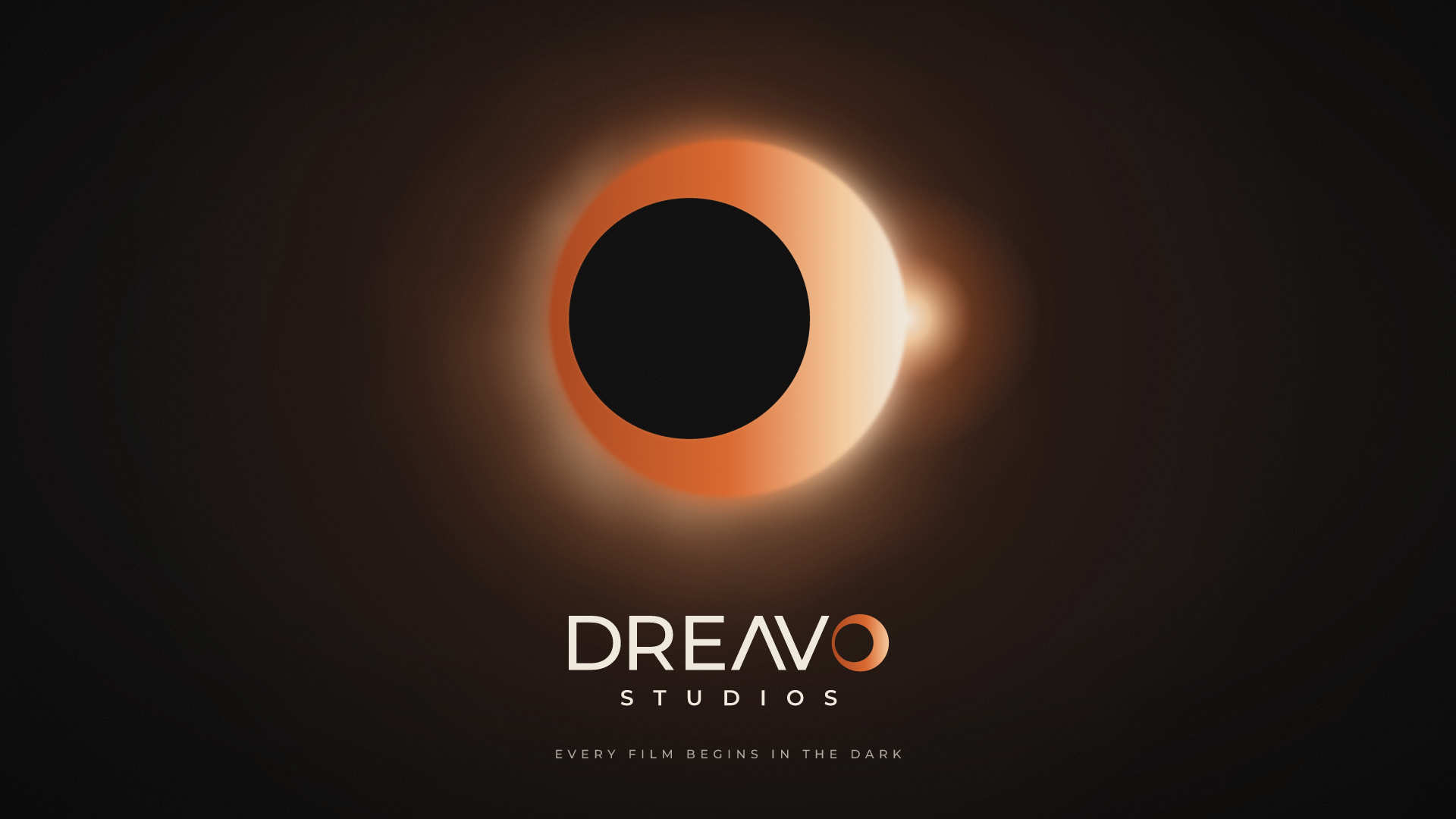
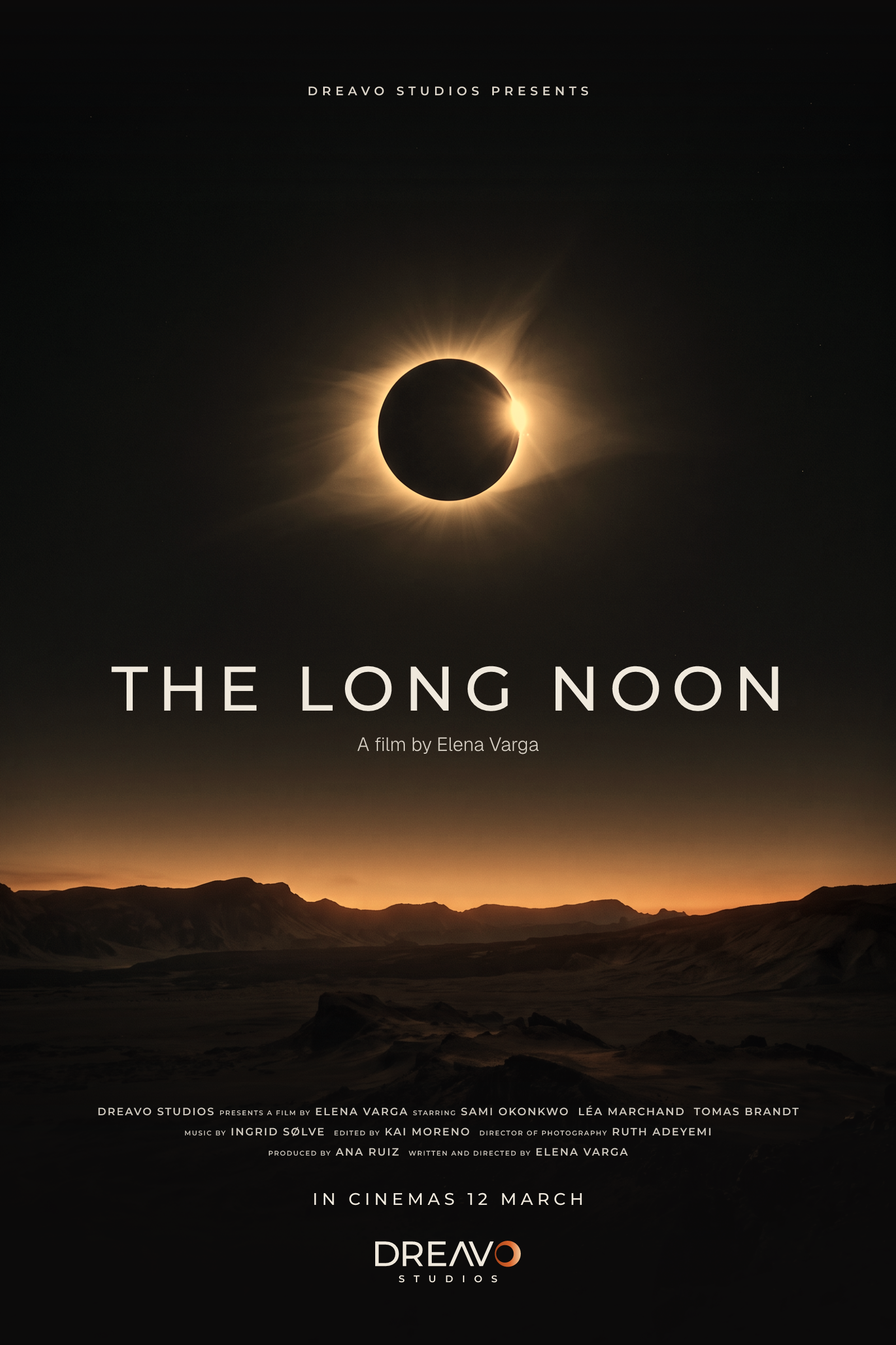
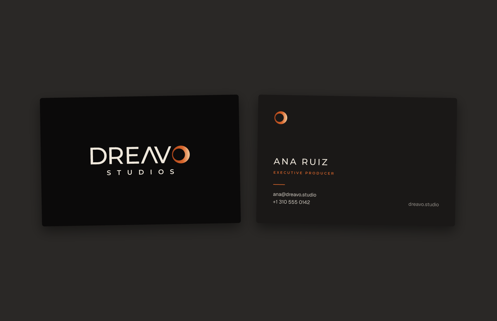
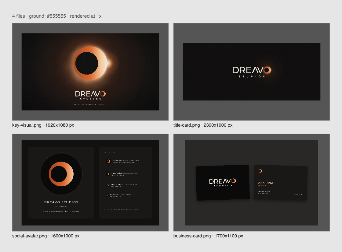
The O becomes a real eclipse: the logo's exact geometry scaled up with corona, bead and atmosphere, and the flat logo crisp beneath it once. A 2:3 one-sheet: a photographic plate graded toward Eclipse Black with warm highlights, "DREAVO STUDIOS PRESENTS" in Montserrat 600 at the top, the title in Montserrat 500 caps, "A film by" in Geist 300, a credits block in Montserrat 600 with the role words at 0.63 size, and primary.svg at the foot at 260 px wide, above its 210 px minimum. The plate is darkened toward the foot so the credits and logo sit on near-black. The ident on Eclipse Black: primary.svg at 28% of the frame width, a quiet corona behind the O, nothing else in frame. mark.svg at 60% of a circular crop on Eclipse Black, holding from the profile size down to 32 px in a feed. 85 × 55 mm. Front: the primary lockup on Eclipse Black stock, with 2X clear space at least. Back: Umbra stock, the mark at 6 mm or more, the name in Montserrat 500 caps, the role in Montserrat 600 Ember, contact lines in Geist 400.