Dreavo Studios
Study 1 of 6
Eclipse
Open the brand book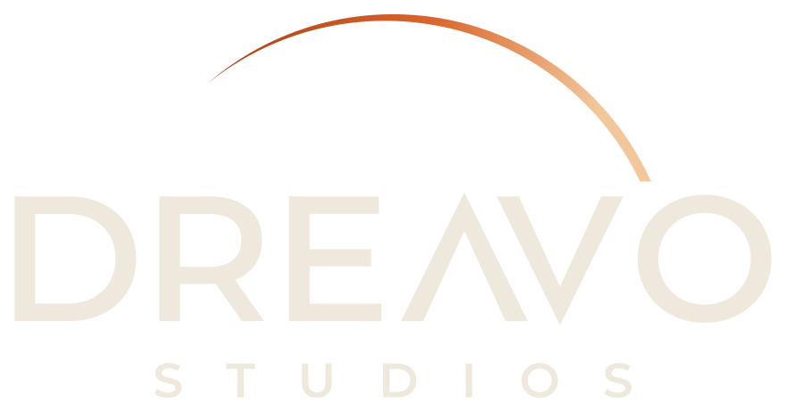
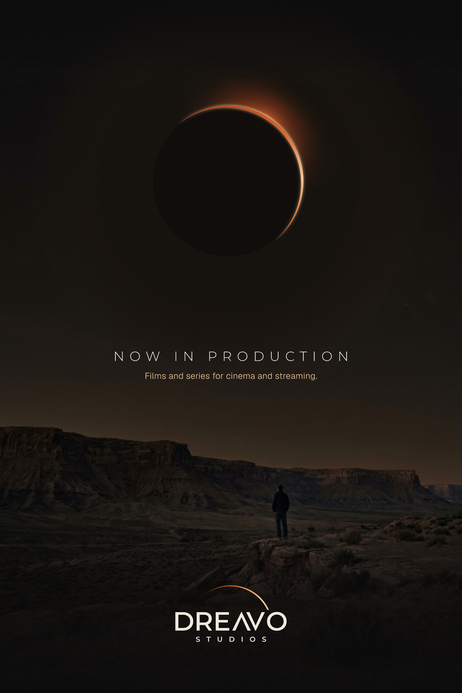
A thin eclipse crescent hangs over the name like the last light before a film begins, with the A drawn as an inverted V mirrored against the V.

- Eclipse Black#0B0A0A
- Bone#EFE8DC
- Ember#D9652B
- Corona#F2C79A
- Rust#A8431A
- Umbra#1A1817
- Vellum#F5F1EA
Dreavo Studios
Aa Bb Cc Dd Ee Ff Gg Hh Ii Jj Kk 0123456789
Montserrat 600 and Geist 400
Study 2 of 6
Splice
Open the brand book
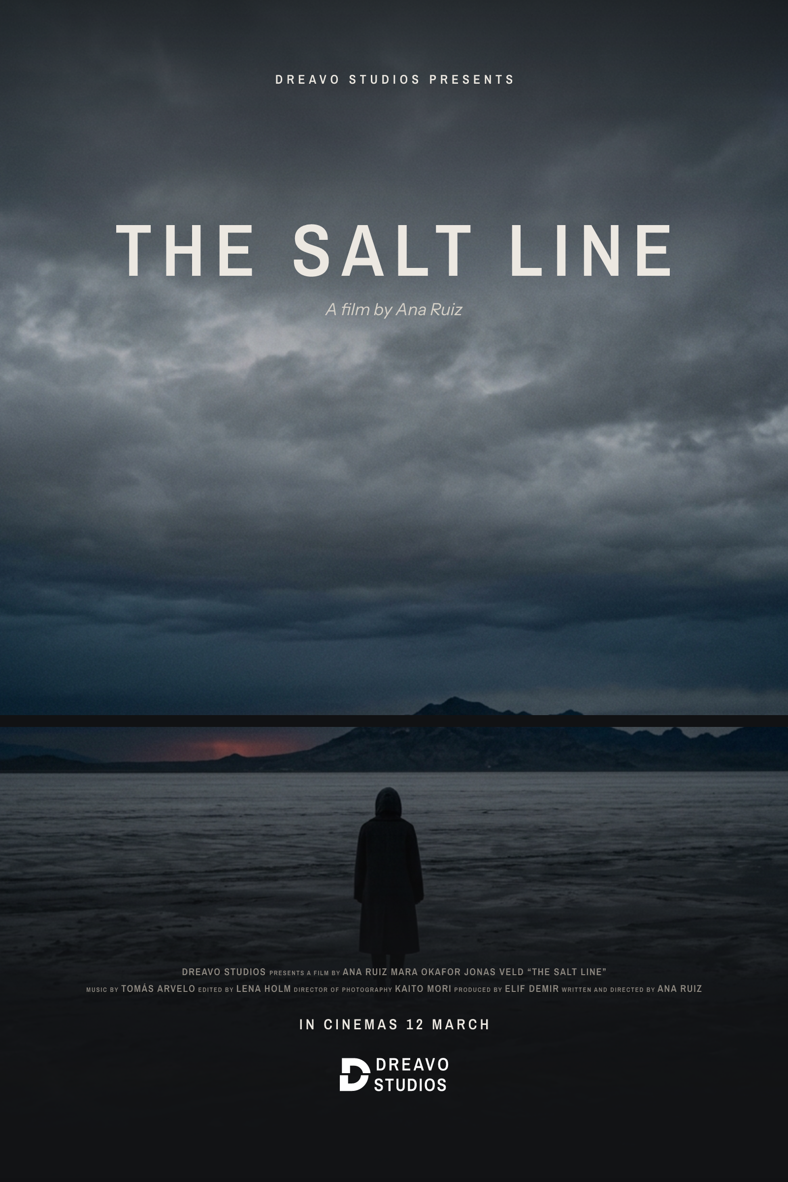
A heavy, monumental D cut once by a horizontal line with its upper half shifted by the width of the cut, the edit that turns footage into a film.

- Cutting Room#111214
- Print Stock#ECE8E1
- Leader#D6D1C8
- Flatbed#1C1D20
- Grain#8E8981
- Paper#F3F0EA
- Safelight#B3341F
Dreavo Studios
Aa Bb Cc Dd Ee Ff Gg Hh Ii Jj Kk 0123456789
Archivo Narrow 600 and Instrument Sans 400
Study 3 of 6
Hinge
Open the brand book
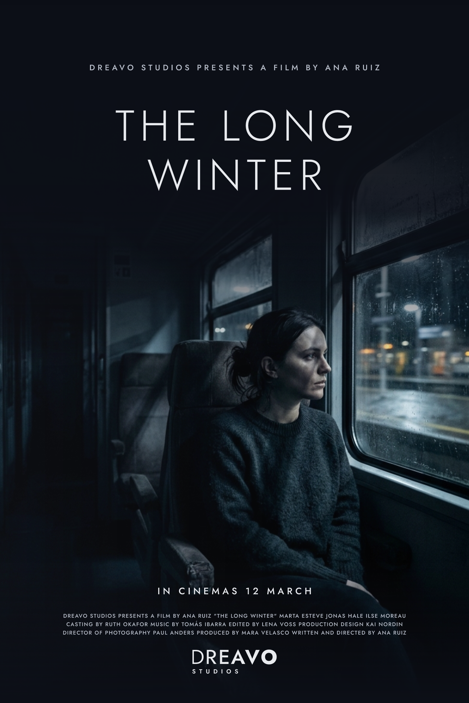
DREAVO in one line of geometric caps that swells without a break from a fine D to a full-weight O, so the name moves from the dream to the bravo like a picture fading in from black.

- House Dark#0B0E16
- Screen#E8EAEE
- Silver#B9BFCB
- Booth#171C28
- Day for Night#7483AB
- Matte#EEEFF2
Dreavo Studios
Aa Bb Cc Dd Ee Ff Gg Hh Ii Jj Kk 0123456789
Jost 500 and Funnel Sans 400
Study 4 of 6
Triads
Open the brand book
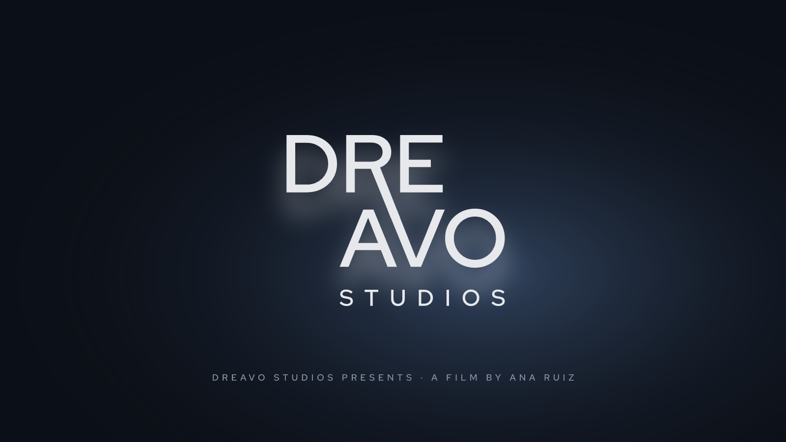
DREAVO stacked as its two spoken beats, DRE over AVO, with the R's leg running on across the line gap to become the V's arm: one stroke carries the dream into the bravo.
- Blue Hour#0B0F17
- Nitrate#E6E8EC
- Script#D3D8E0
- Paper#EEF0F2
- Night Exterior#161D29
- Grade#8A96A8
- Day for Night#4F6E99
Dreavo Studios
Aa Bb Cc Dd Ee Ff Gg Hh Ii Jj Kk 0123456789
Red Hat Display 600 and Red Hat Text 400
Study 5 of 6
Totality
Open the brand book
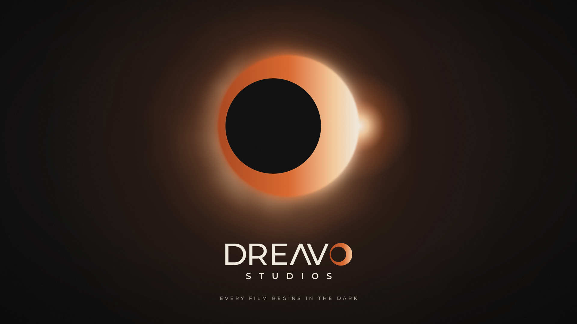
The name ends in an eclipse: the O of Dreavo is the moment the sky closes its eye and the dream begins, a ring hair-thin on one side and a bright crescent on the other.

- Eclipse Black#0B0A0A
- Bone#EFE8DC
- Ember#D9652B
- Corona#F4C99B
- Rust#A8431A
- Umbra#1A1817
- Paper#F3EEE5
Dreavo Studios
Aa Bb Cc Dd Ee Ff Gg Hh Ii Jj Kk 0123456789
Montserrat 600 and Geist 400
Study 6 of 6
Rimlight
Open the brand book
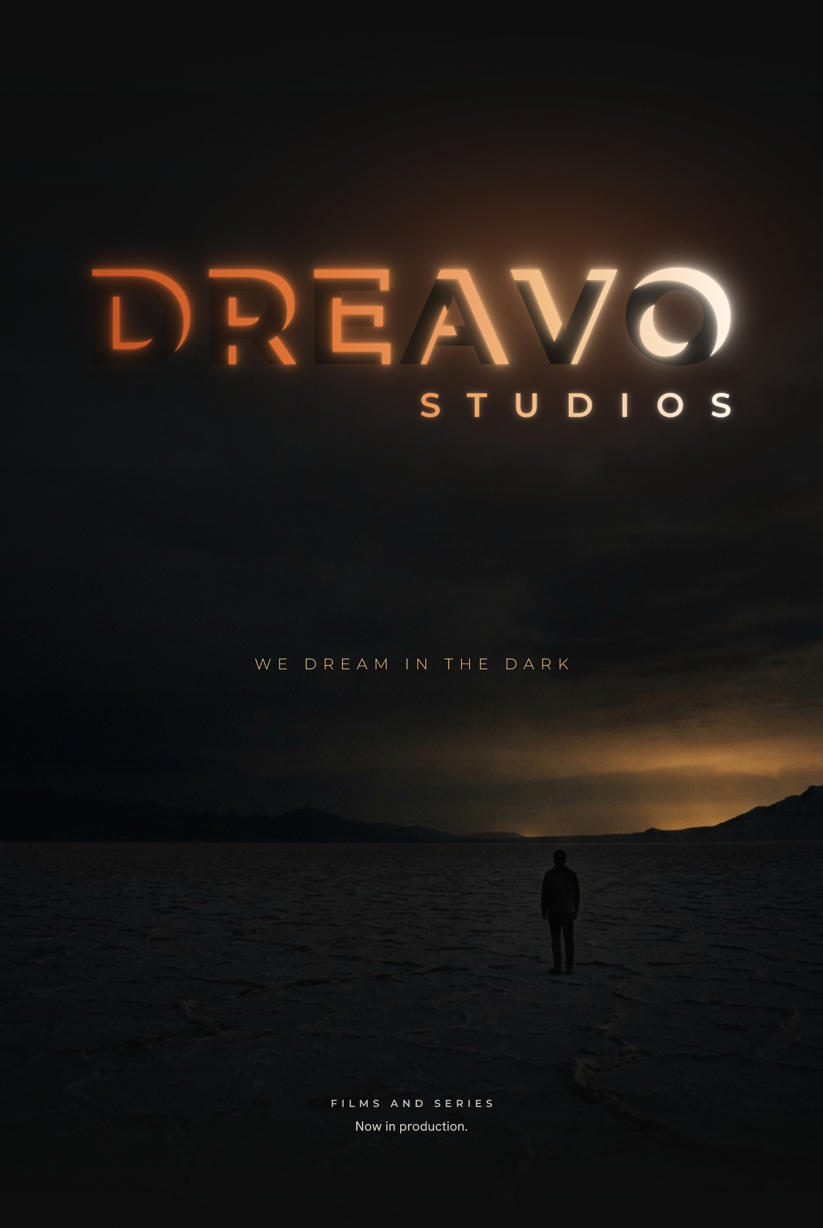
Dreavo means to dream, and we dream in the dark: every letter of the name is eclipsed and drawn only by the light on its upper-right edge, warming from ember at the D to white at the O, the way a title appears when the house lights go down.

- House Dark#0B0A0A
- Bone#EFE8DC
- Ember#E2793A
- Afterglow#F3C08A
- Deep Ember#C2501F
- White Heat#FFF4E6
- Rust#A8431A
- Umbra#181615
- Paper#F3EEE5
Dreavo Studios
Aa Bb Cc Dd Ee Ff Gg Hh Ii Jj Kk 0123456789
Montserrat 800 and Hanken Grotesk 400
Side by side
1
Eclipse
2
Splice
3
Hinge
4
Triads
5
Totality
6
Rimlight
- Eclipse Black#0B0A0A
- Bone#EFE8DC
- Ember#D9652B
- Corona#F2C79A
- Rust#A8431A
- Umbra#1A1817
- Vellum#F5F1EA
- Cutting Room#111214
- Print Stock#ECE8E1
- Leader#D6D1C8
- Flatbed#1C1D20
- Grain#8E8981
- Paper#F3F0EA
- Safelight#B3341F
- House Dark#0B0E16
- Screen#E8EAEE
- Silver#B9BFCB
- Booth#171C28
- Day for Night#7483AB
- Matte#EEEFF2
- Blue Hour#0B0F17
- Nitrate#E6E8EC
- Script#D3D8E0
- Paper#EEF0F2
- Night Exterior#161D29
- Grade#8A96A8
- Day for Night#4F6E99
- Eclipse Black#0B0A0A
- Bone#EFE8DC
- Ember#D9652B
- Corona#F4C99B
- Rust#A8431A
- Umbra#1A1817
- Paper#F3EEE5
- House Dark#0B0A0A
- Bone#EFE8DC
- Ember#E2793A
- Afterglow#F3C08A
- Deep Ember#C2501F
- White Heat#FFF4E6
- Rust#A8431A
- Umbra#181615
- Paper#F3EEE5
Dreavo Studios
Montserrat
Dreavo Studios
Archivo Narrow
Dreavo Studios
Jost
Dreavo Studios
Red Hat Display
Dreavo Studios
Montserrat
Dreavo Studios
Montserrat
Documents
BriefWrittenDreavo Studios is a film production company: films, series, and similar screen work. The user's own framing: "This is all serious business."
Brand folder: brands/dreavo-studios/. Started 2026-11-14.
The brand
Dreavo Studios is a film production company: films, series, and similar screen work. The user's own framing: "This is all serious business."
Audience
The user did not name an audience. Assumed, in order of importance:
- Assumption: people who decide whether to work with the company: financiers and co-producers, distributors and streamer acquisition teams, and directors, writers, actors, and their agents. They meet the logo on pitch decks, the website, market and festival listings, and email signatures. They care whether this is a real studio that finishes what it starts.
- Assumption: audiences, who meet the logo as the production ident before a film or episode and in poster billing blocks and end credits. They care that it looks like the work will be worth their time.
Proof
None yet. The user was asked what backs up the company's claim (track record, past work or slate, people, awards) and gave no answer.
What that means for the positioning: strategy.md cannot cite a reason to believe from facts. Until the user supplies proof, the claim ("the weight of a studio picture") rests on the brand's conduct, so the identity itself has to carry it through restraint and finish. Replace the reason to believe with real slate facts when they exist.
Feel
In the user's words: "No funny shit. This is all serious business. Aim for class, or studio and epic vibes."
- Should feel: serious, classy, epic (studio scale).
- Must never feel: funny or playful. No jokes, no cute shapes, no levity.
- 2026-11-15, after the first four studies: the user added "nuke Inscription and headland. change it. understand and research what dreavo means. and play around with it please" and called the serif body faces "not sexy". The bar is now serious, class, studio, epic, and sexy (sleek, confident, cinematic); nothing playful, bookish, or tech-startup. The light-ground requirement is withdrawn. Details in "Update 2026-11-15" below.
- 2026-11-15, after seeing 07-bookends and 08-reverie: the user rejected both, word for word: "it sucks so bad... how does those represent dreavo?" Letter-shape observations (round D and O, shared lowercase circles) do not count as representing Dreavo; an idea must say something about what the company is.
Competitors and neighbors
None named.
Where the logo lives
The user did not list placements. Assumed, most important first:
- On-screen production ident: opening and closing credits, a title card on black, in 16:9 and scope (2.39:1) frames.
- Poster billing blocks and end-credit logo pages: small, one color, next to other companies' logos.
- Social avatar in a round crop (the user's reference is exactly that) and the website header and favicon.
- Pitch decks, letterhead, business cards.
- Festival and market materials, crew apparel.
Constraints
- Colors to use or avoid: none stated. The reference uses near-black, an ember-orange to warm-white glow, and warm off-white; that palette belongs to study 1 and does not bind the other studies.
- Existing assets to keep: the reference image (see References). It is a concept image, not a finished logo file.
- Tagline: none.
- Languages and scripts: none stated (see Assumptions).
- Off limits: anything funny or playful.
- From the user's reference notes: the eclipse study's logo files stay flat and outlined. The arc and wordmark must survive in one color. The glow belongs in key visuals, and in
primary.svgonly as far as the SVG rules allow (gradients are fine in primary, not in mono).
References
references/eclipse-reference.jpg(copied from the user's file907082120_2220634518485428_1686126464614929489_n.jpg). A round social-avatar crop on near-black. A thin eclipse arc over the upper right of a large circle, with an ember-orange to warm-white glow that fades out along the arc. Below it, "DREAVO" in wide, light-to-regular geometric sans caps in warm off-white; the "A" has no crossbar (an inverted V) and sits against the "V" so the pair reads as mirrored chevrons. Under it, "STUDIOS" small, very widely tracked, centered. Mood: cinematic, premium, quiet, a title card just before the film starts. The user wants this developed into its own study (study 1), built faithfully from the reference.
Studies
4 studies, as the user asked.
- Study 1 is fixed: built faithfully from
references/eclipse-reference.jpg. - Studies 2 to 4: a wide range. Same strategy, clearly different ideas. At least one designed for a light ground (withdrawn 2026-11-15; see "Update 2026-11-15").
- Track: the user stated no preference.
Assumptions
The user answered two short forms and was not available for an interview, so these were decided on their behalf:
- The audience and the order of logo placements above.
- Dreavo Studios is an independent production company, not a major studio or a distributor, working in English for an international market.
- Latin script only; no other languages or scripts need support.
- No tagline.
brand.jsonstays without one. - The full name in the logo is "DREAVO STUDIOS", with "Dreavo" as the distinctive word and "Studios" as the descriptor, as in the reference.
- The reference palette (near-black, ember orange, warm off-white) is a starting point for study 1 only.
- Track mix: three studies on the
svgtrack (including the reference study) and exactly one on theimagetrack, so both production routes get explored. The image study is the one whose idea is organic rather than typographic. - Pronunciation is not settled (DREE-voh, DRAY-voh, and dree-AH-voh are all plausible). No study depends on it.
Update 2026-11-15: after the first four studies
After seeing the four produced studies, the user said, word for word: "nuke Inscription and headland. change it. understand and research what dreavo means. and play around with it please. change body font for Eclipse. I hate it. it's not sexy. same as body font for splice."
02-inscriptionand03-headlandare deleted.01-eclipseand04-splicestay; their body faces were replaced with sans faces.- Two new studies (05, 06) play with the name itself, after research into what "Dreavo" means (
strategy.md, section Name). - Taste signal, read from what was kept and what was rejected: the survivors are dark, sleek, and modern; the rejected ones were light-ground, serif, classical, or pictorial. Bookish serifs are "not sexy". The bar is now serious, class, studio, epic, and sexy (sleek, confident, cinematic); nothing playful, nothing bookish.
- The earlier requirement for at least one light-ground study (section Studies) is withdrawn.
Sign-off
Confirmed by the user on 2026-11-15. No corrections. The Proof question (track record, slate, people) was asked and left unanswered.
StrategyWrittenPrimary: the people who decide to work with Dreavo (assumed in the brief).
Written 2026-11-14. Read with brief.md.
Positioning
For financiers, distributors, streamers, and filmmakers who need to know a production partner will treat their project as a major work, Dreavo Studios is the independent film and series production company that gives every project the weight of a studio picture, because it carries itself with a studio's restraint in everything it puts its name to: no gimmicks, no noise, nothing unfinished.
Reasoning:
- The user's three words, serious, class, and epic, point at one claim: studio weight without studio size. The prestige independents in the landscape each own something else (A24 owns taste and auteurs, Neon owns edge, Blumhouse owns genre), and the majors own scale through heritage symbols. "Studio weight from an independent" is open.
- Swap test: "A24 gives every project the weight of a studio picture" does not ring true (A24 sells taste, not weight); neither does Neon or Blumhouse. The benefit holds.
- The reason to believe is weak today: the brief gives no slate, track record, or awards. Until it does, the identity itself has to prove the claim through its conduct (restraint, finish, no gimmicks). Replace the reason with slate facts when the user supplies them.
Audience
Primary: the people who decide to work with Dreavo (assumed in the brief).
- Who and where: financiers, co-producers, distributors, streamer acquisition teams, and directors, writers, actors, and agents. They meet the logo on a pitch deck cover, the website, a market or festival listing, an email signature, and as the ident in front of a cut they are screening.
- What they already see: strict black-and-white wordmarks from prestige independents (A24, Plan B, Neon's print mark), 3D heritage emblems from majors, and a long tail of small production companies with camera, reel, clapperboard, and lens logos.
- What earns trust: looking like a company that finishes things. The one feeling at first contact is confidence: "this is a real studio."
Secondary: audiences. They see the ident for a few seconds before the film, and the logo small in billing blocks and end credits. They need it to promise that the film will be worth their time and to look at home next to Paramount and A24 logos on the same poster.
Critical sizes:
- Largest: full-screen title card on black, 16:9 and 2.39:1.
- Smallest and hardest: the poster billing block (one color, about 160 px or 20 mm wide, among other logos) and the round social avatar (about 32 to 40 px).
Personality
| Pair | Rules out |
|---|---|
| Serious, not grim | Horror cues: distressed and grunge textures, blood red, cracked, glitched, or dripping letters, skulls, heavy shadow play. |
| Epic, not bombastic | Chrome, bevels, 3D extrusion, lens flares, metallic gold, heroic swooshes, exploding light rays in the logo. Scale has to come from proportion and space. |
| Classic, not nostalgic | Art-deco pastiche, golden-age searchlights, film reels, sprocket holes, sepia, retro badges, Trajan-style movie-poster capitals. |
| Quiet, not anonymous | A default sans set at medium weight with nothing drawn; a logo that could belong to any production company. One feature must be unmistakably Dreavo's. |
Voice
Dreavo writes like a title sequence: names, verbs, facts. Short declarative sentences in the present tense. No exclamation marks, no superlatives, no marketing filler. It uses "film", "series", "production", "slate", names, and dates. It avoids "content", "creatives", "passionate", "epic" (the work should be epic; the copy never says so), and emoji.
- Say less, mean it. Do: "Now in production." Don't: "We're so excited to finally share our amazing new project!!"
- Credits, not copy. Do: "Dreavo Studios presents a film by Ana Ruiz." Don't: "Your one-stop partner for premium creative content."
- Confident, never loud. Do: "In cinemas 12 March." Don't: "The most unforgettable film of the year!"
Competitors and visual landscape
No competitors were named in the brief, so the audit covers the companies the primary audience compares a production partner to.
| Company | Logo type | Shape language | Type | Color and ground | Recurring device |
|---|---|---|---|---|---|
| A24 | Wordmark, no symbol | Sharp, high stroke contrast | Custom-drawn Didone-style capitals and figures; the A and 4 echo each other | Strict black and white | Fixed mark, re-skinned per film (googly eyes, foliage, bronze) |
| Neon | Wordmark | Wide caps drawn as hollow double-line tubes, rounded corners | Custom inline caps | Black on white in print; red or tinted on screen | A live-action neon sign that flickers on |
| Plan B | Wordmark | Rectangular box | Condensed bold sans caps reversed out of a box | Black and white | Re-tinted per film |
| Mubi | Symbol plus wordmark | Seven circles in a cluster | Sans caps (Riforma) | Black and white; film-matched colors in sub-brands | Seven dots for "the seventh art" |
| Legendary | Symbol plus wordmark | Interlaced square knot | Wide, widely tracked geometric sans caps | Silver and gold on screen; black or white in print | Celtic knot, light streaks |
| Annapurna | Monogram plus wordmark | Large single "A" | Sans caps, "PICTURES" small and wide | White on black | Glow and VHS static |
| Focus Features | Wordmark | Letters revealed by light | Sans caps, "FEATURES" small | White on black | Light, an out-of-focus "O" |
| Skydance | Wordmark (formerly with a sun) | Serif caps with an arch of light | Minion-based serif | Purple space, sun, light | The sun, a drawn arc of light |
| Majors (Paramount, Universal, Columbia, 20th Century, Warner Bros., DreamWorks) | Emblems | Scenic or heraldic 3D objects | Serif or script, often custom | Blue skies, gold, chrome | Mountain and stars, globe, torch lady, monument and searchlights, shield, boy on the moon |
Category conventions (what everyone does):
- White on black is home. Idents are title cards on black. Prestige independents run strict black-and-white wordmarks (A24, Plan B, Neon in print).
- Light is the hero of the ident. Light reveals the letters (Focus), a sun and an arc of light (Skydance), a glow (Annapurna), light streaks (Legendary), searchlights (Searchlight, 20th Century).
- All-caps name over a small, widely tracked descriptor (LEGENDARY, ANNAPURNA / PICTURES, FOCUS / FEATURES).
- A fixed mark, re-skinned per film. A24, Neon, Plan B, Annapurna, and Legendary all recolor or restage their logo for individual films, so the mark has to survive any treatment.
- The small-company cliché: reels, clapperboards, film strips, camera lenses and apertures, play buttons, stars.
Open space (what nobody does):
- Few prestige independents have a symbol that works alone in an avatar; A24, Plan B, and Neon are type only. Mubi's dots are the exception.
- No one owns a light-ground primary; every identity is built for the black title card.
- No one draws on the grammar of filmmaking (the cut, the shot, the frame, the scale of a wide shot). Everyone uses its hardware (reels, lenses) or its light.
- Scale through composition, not chrome: majors show scale with 3D scenery; the independents do not show it at all.
What Dreavo does with them: follow conventions 1 and 3 so the brand reads as a film company at first sight. Break convention 2 in the logo files: the logo never depends on light or effects to work, and light lives in the motion ident and key visuals. Treat convention 4 as a requirement (principle 1). Avoid convention 5 entirely (principle 3). The reference study deliberately sits close to convention 2 (an eclipse is light); it must earn its place through a flat, one-color arc. Note that Legendary's wordmark is a wide, widely tracked geometric sans, close to the reference's lettering style, so the reference study's custom A and V must carry its distinctiveness.
Verified and unverified. Verified by viewing the logo files: A24, Neon, Plan B, Mubi, and Legendary (their Wikimedia Commons SVGs, rendered side by side on 2026-11-14). Verified by web search, from secondary sources only (fan-maintained logo wikis such as the Audiovisual Identity Database and Closing Logo Group, logo-history blogs, It's Nice That and Creative Bloq for Mubi, Variety for Searchlight, Fast Company and NewscastStudio for Skydance): the ident descriptions, re-skinning per film, Annapurna's monogram and glow, Focus's light reveal, Skydance's sun, arc, and Minion-based serif, Mubi's seven dots and Riforma, and Legendary's knot and sans. Typeface identifications from the wikis (for example Annapurna's) are unverified. From memory and unverified: the majors' emblems as described in the last row, and the claim that small production companies cluster around camera, reel, and clapperboard symbols (consistent with marketplace listings seen in search results, but not audited). No competitor's own website was visited.
Name
Researched 2026-11-15 (web search, Wiktionary, Behind the Name, Forebears, the App Store; sources in research/notes.md). Rendered forms: research/name-forms.png.
Finding: Dreavo is a coined name. None of the dictionaries and name databases checked lists "dreavo" as a word or explains it. What it carries is associations, ranked by how strongly a viewer feels them.
Verified facts
- Surname. Forebears lists Dreavo as a surname with about 6 bearers, most in Moldova (2014 data); it gives no meaning.
- Existing uses. "AI Dream Interpretation DREAVO", an iPhone app by Barys Bandarenko in the App Store's Entertainment category (v1.0 April 2023), black-and-white design; a "Dreavo ASMR" YouTube channel of AI bedtime stories; social handles. No film company of that name was found. Near names: Dreav Studio (jewelry, Etsy), DRAV Studios (VR games), Studio Drevo (architecture, Ljubljana), and a US trademark DRAVO held by Draco Evolution Corp. (seen on a secondary listing, not checked at the USPTO). USPTO, EUIPO, and WIPO were not searched: run a trademark search, including Dravo and Dreevo, before launch.
- Slavic drevo. Proto-Slavic *dȇrvo "tree, wood" gives Slovene and Slovak drevo, Czech dřevo, Russian дерево, and Old Church Slavonic дрѣво (drěvo), spelled with the letter yat (ѣ). Bulgarian has дряво (drjávo), and Macedonian and Bulgarian dialects древо; Russian keeps древо as a bookish word, used in древо жизни "tree of life" and родословное древо "family tree".
- Romanian "ea". Romanian loanwords from Old Church Slavonic render yat as ea: veac from вѣкъ "century", leac from лѣкъ "remedy". In the Romanian Cyrillic alphabet (used until the 1860s) ѣ was read as ea. So дрѣво, read the Romanian way, is spelled "dreavo" letter for letter. But Wiktionary lists no Romanian borrowing of this word, and no source attests "dreavo" as a word or derives the surname from it.
- Esperanto. revo means daydream, vision, wish (from French rêve); avo means grandfather (from Latin avus). Esperanto has no suffix -avo, and "dreavo" does not parse in Esperanto. revo sits in the name only with two letters added (D and A); drevo needs one (A).
- Italian -avo and avo. -avo is the first-person imperfect ending of Italian -are verbs: sognavo = "I was dreaming", stressed sognàvo. The standalone Italian noun avo means ancestor, forefather. English bravo is from Italian bravo, which in Italian also means skilled, capable.
- Old English drēam. Before it meant "dream", the Old English word meant joy, music, and revelry (Wiktionary, dream, etymology).
- VO. The initialism for voice-over, the screenplay's V.O.
- Drea. An English given name, a short form of Andrea (Behind the Name); Andrea goes back to Greek andreios "manly". The actress Drea de Matteo is a known bearer.
Associations, strongest first (readings, not etymology)
- Dream. DREA is the first four letters of DREAM, and English speakers hear it first. Faint undertone: the same four letters begin dread and dreary; the bright ending outweighs it.
- Bravo. -AVO is the last three letters of BRAVO, and the ending sounds like applause and like Italian or Spanish words (bravo, octavo, centavo). Spelled out, DREA(M) and (BR)AVO overlap on one letter, the A; it is also the stressed vowel if the name rhymes with bravo. "Dream" + Italian -avo also gives a pseudo-Italian "I was dreaming", felt only by Italian speakers.
- Tree, wood. Felt by Slavic speakers (Slovene, Slovak, Serbo-Croatian Ekavian, Macedonian and Bulgarian dialects, literary Russian), who hear drevo or древо. Through the Romanian-yat reading above it is a plausible root for the Moldovan surname, but that link is my inference, unverified.
- Weak or negligible: Drea (the name, "manly"), Esperanto revo and avo, Italian avo "ancestor", Latin avus "grandfather", the joy and music in Old English drēam, and the film codes VO (voice-over) and AV (audiovisual), which only filmmakers will spot. Nobody reading the logo will feel them; do not build on them.
Pronunciation. Not settled: DREE-voh (from "dream"), DRAY-voh (like Slavic drevo), dree-AH-voh or dreh-AH-voh (three syllables, rhyming with bravo and stressed like Italian sognàvo). Read the Romanian way, ea is one diphthong, "ya" (Romanian Udrea is /ˈu.dre̯a/), so a Moldovan bearer would likely say DRYAH-voh. English speakers who know Dr. Dre may say DRAY. No study may depend on one; 05 and 06 favor dre-AH-vo but stay readable either way.
The word as form (my reading, checked against renders in Geist, Montserrat, Red Hat Display, Instrument Sans, Archivo Narrow, Lexend Exa, and Jost)
- Six letters, no repeats. Pattern D R E A V O = consonant, consonant, vowel, vowel, consonant, vowel: three open vowels and three voiced consonants, so it sounds smooth.
- Two triads. D, R, and E all stand on a vertical stem at the left; A, V, and O have no stem and are each mirror-symmetric. The break falls between E and A, where the spoken break dre | avo falls.
- Bookends. The round D opens the word and the round O closes it; D, E, and O are also symmetric top to bottom.
- A and V. Mirror images; the classic kerning pair, and "AV" reads audiovisual. Owned by 01-eclipse.
- Mirrored left to right: AVO becomes OVA and stays readable; DRE does not. Flipped top to bottom: D, E, and O are unchanged, R breaks, A and V swap. Rotated 180°: unreadable in caps; in lowercase the d becomes a p.
- Lowercase. One ascender (the d) and no descenders: a flat band with one stroke standing up at the start. In a single-storey face (Jost) d, e, a, and o share one bowl. A raised d stem reads as a musical half note.
- Stacked. DRE over AVO splits at the triads; AVO sets wider than DRE. DR / EA / VO puts EA in the middle.
- Width. DREAVO and STUDIOS set close to the same width at equal cap height, so a justified two-line block works.
- Monograms. D alone (owned by 04-splice); D·S (used by the rejected Inscription). R and E alone read as film and game ratings.
Readings to avoid. EA set as a ligature points at Electronic Arts. DV reads as digital video. "reave" (archaic: to plunder) is hidden in the middle and harmless. "Avo" is Australian and South African slang for avocado; harmless inside the word, but do not isolate AVO with a playful treatment.
What this gives the studies. Each study takes one reading of the name, and no two share it:
- 01-eclipse: the A V mirror. The crossbar-less A against the V, from the user's reference.
- 04-splice: the D. The opening bookend as one monumental letter, cut once.
- 05-hinge: dream into bravo. One line that turns from fine to heavy inside the A, the letter DREA(M) and (BR)AVO share.
- 06-triads: the two beats of three. DRE over AVO, split where the word splits when spoken, joined by one diagonal.
Design principles
Scored at review on a 1 to 5 scale. Each traces to the brief's tone or a fact above.
- Survives in one flat color. In solid black on white and solid white on black, every part of the logo stays separate and the idea still reads; glow, gradient, or texture may enrich the primary but carry nothing. Violation: an arc or edge that only exists as a glow, parts that merge in mono, or a gradient doing the work of the shape. (From "Epic, not bombastic", convention 4, and the user's note on the reference.)
- Holds in a billing block and a round avatar. The full lockup is legible at 160 px wide in one color, and the mark alone is recognizable at 32 px inside a circular crop. Violation: hairlines or a STUDIOS line that fills in or vanishes at 160 px, or a mark that turns into a dot at 32 px or loses its key feature to the circle crop. (From the audience's critical sizes.)
- No stock cinema and no levity. None of these appear: reels, film strips, clapperboards, lenses or apertures, cameras, projector beams, stars, laurels, play buttons, Trajan-style poster capitals, chrome or bevels, rounded or bubbly letters, scripts, mascots, bright primary colors. Violation: any one of them in the logo. (From the brief's "no funny shit", "Classic, not nostalgic", and convention 5.)
- One drawn feature you can name. The logo contains at least one element that no stock font or clip art supplies (a custom glyph, a cut, a constructed symbol), and you can point at it in one short phrase. Violation: an unmodified typeface next to a generic shape, or a feature that takes a paragraph to explain. (From "Quiet, not anonymous".)
- Two elements, one weight logic. The lockup holds at most a symbol and the name (STUDIOS counts as part of the name); strokes use one weight or one fixed ratio of weights; nothing is decorative. Violation: swooshes, sparkles, orbiting dots, a tagline inside the lockup, or three or more unrelated stroke weights. (From "Serious, not grim" and the user's "class".)
DirectionsWrittenNo two rows share a logo construction, but 01 and 07 share an idea: 07 is the eclipse pushed into the O, and the review compares the two as variants. 08 takes the same eclipse light into every letter. All six are on…
Written 2026-11-14, reworked 2026-11-15 after the user rejected Inscription and Headland. Each study below has its own folder in studies/ and its own concept.md.
Studies
| id | Idea | Logo type | Track | Ground | Different from every other study because |
|---|---|---|---|---|---|
| 01-eclipse | A thin eclipse crescent over the name like the last light before a film; the A drawn without a crossbar as Λ, mirrored against the V (from the user's reference) | Combination: crescent symbol above wordmark; mark is the crescent over ΛV | svg | dark | The only study built on light and the only thin geometric curve; wide geometric caps (Montserrat-based) with STUDIOS widely tracked; warm Ember palette |
| 04-splice | A monumental D cut once horizontally, its upper half shifted by the cut's width, the edit that turns footage into a film; the cut carries into the key visuals | Lettermark plus two-line wordmark; mark is the cut D | svg | dark | The only lettermark and the only cut; the heaviest, rectilinear slab with condensed grotesk caps (Archivo Narrow); the grammar of editing, not light |
| 05-hinge | DREA(M) and (BR)AVO share the A: one line of geometric caps that gains weight from a fine D to a full-weight O, turning inside the A | Wordmark; mark is the hinge A | svg | dark | The only study built on stroke contrast and the only one that reads the name's sound as meaning; one line, no symbol beside the name (Jost-based) |
| 06-triads | DRE stacked over AVO, the name's two spoken beats, with the R's leg running on across the gap as the V's left arm | Stacked wordmark (the two-row block is the symbol); mark is V and O with the long arm | svg | dark | The only stacked composition; one weight throughout (Red Hat Display); its feature is a stroke carried across two rows, not light, a cut, or contrast |
| 07-totality | The O of DREAVO is the eclipse, the moment the dream begins in the dark: a ring hair-thin on one side, a bright crescent on the other; the O alone is the mark (from the user's "Dreavo basically means to dream" and their eclipse logo, approved from sketches) | Wordmark with the symbol inside it; mark is the eclipse O | svg | dark | The same eclipse idea, Λ V wordmark, and Ember palette as 01, pushed into the name: the only study whose symbol is a letter of the name rather than set beside it |
| 08-rimlight | Dreavo means to dream, and we dream in the dark: every letter eclipsed and drawn only by the light on its upper-right edge, warming from ember at the D to white at the O (approved from sketches) | Wordmark; mark is the rim-lit D | svg | dark | The only study where the letters themselves are eclipsed; drawn by edge light rather than strokes, the only lockup that is mostly darkness |
No two rows share a logo construction, but 01 and 07 share an idea: 07 is the eclipse pushed into the O, and the review compares the two as variants. 08 takes the same eclipse light into every letter. All six are on dark grounds: the user's taste after the first round (2026-11-15) is dark, sleek, and modern, and the earlier requirement for a light-ground study is withdrawn. 05 and 06 both notice that the name breaks between E and A; 05 uses it for meaning (one line, a weight swell), 06 for structure (two rows, one weight).
Ideas dropped
Dropped after production (2026-11-15):
- 02-inscription: the name carved as an equal-width block of glyphic serif capitals, abbreviated D·S. Rejected by the user after production. Learned: chiseled serif capitals on a light ground read as institution, memorial, or publisher, not as a studio; anything bookish is "not sexy" to this user.
- 03-headland: a solid headland with a small figure at its edge, in an old-style serif. Rejected by the user after production. Learned: pictorial, organic symbols and light grounds miss the taste; the user wants sleek, constructed, cinematic marks on dark. Scale belongs in key visuals, not in a drawn landscape.
- 07-bookends: a solid O-roundel whose counter is a D, above wide light capitals. Rejected by the user after production ("how does those represent dreavo?"). Learned: built from a letter-shape observation (D and O are round), which says nothing about what Dreavo is.
- 08-reverie: lowercase
dreavoin a hairline with a tall d whose stem carriesstudios. Rejected by the user after production. Learned: built from a letter-shape observation (the lowercase letters share a circle), which says nothing about what Dreavo is.
Dropped at the first round (2026-11-14):
- Letterbox or camera gate: the name framed by 2.39:1 mattes. Too close to Plan B's boxed wordmark, and a rectangle with something inside has no silhouette of its own (logo-principles check 3).
- Soundstage barrel roof: the studio building as a symbol. Reads as a warehouse or hangar, logistics rather than film.
- Theatre curtain: heavy drapery parting. Stage, not screen, and nostalgic ("Classic, not nostalgic").
- AV ligature: A and V fused as the audiovisual pair. That mirror is the reference study's signature; a second study on it would be a variation of 01.
- Desert dune with a lone figure: the first version of Headland. Too close to Legendary's Dune films; replaced by a rock headland.
- Brush-stroke D: a single ink gesture forming the D. Reads as calligraphy or martial arts and fails "Serious, not grim" toward arty.
- Projector beam, searchlight, or light rays: the category's main convention, already covered by 01, and close to banned stock cinema hardware (principle 3).
- Film reel, clapperboard, lens or aperture, film strip: banned by principle 3.
- Monolith slab without a letter: a rectangle with no silhouette and a direct 2001 quotation; its weight survives in 04 as a letter.
Name ideas considered for 05 and 06 and dropped (2026-11-15; findings in strategy.md, section Name):
- Dream as a picture (moon, closed eye, cloud, spiral, floating letter): every literal dream image is a cliché, cute, or a moon that collides with 01. The App Store already has a dream-interpretation app called Dreavo, so leaning on "dream" literally also points at it.
- Drevo as a tree (tree of life, growth rings, branching V): pictorial and organic, the lesson of Headland; rings read as a target or a film reel (principle 3). Viewers outside Slavic languages do not hear "tree".
- Lowercase dreavo with the d's ascender raised as a lone tree: a lowercase d with a long stem is a half note in music, and lowercase reads approachable, against "serious business".
- Reflection on a black floor: D, E, and O survive a top-to-bottom flip, but A and V swap, which is 01's A V territory, and a glossy reflection is a 2000s cliché.
- D and O as bookends (one circle, D inside O, interlocked D and O): circle geometry close to 01's crescent, and a D-based mark next to 04's; interlocked rounds approach Dolby's double D.
- E rotated to make the M of DREAM: a puzzle; playful.
- Accent or diaeresis to fix the pronunciation (DREÁVO, DREÄVO): decides the pronunciation for the user, breaks handles and URLs, and the umlaut reads as heavy-metal or German.
- Yat ligature (Ѣ for EA): illegible to the audience, and any EA ligature collides with Electronic Arts' EA mark.
- VO as "voice-over": a pun; playful.
- Six-step weight gradient, D to O: an inconsistent-font look and six weights against principle 5; the two-weight version became 05.
- The name cropped by a scope frame, "too big for the screen": epic, but illegible at 160 px (principle 2), and about composition rather than the name.
- Anamorphic squeeze (the name narrow on the negative, wide on screen): film grammar, not the name, and too close to 04's grammar-of-editing angle.
ReviewAwaiting sign-off, Gate 3The table is split in two so six columns stay readable; both halves use the same rows and the same 1 to 5 scale.
Studies compared against the design principles in strategy.md. Gallery: bun lf gallery --serve. Rendered evidence: research/review/.
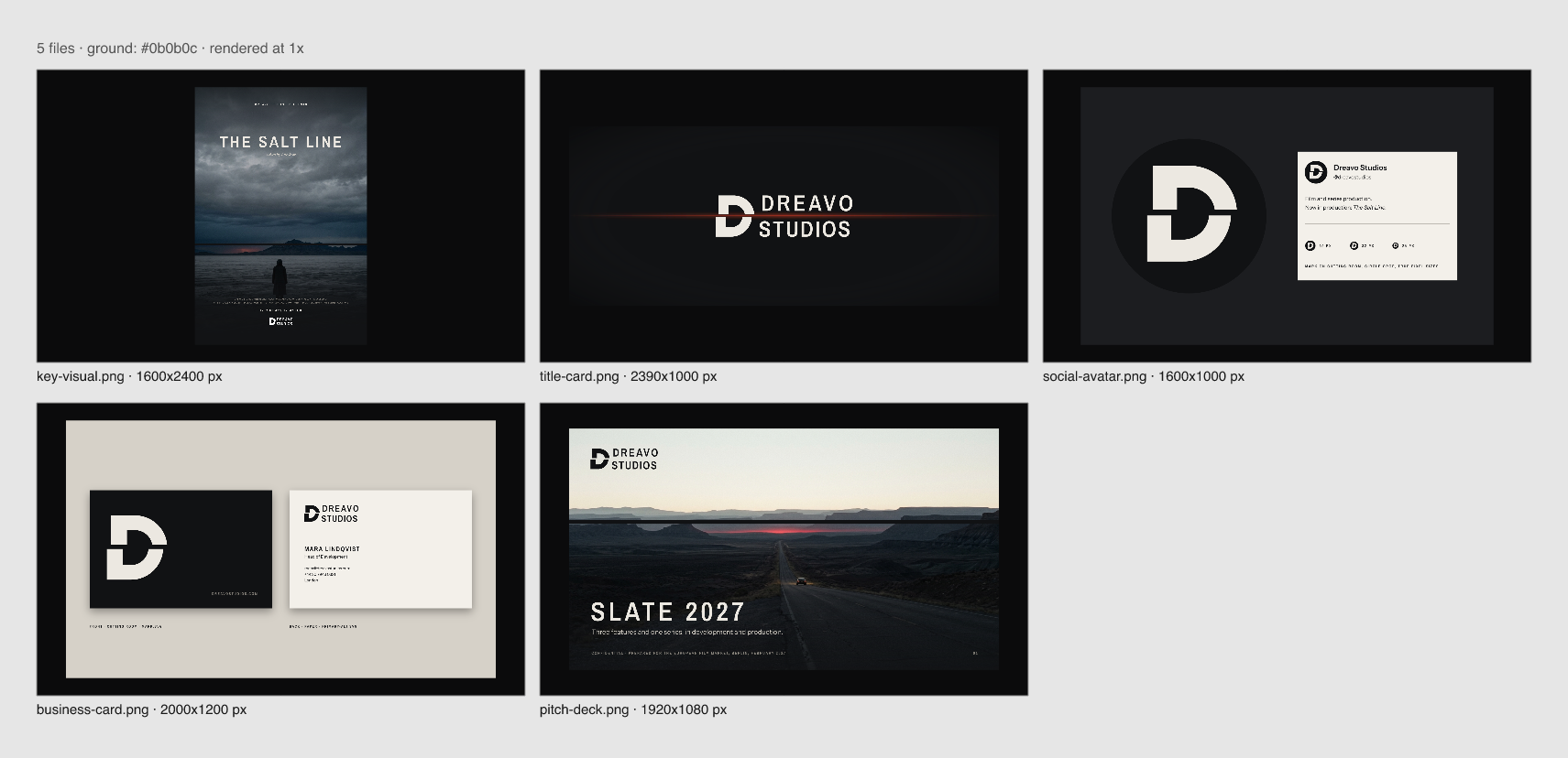
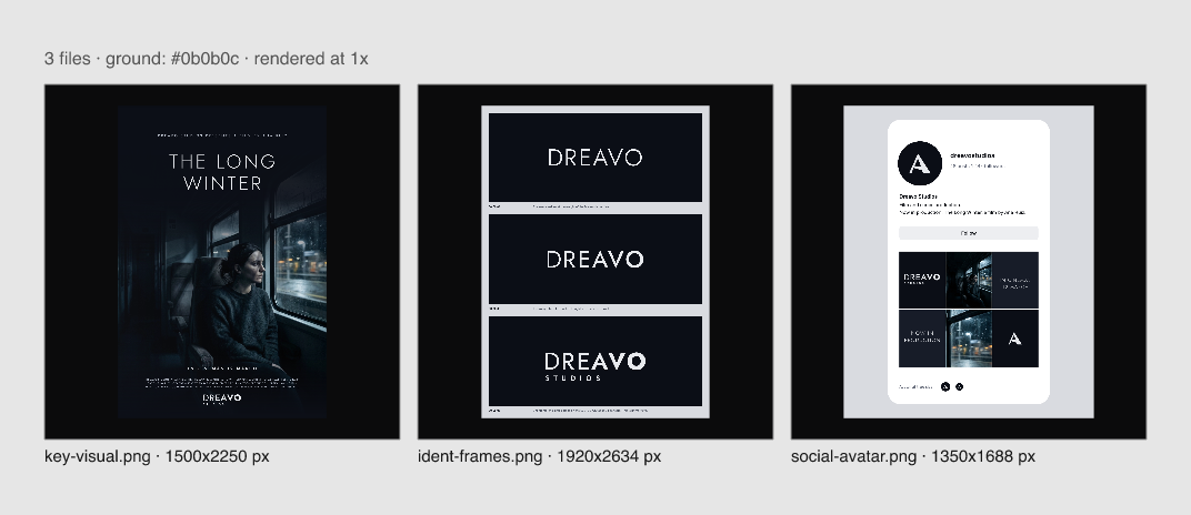
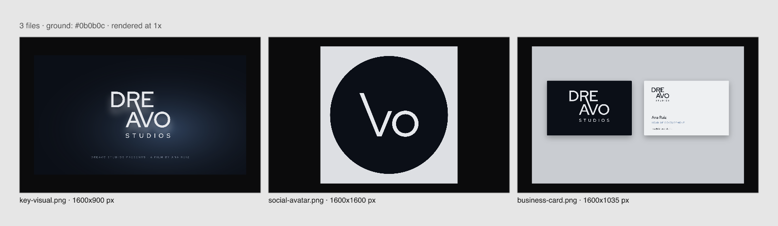
Reviewed 2026-11-15. Six studies: 01-eclipse (the user's reference), 04-splice, 05-hinge, 06-triads, and two made after the user said Dreavo "basically means to dream", both grown from their eclipse logo: 07-totality and 08-rimlight. Inscription, Headland, Bookends, and Reverie were rejected by the user after production and are not scored (see directions.md). Logos were scored first on the shared mono sheets (mono-white.png, mark.png, all six side by side), then each study's logo/sheet.png small-size rows, then the applications (apps-01.png, apps-04.png, apps-05.png, apps-06.png, apps-07.png, apps-08.png). The designers' self-scores were not used.
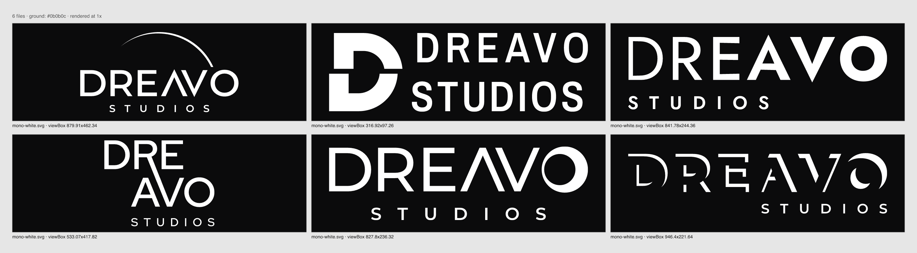
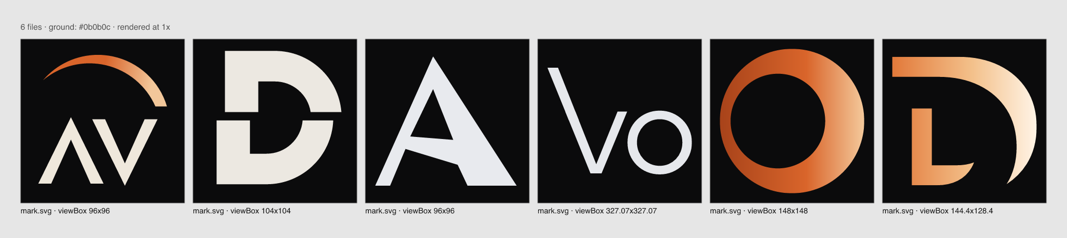
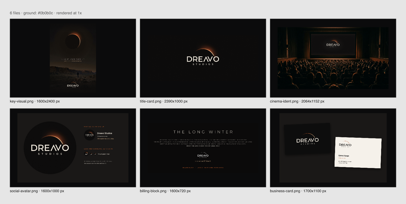
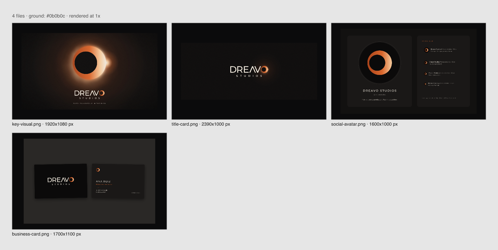
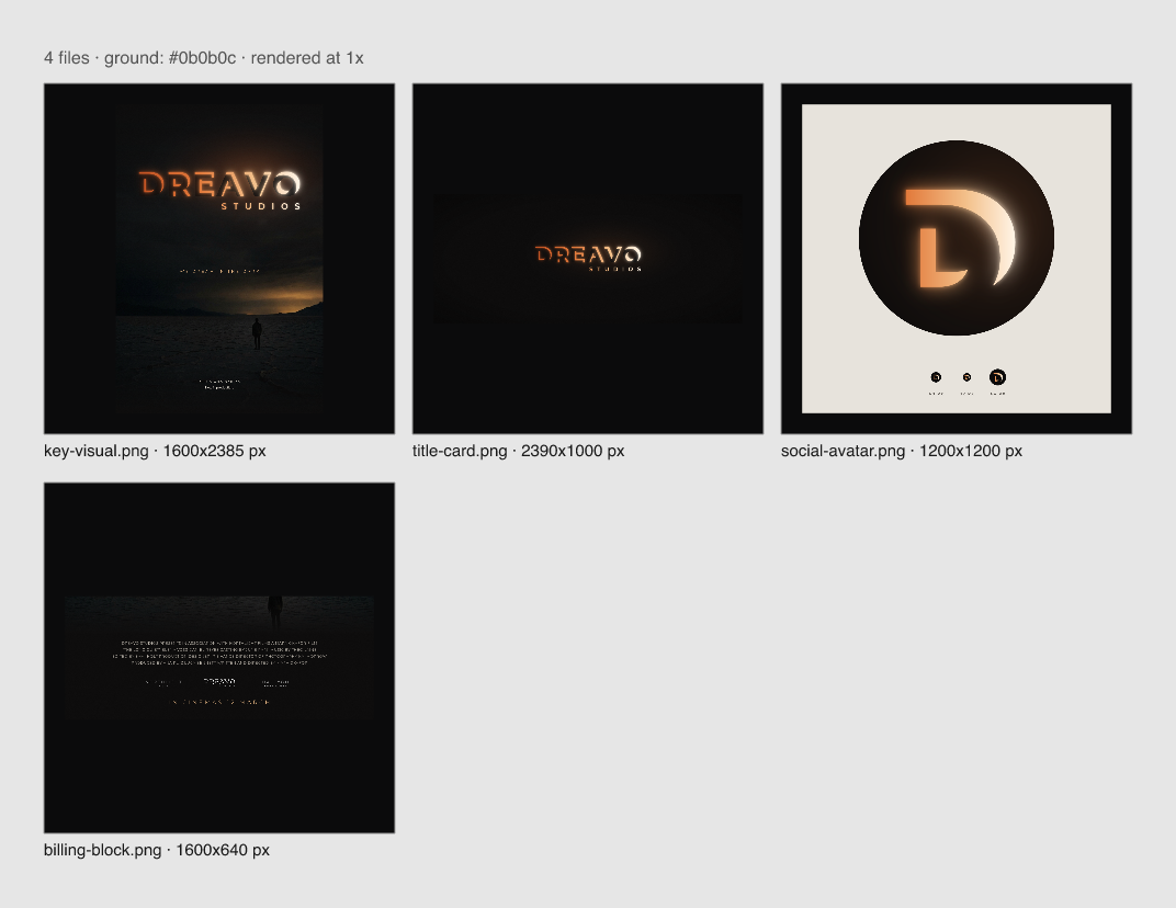
07-totality and 01-eclipse are the same idea (an eclipse with the reference's Λ V lettering, same wordmark build, same Ember palette), so they were compared as variants first: 07 moves the eclipse from a floating arc into the O, and it beats 01 on principles 1, 2, 4, and 5. Both stay in the table so the user can see what changed.
Scores
The table is split in two so six columns stay readable; both halves use the same rows and the same 1 to 5 scale.
Studies 01, 04, 05
| Principle | 01-eclipse | 04-splice | 05-hinge |
|---|---|---|---|
| 1. Survives in one flat color | 3: the mono-white crescent stays a clean separate arc, but without the dark disc and glow it reads as an arc over the name, not an eclipse | 5: solid slab D, the cut is negative space; nothing depends on tone | 4: the swell is pure shape and holds in mono-white; nothing merges |
| 2. Holds in a billing block and a round avatar | 3: at 120 px the crescent is a hairline and the widely tracked STUDIOS is barely there; the 32 px circle shows AV under a thread of arc | 5: the D reads at 16 px and in the 32 px circle; STUDIOS is as large as DREAVO, so the 120 px lockup stays legible | 3: the hinge A holds at 32 px, but the fine D thins at 120 px and STUDIOS is small and tracked wide |
| 3. No stock cinema and no levity | 4: no banned item; the arc of light sits close to the category's light convention (Skydance's arc) | 5: no banned item, nothing ornamental; a cut, not hardware | 4: no banned item; the ramp is serious but risks reading as a variable-font demo |
| 4. One drawn feature you can name | 3: "the crossbar-less A mirrored against the V" is nameable, but a crossbar-less A is a common device and the lettering is a wide geometric sans close to Legendary's | 5: "the D cut once and shifted": seen and named in one phrase on every sheet | 3: "the name gains weight from D to O" is nameable, but at a glance the line reads as mixed fonts; the hinge inside the A is invisible at lockup size, and the mark A looks misdrawn |
| 5. Two elements, one weight logic | 3: crescent, letters, and STUDIOS sit at three different stroke weights, and the mark's crescent carries an Ember-to-Corona gradient | 4: heavy slab D and Archivo Narrow 600 at one fixed ratio; DREAVO and STUDIOS are tracked differently, so the two lines do not lock | 2 (fail): six letters at six weights; this is the "six weights" look that directions.md dropped against this principle, now as a continuous ramp |
| Craft: distinctiveness against the landscape | 2: wide geometric caps plus an arc of light sit between Legendary's wordmark and Skydance's arc | 4: no prestige independent owns a single cut letter; the D is ownable in an avatar | 3: weight contrast is unusual in the category but reads as a type effect, not a mark |
| Craft: system depth (applications) | 5: six pieces; the poster, scope title card, and auditorium ident are the most cinematic work in the set | 5: five pieces; the cut carried into the poster and deck images makes the idea a system | 3: three pieces; the ident frames are three near-identical slides |
Studies 06, 07, 08
| Principle | 06-triads | 07-totality | 08-rimlight |
|---|---|---|---|
| 1. Survives in one flat color | 5: one weight, one color; the R-to-V diagonal stays separate from the A in mono | 4: in mono-white the O becomes a solid crescent with a hair-thin ring on its left and still reads as an eclipse; the gradient only enriches it | 3: the rim-lit letters survive as cut shapes in mono, but the ember-to-white warming from D to O, half the idea, exists only as a gradient |
| 2. Holds in a billing block and a round avatar | 3: the compact stacked lockup is the best billing-block shape here, but the Vo mark's thin long arm fades at 16 to 32 px and the mark reads as two letters, not a symbol | 4: the ring mark holds at 16 px and in the 32 px circle; at 120 px the eclipse O still reads, but the hair side of the ring and the widely tracked STUDIOS thin out | 2 (fail): at 120 px the fragmented letters break into scattered slivers and STUDIOS is a few pixels high; the billing-block mockup shows the lockup barely legible; the D mark reads as an L plus a crescent at 32 px |
| 3. No stock cinema and no levity | 2 (fail): the mark is "Vo", the V.O. voice-over pun that directions.md itself dropped as playful, and it isolates VO/AVO, which the strategy's Name section warns against |
3: no banned item in the lockup, but the mark alone, an orange gradient ring on black, sits close to a lens ring and to the familiar eclipse image | 3: no banned item, but letters with most of their body missing edge toward the cracked or broken lettering the Personality section rules out, and rim light is the category's light convention |
| 4. One drawn feature you can name | 4: "the R's leg runs on into the V" is visible on the mono sheet and nameable | 4: "the O is the eclipse", one phrase, visible at every size, plus the Λ V pair inherited from 01 | 4: "every letter drawn only by its rim of light" is drawn and nameable, though it first reads as stencil cuts |
| 5. Two elements, one weight logic | 5: one weight for DRE/AVO, the symbol is the name itself, nothing decorative | 4: the symbol is inside the name, so the lockup is the name alone; one letter weight, and the O's ring runs from hair to heavy by one rule | 3: one name, but the rims vary from thick bars to slivers letter by letter, and the color ramp adds a second logic |
| Craft: distinctiveness against the landscape | 4: no competitor stacks its name; the block has its own silhouette | 3: an eclipse O is a common device, and this is 01's idea and wordmark | 4: no film company draws its name in rim light; the most unusual lockup in the set |
| Craft: system depth (applications) | 2: three pieces; the key visual is the lockup on a blue glow and the avatar is the mark on a flat circle | 4: four pieces; the eclipse key visual and the scope title card are strong, and the O becomes the hero image | 4: four pieces; the poster and title card are the most atmospheric, while the billing block exposes the small-size problem |
Fails:
- 05-hinge: 5. Two elements, one weight logic
- 06-triads: 3. No stock cinema and no levity
- 08-rimlight: 2. Holds in a billing block and a round avatar
Studies
01-eclipse: Eclipse
A thin eclipse crescent over the name, the A drawn without a crossbar and mirrored against the V (the user's reference).
- Evidence: P1, the mono-white arc on mono-white.png is crisp but reads as a generic arc once the gradient is gone. P2,
logo/sheet.pngsmall-size row: the crescent is a hairline at 120 px and STUDIOS nearly vanishes. P3, no banned item, but it sits on the category's light convention. P4, the ΛV pair is the feature; the rest is a wide geometric sans. P5, three stroke weights and a gradient inmark.svg(mark.png). - No fails.
- Strongest point: the most cinematic system in the set. The scope title card and the auditorium ident (apps-01.png) look exactly like a studio ident in a dark room.
- Biggest weakness: the logo itself is the least ownable. Without its glow it is a thin arc over wide geometric caps, close to Legendary and Skydance, and the hairline is the first thing lost in a billing block.
04-splice: Splice
A monumental D cut once horizontally, its upper half shifted by the width of the cut: the edit that turns footage into a film.
- Evidence: P1, solid slab in mono, the cut is negative space. P2, the D reads at 16 px and in the 32 px circle in
logo/sheet.png. P3, nothing borrowed from cinema hardware. P4, "the cut D" is visible on every sheet. P5, slab plus condensed caps at one ratio, but DREAVO and STUDIOS are tracked differently (mono-white.png). - No fails.
- Strongest point: the only mark that is both monumental and tiny-proof. The D holds from the 16 px row to the full-frame title card, and the cut carries into the poster and deck images (apps-04.png), so the idea is a system, not a logo. It is also the one study whose idea says what Dreavo does (the cut that makes a film), not only what its letters look like.
- Biggest weakness: the concept says the cut runs through the whole lockup, but on the mono sheet DREAVO sits only a hair right of STUDIOS; the claim is not visible. STUDIOS also sets as large as DREAVO, against the category's name-over-small-descriptor convention, so the lockup reads slightly flat.
05-hinge: Hinge
DREAVO in one line that gains weight from a fine D to a full-weight O, turning inside the A that DREA(M) and (BR)AVO share.
- Evidence: P1, the swell is shape and holds in mono. P2, the A holds in the 32 px circle; the fine D thins at 120 px. P3, serious, but close to a variable-font demo. P4, the ramp is nameable; the hinge in the A is not visible at lockup size. P5, six weights in one word.
- Fail: 5. Two elements, one weight logic. Fix: commit to the two-weight version the directions described, fine DRE and heavy AVO with the single break inside the A, so the lockup has one fixed ratio.
- Strongest point: the only idea drawn from the name's sound and meaning, and on a black card the left-to-right swell does read like a picture fading in (apps-05.png, ident frames).
- Biggest weakness: at a glance the wordmark looks like mismatched fonts rather than intent, and the mark A, with its slanted crossbar and uneven legs (mark.png), looks misdrawn rather than designed.
06-triads: Triads
DRE stacked over AVO, the R's leg running on across the gap to become the V's left arm.
- Evidence: P1, one weight, one color. P2, the stacked lockup is compact at 120 px; the Vo mark thins at 16 to 32 px. P3, the Vo mark is the dropped voice-over pun. P4, the R-to-V stroke is visible and nameable. P5, one weight throughout.
- Fail: 3. No stock cinema and no levity. Fix: drop the Vo mark and use the DRE/AVO block, or the R-to-V diagonal with the D, as the avatar mark.
- Strongest point: the lockup. The stacked block with one long diagonal is the most composed, architectural wordmark in the set, and it is the only one that is the name and a symbol at once (mono-white.png).
- Biggest weakness: the mark and the system. "Vo" in a circle (apps-06.png) looks like a casual monogram, and with three thin applications the study shows the least of how it would carry a studio.
07-totality: Totality
The O of DREAVO is the eclipse, a ring hair-thin on one side and a bright crescent on the other; the O alone is the mark. Same idea as 01-eclipse, pushed into the O.
- Evidence: P1, the mono O still reads as an eclipse (mono-white.png). P2, the ring holds at 16 px and in the 32 px circle (
logo/sheet.png); the hair side and STUDIOS thin at 120 px. P3, the mark alone is an orange ring, close to a lens ring. P4, "the O is the eclipse". P5, the symbol lives inside the name. - No fails.
- Strongest point: it fixes 01. The floating hairline arc is gone, the eclipse sits inside the name, and the O gives the brand a solid avatar; the eclipse key visual (apps-07.png) carries the "dream begins in the dark" idea without words.
- Biggest weakness: it is still 01's wordmark and palette with one letter changed, so it inherits the closeness to Legendary's wide geometric caps, and the mark alone, a gradient ring, is generic until you see it in the word.
08-rimlight: Rimlight
Every letter of DREAVO is eclipsed and drawn only by the light on its upper-right edge, warming from ember at the D to white at the O.
- Evidence: P1, the cuts survive in mono but the warming does not. P2, the letters fall apart at 120 px and in the billing block (apps-08.png). P3, broken letterforms edge toward the cracked lettering the strategy rules out. P4, the rim is a real drawn feature. P5, rims vary from bars to slivers.
- Fail: 2. Holds in a billing block and a round avatar. Fix: a solid, fully drawn billing-block version of the wordmark (the letters whole, rim light kept for the ident and primary only), and a mark rebuilt so the D reads as a D at 32 px.
- Strongest point: the most cinematic lockup on a title card; the name emerging from the dark in ember light (apps-08.png, poster and title card) is the strongest picture of "we dream in the dark".
- Biggest weakness: it is an effect, not a logo. Take away the size and the gradient and it becomes fragmented stencil letters that a billing block and an avatar cannot hold.
Recommendation
Recommend 04-splice: across six studies it is still the only one at 4 or above on every principle, its cut D is the most ownable and the most legible mark from the 16 px avatar to the scope title card, and its cut-through-the-image key visuals make it read as a serious, modern studio. Next refinements: make the cut visibly run through the lockup (shift DREAVO by exactly the cut width so its jog lines up with the D's), set STUDIOS smaller and tracked to DREAVO's width so the name leads, run a trademark check on single-letter D marks, and build the motion ident with the one-frame Safelight cut.
Runner-up: 07-totality, close behind with no fails; it supersedes 01-eclipse as the eclipse direction, since it keeps the user's own reference and adds the "dream" meaning while fixing 01's floating hairline and weak avatar. What decides between 04 and 07: the principles favor 04's drawn, effect-free mark; the user's own eclipse and "Dreavo basically means to dream" favor 07. If 07 is chosen, refine the wordmark away from wide geometric caps (custom D, R, and E to match the Λ V) and thicken the ring's hair side for 120 px. 08-rimlight is the best ident picture but needs a solid small-size version; 06-triads needs a new mark; 05-hinge needs a two-weight rebuild.
Decision
Awaiting user sign-off (Gate 3).